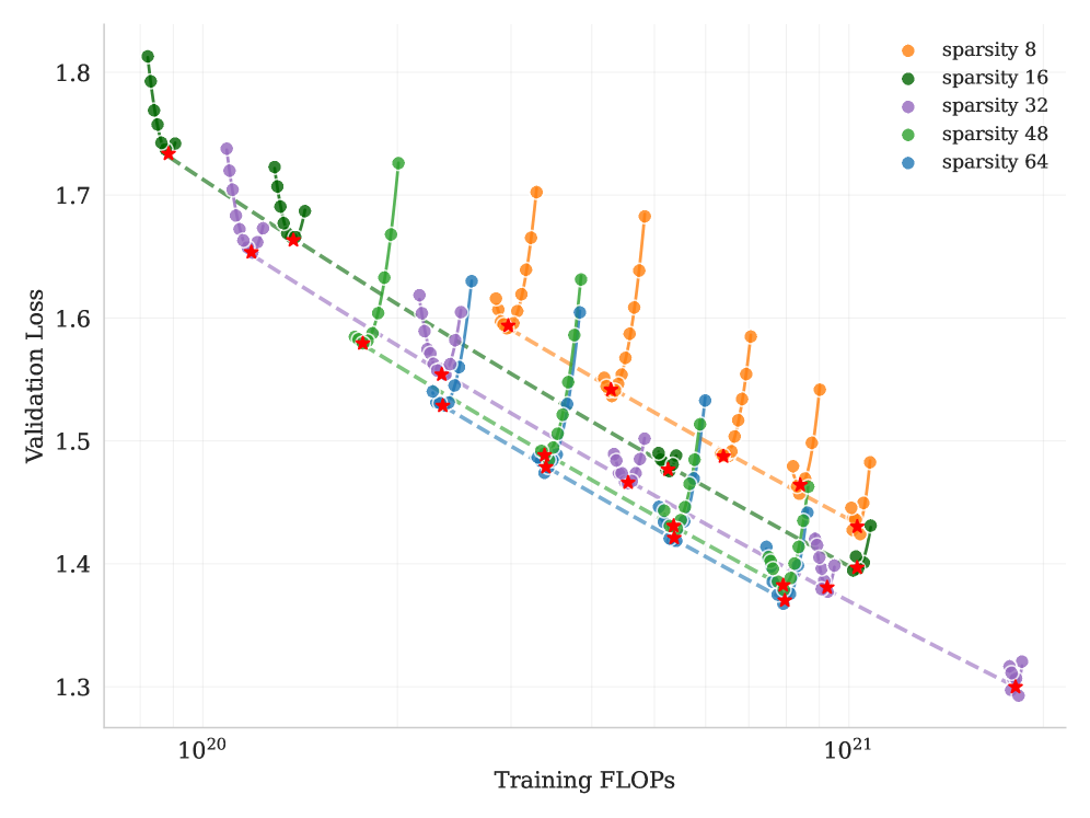
## Scatter Plot: Validation Loss vs. Training FLOPS for Different Sparsity Levels
### Overview
The image is a scatter plot showing the relationship between validation loss and training FLOPS (floating point operations per second) for different levels of sparsity. The plot includes data for sparsity levels of 8, 16, 32, 48, and 64, each represented by a different color. A dashed line is overlaid on each data series, and a red star is placed on each dashed line.
### Components/Axes
* **X-axis:** Training FLOPS (log scale), with markers at 10^20 and 10^21.
* **Y-axis:** Validation Loss (linear scale), ranging from 1.3 to 1.8.
* **Legend:** Located in the top-right corner, indicating the color-coded sparsity levels:
* Orange: sparsity 8
* Green: sparsity 16
* Purple: sparsity 32
* Lavender: sparsity 48
* Blue: sparsity 64
### Detailed Analysis
* **Sparsity 8 (Orange):** The orange data series starts at approximately (1.3e21, 1.43) and rises sharply to approximately (1.3e21, 1.59), then rises again to approximately (1.3e21, 1.68), and finally rises to approximately (1.3e21, 1.43).
* **Sparsity 16 (Green):** The green data series starts at approximately (1.0e20, 1.78) and rises sharply to approximately (1.3e21, 1.43).
* **Sparsity 32 (Purple):** The purple data series starts at approximately (1.0e20, 1.70) and rises sharply to approximately (1.3e21, 1.31).
* **Sparsity 48 (Lavender):** The lavender data series starts at approximately (1.0e20, 1.68) and rises sharply to approximately (1.3e21, 1.40).
* **Sparsity 64 (Blue):** The blue data series starts at approximately (1.0e20, 1.74) and rises sharply to approximately (1.3e21, 1.41).
Each data series shows a trend of decreasing validation loss as training FLOPS increase, up to a certain point, after which the validation loss increases.
### Key Observations
* All sparsity levels show a general trend of decreasing validation loss with increasing training FLOPS initially.
* At higher training FLOPS, the validation loss starts to increase for all sparsity levels, indicating potential overfitting.
* The dashed lines appear to represent a linear approximation of the initial decreasing trend for each sparsity level.
* The red stars mark specific points on the dashed lines, potentially indicating optimal performance or a point of interest.
### Interpretation
The plot illustrates the impact of sparsity on the relationship between training FLOPS and validation loss. Initially, increasing training FLOPS reduces validation loss, suggesting improved model performance. However, after a certain point, further training leads to an increase in validation loss, indicating overfitting. The different sparsity levels exhibit similar trends, but the optimal training FLOPS and minimum validation loss vary depending on the sparsity level. The dashed lines and red stars likely represent a method for identifying the optimal trade-off between training FLOPS and validation loss for each sparsity level. The data suggests that there is an optimal level of sparsity for a given training budget (FLOPS) to minimize validation loss.