\n
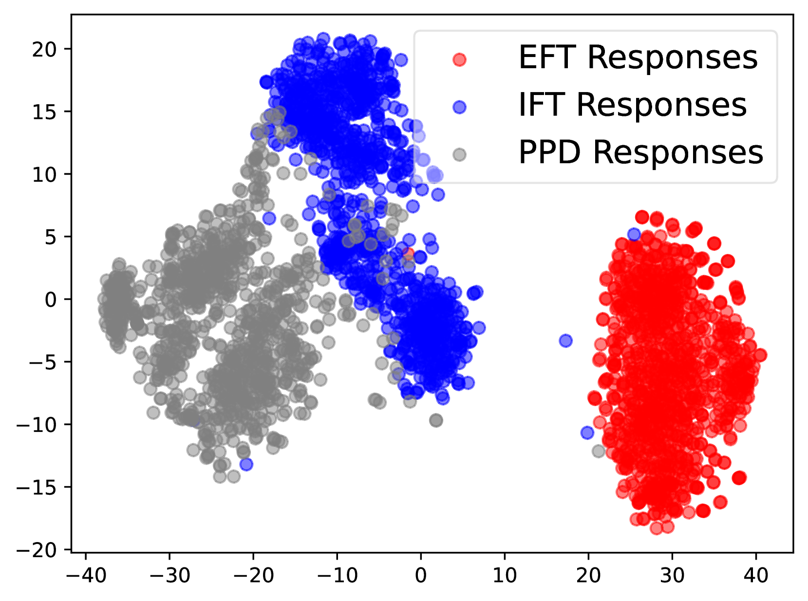
## Scatter Plot: Response Distribution
### Overview
This image presents a scatter plot visualizing the distribution of responses from three different methods: EFT (Emotional Freedom Techniques), IFT (presumably, a different form of therapy), and PPD (likely, Postpartum Depression assessment). The plot displays the responses on a two-dimensional plane, with the x-axis ranging from approximately -40 to 40 and the y-axis ranging from approximately -20 to 20. Each point represents a single response, color-coded according to the method used.
### Components/Axes
* **X-axis:** Ranges from -40 to 40, unlabeled. Represents a score or measurement related to the response.
* **Y-axis:** Ranges from -20 to 20, unlabeled. Represents a score or measurement related to the response.
* **Legend:** Located in the top-right corner.
* **EFT Responses:** Represented by red circles.
* **IFT Responses:** Represented by blue circles.
* **PPD Responses:** Represented by grey circles.
### Detailed Analysis
The plot shows three distinct clusters of data points, each corresponding to one of the response methods.
* **EFT Responses (Red):** This cluster is located in the bottom-right quadrant of the plot, centered around x = 30 and y = -5. The points are relatively tightly grouped, indicating a consistent response pattern. The range of x-values is approximately 20 to 40, and the range of y-values is approximately -15 to 5.
* **IFT Responses (Blue):** This cluster is located in the top-left quadrant of the plot, centered around x = -10 and y = 10. The points are also relatively tightly grouped, but slightly more dispersed than the EFT responses. The range of x-values is approximately -25 to 10, and the range of y-values is approximately 5 to 20.
* **PPD Responses (Grey):** This cluster is located in the bottom-left quadrant of the plot, centered around x = -20 and y = -5. This cluster is the most dispersed of the three, with a wider range of x and y values. The range of x-values is approximately -40 to -10, and the range of y-values is approximately -15 to 10.
Visually, the EFT responses tend to have higher x-values and lower y-values, the IFT responses have lower x-values and higher y-values, and the PPD responses have intermediate x and y values with greater variance.
### Key Observations
* The three methods produce clearly distinguishable response patterns.
* The EFT responses are the most consistently positive (high x-values), while the IFT responses are the most consistently positive in the y-dimension.
* The PPD responses exhibit the greatest variability, suggesting a wider range of experiences or outcomes.
* There is minimal overlap between the clusters, indicating that the methods elicit different types of responses.
### Interpretation
The scatter plot suggests that EFT, IFT, and PPD elicit distinct response patterns. The clustering of EFT responses in the bottom-right quadrant could indicate a strong positive effect on a specific dimension (represented by the x-axis), while the clustering of IFT responses in the top-left quadrant could indicate a strong positive effect on a different dimension (represented by the y-axis). The dispersed pattern of PPD responses suggests that the condition is associated with a wider range of experiences and outcomes.
The lack of overlap between the clusters suggests that these methods are not interchangeable and may be suitable for different individuals or situations. Further analysis would be needed to determine the specific meaning of the x and y axes and to understand the underlying mechanisms driving these response patterns. The plot provides a visual representation of the differences in response distributions, but does not offer causal explanations. It is important to note that without knowing what the axes represent, the interpretation is limited to relative positioning and clustering.