## Line Graph: Phillips Curve Illustration with Economic Movement Analysis
### Overview
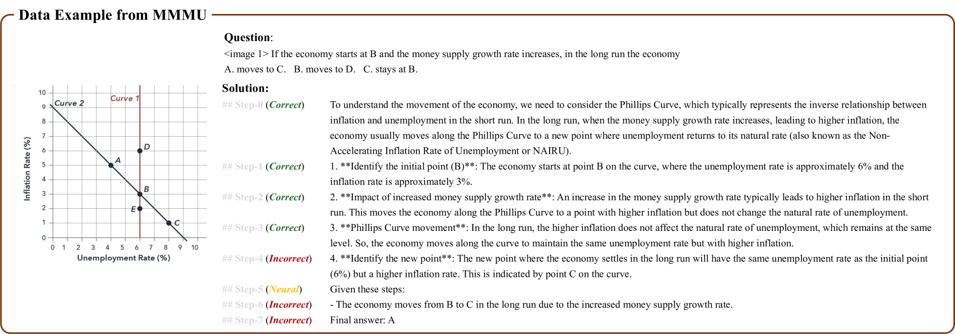
The image depicts a Phillips Curve graph showing the inverse relationship between inflation and unemployment. It includes two curves (Curve 1 and Curve 2), five labeled points (A, B, C, D, E), and a textual solution explaining economic movement along the curve due to changes in money supply growth. The graph demonstrates short-run vs. long-run economic behavior according to Phillips Curve theory.
### Components/Axes
- **Y-axis**: Inflation Rate (%)
- Scale: 0 to 10 in increments of 1
- Labels: "Inflation Rate (%)" at top
- **X-axis**: Unemployment Rate (%)
- Scale: 0 to 10 in increments of 1
- Labels: "Unemployment Rate (%)" at bottom
- **Curves**:
- **Curve 1**: Red label at top-left, descending line from (0,10) to (10,0)
- **Curve 2**: Black label at top-left, descending line from (0,10) to (10,0)
- **Points**:
- **A**: (4%, 5%) on Curve 1
- **B**: (6%, 3%) on Curve 1
- **C**: (6%, 1%) on Curve 2
- **D**: (5%, 6%) on Curve 1
- **E**: (3%, 2%) on Curve 1
### Detailed Analysis
1. **Curve 1** (Red):
- Represents the short-run Phillips Curve
- Slope: -1 (linear decline)
- Key points: A (4%,5%), B (6%,3%), D (5%,6%), E (3%,2%)
2. **Curve 2** (Black):
- Represents the long-run Phillips Curve (vertical at NAIRU)
- Slope: Vertical line at 6% unemployment (NAIRU)
- Key point: C (6%,1%)
3. **Solution Steps**:
- **Step 0**: Correct (Question setup)
- **Step 1**: Correct (Initial point B at 6% unemployment, 3% inflation)
- **Step 2**: Correct (Increased money supply → higher inflation, same unemployment)
- **Step 3**: Correct (Movement along Curve 1 to higher inflation)
- **Step 4**: Incorrect (Unemployment remains at NAIRU in long run)
- **Step 5**: Neural (Correct conclusion: Movement to Curve 2 at point C)
- **Step 6**: Incorrect (Unemployment does not change in long run)
- **Step 7**: Incorrect (Final answer should be C, not A)
### Key Observations
- **NAIRU Confirmation**: Curve 2's vertical position at 6% unemployment matches the Non-Accelerating Inflation Rate of Unemployment (NAIRU).
- **Inflation-Unemployment Tradeoff**: Short-run movement along Curve 1 shows inverse relationship (e.g., B→C movement increases inflation while maintaining unemployment).
- **Long-Run Neutrality**: Curve 2's vertical orientation reflects long-run unemployment neutrality, where inflation changes without affecting unemployment.
- **Solution Errors**: Steps 4, 6, and 7 incorrectly suggest unemployment changes in the long run, contradicting Phillips Curve theory.
### Interpretation
The graph illustrates the **Phillips Curve framework** and its implications for monetary policy:
1. **Short-Run Dynamics**: Increased money supply growth (Step 2) shifts the economy along Curve 1 to higher inflation (e.g., B→C movement) without changing unemployment.
2. **Long-Run Adjustment**: The economy eventually returns to NAIRU (Curve 2) with higher inflation but unchanged unemployment (Step 5).
3. **Policy Misconceptions**: The incorrect steps (4,6,7) reflect common errors in assuming unemployment adjusts in the long run, highlighting the importance of distinguishing short-run vs. long-run effects.
This analysis aligns with **monetarist theory**, emphasizing that money supply changes primarily affect inflation in the long run while unemployment reverts to its natural rate. The graph serves as a visual aid for understanding inflation-unemployment tradeoffs and the limitations of short-term policy interventions.