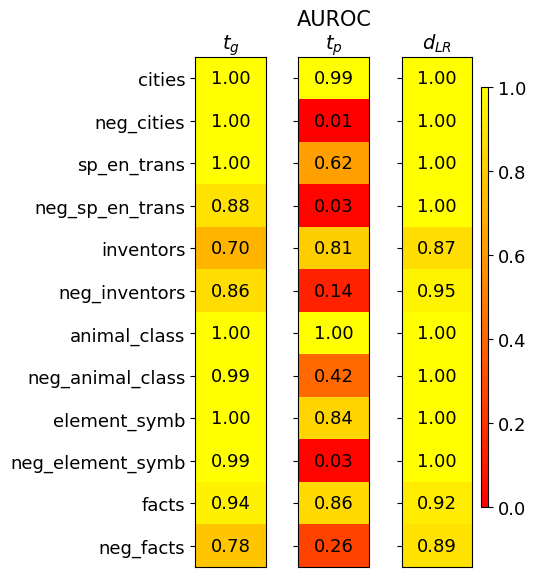
## Heatmap: Performance Metrics for Different Categories
### Overview
This image presents a heatmap displaying performance metrics for ten different categories and their negative counterparts. The heatmap uses a color gradient to represent values ranging from 0.0 to 1.0, with warmer colors (reds) indicating lower values and cooler colors (greens) indicating higher values. Three metrics are displayed: *t<sub>G</sub>*, AUROC<sub>tp</sub>, and *d<sub>LR</sub>*. The categories are listed vertically on the left side of the heatmap.
### Components/Axes
* **Vertical Axis (Categories):**
* cities
* neg\_cities
* sp\_en\_trans (likely "Spanish to English Translation")
* neg\_sp\_en\_trans
* inventors
* neg\_inventors
* animal\_class
* neg\_animal\_class
* element\_symb (likely "Element Symbols")
* neg\_element\_symb
* facts
* neg\_facts
* **Horizontal Axis (Metrics):**
* *t<sub>G</sub>*
* AUROC<sub>tp</sub>
* *d<sub>LR</sub>*
* **Color Scale (Legend):** Located on the right side of the heatmap, ranging from approximately 0.0 (dark red) to 1.0 (dark green). The scale is linear.
### Detailed Analysis
The heatmap displays values for each category and metric combination. I will analyze each metric column separately, noting trends and specific values.
**1. *t<sub>G</sub>* Column:**
* Trend: Generally high values, mostly around 1.0.
* Data Points:
* cities: 1.00
* neg\_cities: 1.00
* sp\_en\_trans: 1.00
* neg\_sp\_en\_trans: 0.88
* inventors: 0.70
* neg\_inventors: 0.86
* animal\_class: 1.00
* neg\_animal\_class: 0.99
* element\_symb: 1.00
* neg\_element\_symb: 0.99
* facts: 0.94
* neg\_facts: 0.78
**2. AUROC<sub>tp</sub> Column:**
* Trend: Values are more variable than *t<sub>G</sub>*, ranging from 0.01 to 1.00. Several values are close to 1.0, but there are also some low values.
* Data Points:
* cities: 0.99
* neg\_cities: 0.01 (lowest value in the entire heatmap)
* sp\_en\_trans: 0.62
* neg\_sp\_en\_trans: 0.03
* inventors: 0.81
* neg\_inventors: 0.14
* animal\_class: 1.00
* neg\_animal\_class: 0.42
* element\_symb: 0.84
* neg\_element\_symb: 0.03
* facts: 0.86
* neg\_facts: 0.26
**3. *d<sub>LR</sub>* Column:**
* Trend: Predominantly high values, mostly around 1.0.
* Data Points:
* cities: 1.00
* neg\_cities: 1.00
* sp\_en\_trans: 1.00
* neg\_sp\_en\_trans: 1.00
* inventors: 0.87
* neg\_inventors: 0.95
* animal\_class: 1.00
* neg\_animal\_class: 1.00
* element\_symb: 1.00
* neg\_element\_symb: 1.00
* facts: 0.92
* neg\_facts: 0.89
### Key Observations
* The "neg\_cities" category has a very low AUROC<sub>tp</sub> value (0.01), significantly lower than all other values in that column and the entire heatmap. This is a notable outlier.
* "neg\_sp\_en\_trans" and "neg\_element\_symb" also have low AUROC<sub>tp</sub> values (0.03 each).
* The "inventors" and "neg\_facts" categories have relatively lower *t<sub>G</sub>* values compared to the other categories.
* *d<sub>LR</sub>* consistently shows high values across all categories, suggesting strong discriminatory power.
### Interpretation
This heatmap likely represents the performance of a model or system on different categories of data. The metrics used suggest the following:
* *t<sub>G</sub>* could be a measure of truthfulness or grounding. High values indicate the system is well-grounded in the data.
* AUROC<sub>tp</sub> (Area Under the Receiver Operating Characteristic curve for true positives) is a measure of the system's ability to distinguish between positive and negative examples.
* *d<sub>LR</sub>* (likely a log-likelihood ratio) is a measure of the separation between positive and negative examples.
The low AUROC<sub>tp</sub> values for "neg\_cities", "neg\_sp\_en\_trans", and "neg\_element\_symb" suggest that the system struggles to correctly identify negative examples within those categories. This could indicate issues with the training data, the model's architecture, or the inherent difficulty of distinguishing negative examples in these areas. The consistently high *d<sub>LR</sub>* values suggest that when the system *does* make a prediction, it is generally confident in its assessment. The lower *t<sub>G</sub>* values for "inventors" and "neg\_facts" might indicate that these categories are more prone to generating outputs that are not well-grounded in the source data.
The pairing of categories with their "neg\_" counterparts suggests an evaluation of the system's ability to handle adversarial or negative examples. The heatmap provides a clear visual representation of where the system excels and where it needs improvement.