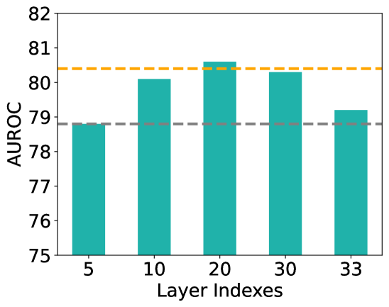
## Bar Chart: AUROC vs. Layer Indexes
### Overview
The image is a bar chart showing the AUROC (Area Under the Receiver Operating Characteristic curve) values for different layer indexes. The chart includes a horizontal dashed orange line at approximately 80.4 and a horizontal dashed gray line at approximately 78.8. The bars are teal.
### Components/Axes
* **Y-axis:** AUROC, ranging from 75 to 82.
* **X-axis:** Layer Indexes, with values 5, 10, 20, 30, and 33.
* **Horizontal Lines:**
* Dashed Orange line at AUROC ~80.4
* Dashed Gray line at AUROC ~78.8
### Detailed Analysis
* **Layer Index 5:** AUROC is approximately 78.9.
* **Layer Index 10:** AUROC is approximately 80.1.
* **Layer Index 20:** AUROC is approximately 80.6.
* **Layer Index 30:** AUROC is approximately 80.3.
* **Layer Index 33:** AUROC is approximately 79.2.
The AUROC values generally increase from layer index 5 to 20, then decrease slightly at layer index 30, and decrease further at layer index 33.
### Key Observations
* The highest AUROC value is observed at layer index 20.
* The lowest AUROC value is observed at layer index 5.
* The AUROC values fluctuate within a relatively narrow range (approximately 78.9 to 80.6).
### Interpretation
The chart suggests that the model's performance, as measured by AUROC, varies depending on the layer index. The optimal performance appears to be around layer index 20. The dashed lines may represent target or baseline performance levels, with the orange line indicating a desired level and the gray line indicating a minimum acceptable level. The model's performance exceeds the minimum level across all layer indexes but only reaches the desired level around layer indexes 10, 20, and 30. The performance drops off at layer index 33.