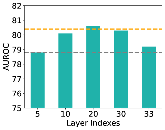
## Bar Chart: AUROC Performance across Layer Indexes
### Overview
This image is a bar chart illustrating the relationship between "Layer Indexes" (horizontal axis) and "AUROC" (Area Under the Receiver Operating Characteristic curve, vertical axis). The chart uses teal-colored bars to represent data points at specific layer intervals and includes two horizontal dashed lines as reference baselines.
### Components/Axes
* **Vertical Axis (Y-axis):**
* **Label:** AUROC
* **Scale:** Ranges from 75 to 82.
* **Major Tick Marks:** Increments of 1 unit (75, 76, 77, 78, 79, 80, 81, 82).
* **Horizontal Axis (X-axis):**
* **Label:** Layer Indexes
* **Categories (Ticks):** 5, 10, 20, 30, 33.
* **Reference Lines:**
* **Orange Dashed Line:** Positioned at approximately **80.4 AUROC**. It serves as an upper-tier performance benchmark.
* **Grey Dashed Line:** Positioned at approximately **78.8 AUROC**. It serves as a lower-tier performance benchmark, aligning exactly with the first data point.
* **Data Series:** Five teal bars representing the AUROC value for each specified layer index.
### Detailed Analysis
The following values are estimated based on the grid alignment:
| Layer Index | Estimated AUROC | Visual Trend Description |
| :--- | :--- | :--- |
| **5** | ~78.8 | Baseline level; aligns perfectly with the grey dashed line. |
| **10** | ~80.1 | Significant upward slope from index 5; crosses the 80.0 threshold. |
| **20** | ~80.6 | Continued upward trend; reaches the peak value of the dataset, slightly above the orange line. |
| **30** | ~80.3 | Slight downward slope from the peak; sits just below the orange dashed line. |
| **33** | ~79.2 | Sharp downward slope; performance drops back toward the lower baseline. |
### Key Observations
* **Peak Performance:** The highest AUROC (~80.6) is achieved at **Layer Index 20**.
* **Performance Arc:** The data follows a "bell-shaped" or concave curve. Performance improves as the layer index increases from 5 to 20, then begins to degrade as it moves toward the final layers (30 and 33).
* **Benchmark Comparison:** Layers 10, 20, and 30 all perform above the 80.0 mark and near or above the orange benchmark. Layers 5 and 33 perform significantly worse, falling near or below the 79.0 mark.
### Interpretation
This chart likely represents a feature extraction experiment in a deep neural network (possibly a transformer or a deep CNN).
* **Optimal Feature Representation:** The data suggests that the "middle-to-late" layers (specifically around index 20) provide the most discriminative features for the task being measured by AUROC.
* **Early vs. Late Layers:** The lower performance at Layer 5 suggests that early layers may contain features that are too generic (e.g., simple edges or shapes). Conversely, the drop-off at Layer 33 suggests that the very final layers might be too specialized to the training objective or have lost some of the generalizable semantic information present in the preceding layers.
* **Significance of Baselines:** The grey line likely represents a "standard" or "previous" model's performance, showing that selecting the correct internal layer can yield a performance boost of nearly 2% AUROC (from ~78.8 to ~80.6), which is often a significant margin in machine learning contexts.