\n
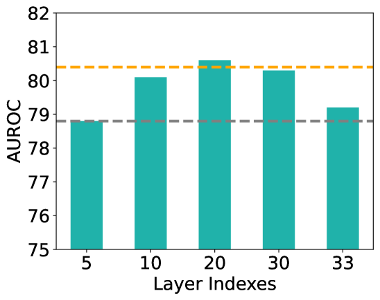
## Bar Chart: AUROC Performance Across Layer Indexes
### Overview
The image is a vertical bar chart displaying the AUROC (Area Under the Receiver Operating Characteristic Curve) performance metric for five different "Layer Indexes." The chart includes two horizontal dashed reference lines. The overall visual suggests an analysis of model performance at different depths or stages (layers) of a system.
### Components/Axes
* **Y-Axis (Vertical):**
* **Label:** `AUROC`
* **Scale:** Linear, ranging from 75 to 82.
* **Major Ticks:** 75, 76, 77, 78, 79, 80, 81, 82.
* **X-Axis (Horizontal):**
* **Label:** `Layer Indexes`
* **Categories:** 5, 10, 20, 30, 33. These are discrete, non-continuous labels.
* **Data Series:**
* **Bars:** Five teal-colored vertical bars, one for each Layer Index.
* **Reference Lines:**
* **Orange Dashed Line:** A horizontal line positioned at approximately **AUROC = 80.4**. It spans the full width of the chart area.
* **Gray Dashed Line:** A horizontal line positioned at approximately **AUROC = 78.8**. It also spans the full width of the chart area.
* **Legend:** There is no explicit legend box. The two dashed lines are distinguished solely by color (orange and gray).
### Detailed Analysis
**Bar Values (Approximate):**
* **Layer 5:** The bar height is just below the 79 mark. Estimated AUROC ≈ **78.9**.
* **Layer 10:** The bar height is slightly above the 80 mark. Estimated AUROC ≈ **80.1**.
* **Layer 20:** This is the tallest bar, extending above the 80 mark and slightly above the orange dashed line. Estimated AUROC ≈ **80.6**.
* **Layer 30:** The bar is shorter than the Layer 20 bar but taller than the Layer 10 bar. Estimated AUROC ≈ **80.3**.
* **Layer 33:** The bar height is above the 79 mark but below the Layer 5 bar. Estimated AUROC ≈ **79.2**.
**Reference Line Analysis:**
* The **orange dashed line (≈80.4)** is exceeded only by the bar for **Layer 20**.
* The **gray dashed line (≈78.8)** is below all bars except for **Layer 5**, which is very close to it (≈78.9).
**Trend Verification:**
The visual trend of the data series (the bars) is non-monotonic. Performance (AUROC) increases from Layer 5 to Layer 10, peaks at Layer 20, then decreases at Layer 30 and further at Layer 33. The highest performance is at the middle index (20), with lower performance at both the earliest (5) and latest (33) indexes shown.
### Key Observations
1. **Peak Performance:** The optimal performance, as measured by AUROC, occurs at **Layer Index 20**.
2. **Performance Drop-off:** There is a clear decline in AUROC after Layer 20, with Layer 33 showing the second-lowest performance.
3. **Reference Line Context:** The orange line appears to represent a high-performance benchmark (e.g., a target or state-of-the-art result), which is only surpassed at Layer 20. The gray line may represent a baseline or average performance level.
4. **Non-linear Relationship:** The relationship between layer depth (index) and performance is not linear; it follows an inverted-U or peaked shape within the given range.
### Interpretation
This chart likely illustrates the performance of a neural network or similar layered model at different intermediate layers. The AUROC metric suggests a classification task.
* **What the data suggests:** The model's discriminative power (ability to separate classes) is not uniform across its layers. It improves as information is processed through initial layers, reaches an optimal representation at an intermediate depth (Layer 20), and then degrades in deeper layers. This could indicate that later layers become too specialized, over-smooth, or lose generalizable features for this specific task.
* **How elements relate:** The bars show the measured performance at each discrete layer. The orange dashed line provides a critical visual benchmark, highlighting that only one layer (20) achieves "exceptional" performance relative to that standard. The gray line contextualizes the lower bound of performance for the shown layers.
* **Notable anomalies/trends:** The most significant trend is the peak at Layer 20. The drop at Layer 33 is notable, suggesting that simply going deeper does not guarantee better performance and may be detrimental. The fact that Layer 5 (the shallowest) performs nearly as well as Layer 33 (the deepest) is an interesting point of comparison, indicating that very early and very late layers may have similarly limited utility for this metric.
* **Underlying message:** The data argues for the importance of **layer-wise analysis** and suggests that the most useful features for the task reside in the middle of the network. It may inform decisions about where to extract features for downstream tasks or where to apply interventions like pruning or distillation.