## Line Chart: MultiChallenge Score vs. Model Number
### Overview
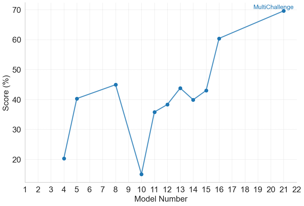
This image is a 2D line chart that visualizes the performance of various models on a specific evaluation metric. The chart plots "Score (%)" against "Model Number" for a single data series identified as "MultiChallenge". The data is not continuous across all model numbers; rather, it shows results for a specific subset of models, connected by a line to illustrate the progression or variance in performance between the tested iterations.
### Components/Axes
**1. Y-Axis (Left)**
* **Label:** "Score (%)" (Oriented vertically, reading bottom to top).
* **Scale:** Linear numerical scale.
* **Markers/Ticks:** Major grid lines and labels are provided at intervals of 10, specifically: 20, 30, 40, 50, 60, and 70. (Note: The data dips below 20, implying the axis extends down to at least 10, though it is not explicitly labeled).
* **Gridlines:** Faint, dashed, light-grey horizontal lines extend from each major tick mark across the chart area.
**2. X-Axis (Bottom)**
* **Label:** "Model Number" (Centered horizontally below the axis).
* **Scale:** Discrete numerical scale.
* **Markers/Ticks:** Numbered sequentially from 1 to 22 in increments of 1.
* **Gridlines:** Faint, dashed, light-grey vertical lines extend upward from each number.
**3. Chart Area & Legend (Center to Top-Right)**
* **Data Series:** A single solid blue line connecting solid blue circular markers.
* **Label/Legend:** The text "MultiChallenge" is located in the top-right quadrant of the chart area, positioned directly above the final data point. The text is colored blue, perfectly matching the color of the data line and markers, confirming this line represents the "MultiChallenge" dataset.
### Detailed Analysis
**Trend Verification:**
The visual trend of the blue "MultiChallenge" line is highly volatile in the earlier models but shows a general upward trajectory in the later models.
* The line begins at Model 4 with a low score, sharply inclines to Model 5, and continues a slight upward slope to Model 8.
* A severe, steep decline occurs between Model 8 and Model 10, marking the lowest point on the graph.
* From Model 10, the line sharply recovers to Model 11, followed by a jagged, fluctuating upward trend through Models 12, 13, 14, and 15.
* A significant, steep upward jump occurs between Model 15 and 16.
* Finally, a steady, moderate incline connects Model 16 to the final and highest point at Model 21.
**Data Extraction Table:**
*Note: Values are visual approximations based on the placement of the blue markers relative to the dashed gridlines.*
| Model Number (X-Axis) | Score (%) (Y-Axis) | Visual Placement Notes |
| :--- | :--- | :--- |
| 4 | ~20.5 | Just barely above the 20 gridline. |
| 5 | ~40.5 | Resting almost exactly on, or slightly above, the 40 gridline. |
| 8 | ~45.0 | Positioned exactly halfway between the 40 and 50 gridlines. |
| 10 | ~15.0 | Positioned halfway between the 20 gridline and the implied 10 baseline. |
| 11 | ~36.0 | Positioned slightly above the midpoint between 30 and 40. |
| 12 | ~38.5 | Positioned just below the 40 gridline. |
| 13 | ~44.0 | Positioned just below the midpoint between 40 and 50. |
| 14 | ~40.0 | Resting exactly on the 40 gridline. |
| 15 | ~43.0 | Positioned slightly below the midpoint between 40 and 50. |
| 16 | ~60.5 | Resting almost exactly on, or slightly above, the 60 gridline. |
| 21 | ~69.5 | Positioned just barely below the 70 gridline. |
### Key Observations
* **Missing Data:** There are significant gaps in the X-axis where no data points exist. Models 1, 2, 3, 6, 7, 9, 17, 18, 19, 20, and 22 have no recorded scores on this chart.
* **Absolute Maximum:** The highest recorded score is achieved by Model 21, nearing 70%.
* **Absolute Minimum:** The lowest recorded score is Model 10, dropping to approximately 15%.
* **Highest Volatility:** The most drastic changes in performance occur around Model 10 (a drop of ~30% from Model 8, followed by a recovery of ~21% to Model 11) and between Models 15 and 16 (a sudden increase of ~17.5%).
### Interpretation
**What the data suggests:**
The chart tracks the evolution of a system—likely a machine learning model, software build, or algorithmic iteration—across sequential versions (Model Numbers). The "MultiChallenge" label suggests this is a specific benchmark or test suite designed to evaluate the models' capabilities.
**Reading between the lines (Peircean investigative analysis):**
1. **Iterative Development:** The general upward trend from Model 10 to Model 21 strongly implies an iterative development process where the system is learning, being optimized, or receiving architectural improvements over time.
2. **The "Model 10" Anomaly:** The catastrophic drop at Model 10 is the most notable feature. In software/ML development, this usually indicates a failed experiment, a major bug introduced in that specific build, or a fundamental change in architecture that performed poorly on this specific "MultiChallenge" benchmark before being corrected in Model 11.
3. **The "Model 16" Breakthrough:** The sudden leap in performance at Model 16 (jumping from the low 40s to 60) suggests a breakthrough. This wasn't a minor tweak; it likely represents a successful implementation of a new feature, a significant increase in training data, or a major bug fix that unlocked higher performance.
4. **Selective Testing/Reporting:** The missing data points (e.g., Models 1-3, 17-20) are highly informative. It suggests that either:
* Not every model iteration was subjected to the "MultiChallenge" benchmark (perhaps it is computationally expensive to run).
* Some models failed to compile or run the test entirely.
* The chart author selectively chose to display only major milestone models or models that yielded interesting results, omitting intermediate minor builds.
5. **Diminishing Returns vs. Steady Growth:** The slope from Model 16 to 21 is shallower than the jump from 15 to 16, but it is steady. This indicates that after the breakthrough at Model 16, the developers found a stable path for incremental improvements leading up to Model 21.