\n
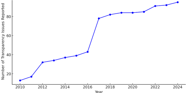
## Line Chart: Number of Transparency Issues Reported Over Time
### Overview
The image presents a line chart illustrating the trend of reported transparency issues from 2010 to 2024. The chart shows a generally increasing trend, with a particularly steep rise between 2017 and 2019.
### Components/Axes
* **X-axis:** Year, ranging from 2010 to 2024, with increments of 2 years.
* **Y-axis:** Number of Transparency Issues Reported, ranging from 0 to 100, with increments of 20.
* **Data Series:** A single blue line representing the number of reported issues over time.
* **No Legend:** The chart does not have a separate legend, as there is only one data series.
### Detailed Analysis
The blue line starts at approximately 10 in 2010 and exhibits a generally upward trend. Here's a breakdown of approximate data points:
* **2010:** ~10
* **2012:** ~18
* **2014:** ~32
* **2016:** ~42
* **2017:** ~44
* **2018:** ~75
* **2019:** ~84
* **2020:** ~85
* **2022:** ~90
* **2024:** ~94
The line slopes upward gradually from 2010 to 2016. There is a significant jump in reported issues between 2017 and 2018. From 2018 to 2020, the line plateaus, showing minimal increase. A slight increase is observed from 2020 to 2024.
### Key Observations
* **Steepest Increase:** The most significant increase in reported transparency issues occurs between 2017 and 2018.
* **Plateau:** The number of reported issues stabilizes between 2018 and 2020.
* **Overall Trend:** The overall trend is positive, indicating a growing awareness or reporting of transparency issues over the period.
### Interpretation
The data suggests a growing concern or increased scrutiny regarding transparency issues from 2010 to 2024. The sharp increase in 2018 could be attributed to a specific event, policy change, or increased media attention that prompted more reporting. The subsequent plateau might indicate that the initial surge in reporting stabilized, or that the underlying issues were addressed to some extent. The slight increase from 2020 to 2024 suggests that transparency issues continue to be a concern, albeit at a slower rate of increase. It's important to note that this chart only shows *reported* issues, and doesn't necessarily reflect the actual number of issues occurring. A possible explanation for the initial increase could be a change in reporting mechanisms or increased public awareness campaigns. Further investigation would be needed to understand the underlying causes of these trends.