## Line Chart: Convergence of a Metric over HMC Steps for Different Dimensions
### Overview
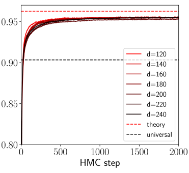
The image is a line chart plotting a numerical metric (y-axis) against the number of Hamiltonian Monte Carlo (HMC) steps (x-axis). It displays multiple curves corresponding to different dimensionality parameters (`d`), along with two theoretical reference lines. The chart demonstrates the convergence behavior of the metric as the number of sampling steps increases.
### Components/Axes
* **X-Axis:**
* **Label:** `HMC step`
* **Scale:** Linear, ranging from 0 to 2000.
* **Major Tick Marks:** 0, 500, 1000, 1500, 2000.
* **Y-Axis:**
* **Label:** Not explicitly stated. The axis represents a performance or similarity metric (e.g., accuracy, correlation).
* **Scale:** Linear, ranging from 0.80 to approximately 0.96.
* **Major Tick Marks:** 0.80, 0.85, 0.90, 0.95.
* **Legend (Position: Bottom-right corner):**
* **Data Series (Solid Lines):** A gradient of colors from red to black, each representing a different dimension `d`.
* `d=120` (Lightest red)
* `d=140`
* `d=160`
* `d=180`
* `d=200`
* `d=220`
* `d=240` (Black)
* **Reference Lines (Dashed Lines):**
* `theory` (Red dashed line)
* `universal` (Black dashed line)
### Detailed Analysis
1. **Trend Verification:** All solid lines for `d=120` through `d=240` exhibit the same fundamental trend: a very steep, near-vertical increase from a starting point near y=0.80 at step 0, followed by a rapid deceleration in growth, forming a "knee" around step 200-300. After the knee, the curves continue to rise very gradually, appearing to plateau as they approach step 2000.
2. **Data Series Values:**
* **Starting Point (Step 0):** All curves begin at approximately y ≈ 0.80.
* **Knee Region (Steps ~200-300):** The curves reach a value of approximately y ≈ 0.93-0.94.
* **Plateau Region (Steps 1500-2000):** All curves converge to a very similar final value. The lines are tightly clustered, making precise differentiation difficult. The final value is approximately y ≈ 0.955 ± 0.005. There is no visually significant separation between the curves for different `d` values in the plateau region.
3. **Reference Lines:**
* **`theory` (Red Dashed):** A horizontal line positioned at y ≈ 0.96. This represents a theoretical upper bound or target value.
* **`universal` (Black Dashed):** A horizontal line positioned at y ≈ 0.90. This represents a different baseline or universal benchmark.
### Key Observations
* **Rapid Convergence:** The primary learning or convergence happens within the first 300 HMC steps.
* **Dimensional Insensitivity:** The final converged value (≈0.955) appears largely independent of the dimension `d` within the tested range (120 to 240). The curves for all `d` values are nearly indistinguishable after step 500.
* **Proximity to Theory:** The empirical results converge to a value (≈0.955) that is very close to, but slightly below, the `theory` line (≈0.96).
* **Above Universal Baseline:** All results converge to a value significantly above the `universal` baseline (≈0.90).
### Interpretation
This chart likely illustrates the performance of a sampling algorithm (HMC) in estimating a property of a high-dimensional statistical model or machine learning system. The y-axis metric could be something like predictive accuracy, log-likelihood, or a similarity score.
The data suggests that:
1. **The algorithm is effective:** It quickly moves from a poor initial state (0.80) to a high-performance state (0.955).
2. **The result is robust to dimensionality:** Within the range tested, increasing the problem dimension `d` does not degrade the final quality of the estimate, which is a desirable property for scalability.
3. **The theoretical model is accurate:** The close match between the empirical plateau and the `theory` line validates the underlying theoretical understanding of the system. The small gap may be due to finite sampling (2000 steps may not be full convergence) or minor model misspecification.
4. **The system performs well relative to a baseline:** It consistently outperforms the `universal` benchmark, indicating the specific model or method being tested has an advantage.
**Omission Note:** The y-axis lacks an explicit descriptive label (e.g., "Accuracy," "R²"), which is a critical piece of information for full interpretation. The analysis infers its meaning from context.