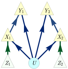
## Diagram: Causal Relationship Diagram
### Overview
This image depicts a directed acyclic graph (DAG) illustrating potential causal relationships between several variables. The diagram uses nodes represented by triangles and circles, with arrows indicating the direction of influence.
### Components/Axes
* **Nodes:**
* Triangles: Labeled $X_1$, $Y_1$, $X_2$, $Y_2$, $Z_1$, $Z_2$. These represent variables.
* Circle: Labeled $U$. This represents a variable.
* **Arrows:**
* Dark Blue Arrows: Indicate causal influence.
* Green Arrows: Indicate causal influence.
### Detailed Analysis or Content Details
The diagram shows the following directed relationships:
* $Z_1$ has a causal influence on $X_1$ (indicated by a green arrow).
* $Z_2$ has a causal influence on $X_2$ (indicated by a green arrow).
* $U$ has a causal influence on $X_1$ (indicated by a dark blue arrow).
* $U$ has a causal influence on $Y_1$ (indicated by a dark blue arrow).
* $U$ has a causal influence on $X_2$ (indicated by a dark blue arrow).
* $U$ has a causal influence on $Y_2$ (indicated by a dark blue arrow).
* $X_1$ has a causal influence on $Y_1$ (indicated by a dark blue arrow).
* $X_2$ has a causal influence on $Y_2$ (indicated by a dark blue arrow).
### Key Observations
* The variable $U$ appears to be a common cause for $X_1$, $Y_1$, $X_2$, and $Y_2$.
* $Z_1$ and $Z_2$ are exogenous variables that directly influence $X_1$ and $X_2$, respectively.
* $X_1$ and $X_2$ act as mediators in the causal pathways from $U$ to $Y_1$ and $Y_2$, respectively.
* There are no feedback loops, indicating a directed acyclic structure.
### Interpretation
This diagram represents a causal model where the variable $U$ is a latent or unobserved factor that influences several observed variables ($X_1, Y_1, X_2, Y_2$). Additionally, there are direct influences from exogenous variables $Z_1$ and $Z_2$ onto $X_1$ and $X_2$. The structure suggests that $X_1$ and $X_2$ are intermediate variables that transmit the effect of $U$ to $Y_1$ and $Y_2$. This type of diagram is commonly used in fields like econometrics, epidemiology, and social sciences to represent hypothesized causal mechanisms and to guide statistical modeling and analysis. The different arrow colors (green and dark blue) might represent different types of causal relationships or sources of influence, though this is not explicitly defined in the diagram itself. The overall structure implies a hierarchical or nested causal system.