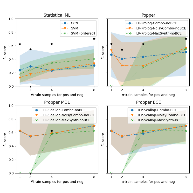
## Chart Type: 2x2 Grid of Line Charts with Confidence Intervals
### Overview
The image contains four line charts arranged in a 2x2 grid, each comparing the performance of different machine learning models across varying numbers of training samples. The charts are labeled:
1. **Statistical ML**
2. **Popper**
3. **Propper MDL**
4. **Propper BCE**
Each chart plots the **F1 score** (y-axis) against the **number of training samples for positive and negative examples** (x-axis, ranging from 1 to 8). Confidence intervals are shaded around the lines, and black stars denote specific data points.
---
### Components/Axes
#### Common Elements Across All Charts:
- **X-axis**: `#train samples for pos and neg` (1, 2, 4, 8)
- **Y-axis**: `f1 score` (0.0 to 1.0)
- **Legends**: Model-specific labels with color-coded lines and markers.
- **Shaded Areas**: Confidence intervals (e.g., ±0.1–0.2 around the mean F1 score).
#### Chart-Specific Legends:
1. **Statistical ML**:
- GCN (blue line)
- SVM (orange line)
- SVM (ordered) (green dotted line)
2. **Popper**:
- ILP-Prolog-Combo-noBCE (blue line)
- ILP-Prolog-NoisyCombo-noBCE (orange line)
- ILP-Prolog-MaxSynth-noBCE (green dotted line)
3. **Propper MDL**:
- ILP-Scallop-Combo-noBCE (blue line)
- ILP-Scallop-NoisyCombo-noBCE (orange line)
- ILP-Scallop-MaxSynth-noBCE (green dotted line)
4. **Propper BCE**:
- ILP-Scallop-Combo-BCE (blue line)
- ILP-Scallop-NoisyCombo-BCE (orange line)
- ILP-Scallop-MaxSynth-BCE (green dotted line)
---
### Detailed Analysis
#### 1. **Statistical ML**
- **GCN (blue)**:
- Starts at ~0.2 (1 sample), peaks at ~0.6 (4 samples), then drops to ~0.3 (8 samples).
- Confidence interval widens significantly at 8 samples.
- **SVM (orange)**:
- Starts at ~0.1 (1 sample), rises to ~0.3 (4 samples), then plateaus at ~0.4 (8 samples).
- **SVM (ordered) (green)**:
- Starts at ~0.2 (1 sample), increases to ~0.4 (4 samples), then ~0.5 (8 samples).
- **Black Stars**:
- Located at (1, 0.6), (4, 0.5), and (8, 0.7), suggesting experimental benchmarks.
#### 2. **Popper**
- **ILP-Prolog-Combo-noBCE (blue)**:
- Starts at ~0.4 (1 sample), dips to ~0.3 (2 samples), then rises to ~0.5 (4 samples) and ~0.6 (8 samples).
- **ILP-Prolog-NoisyCombo-noBCE (orange)**:
- Starts at ~0.2 (1 sample), rises to ~0.3 (2 samples), then ~0.4 (4 samples) and ~0.5 (8 samples).
- **ILP-Prolog-MaxSynth-noBCE (green)**:
- Starts at ~0.0 (1 sample), jumps to ~0.4 (4 samples), then ~0.5 (8 samples).
- **Black Stars**:
- Located at (1, 0.6), (4, 0.5), and (8, 0.7), mirroring the Statistical ML chart.
#### 3. **Propper MDL**
- **ILP-Scallop-Combo-noBCE (blue)**:
- Starts at ~0.6 (1 sample), dips to ~0.5 (2 samples), then rises to ~0.7 (4 samples) and ~0.8 (8 samples).
- **ILP-Scallop-NoisyCombo-noBCE (orange)**:
- Starts at ~0.5 (1 sample), rises to ~0.6 (2 samples), then ~0.7 (4 samples) and ~0.8 (8 samples).
- **ILP-Scallop-MaxSynth-noBCE (green)**:
- Starts at ~0.0 (1 sample), jumps to ~0.6 (4 samples), then ~0.7 (8 samples).
#### 4. **Propper BCE**
- **ILP-Scallop-Combo-BCE (blue)**:
- Starts at ~0.6 (1 sample), dips to ~0.5 (2 samples), then rises to ~0.7 (4 samples) and ~0.8 (8 samples).
- **ILP-Scallop-NoisyCombo-BCE (orange)**:
- Starts at ~0.5 (1 sample), rises to ~0.6 (2 samples), then ~0.7 (4 samples) and ~0.8 (8 samples).
- **ILP-Scallop-MaxSynth-BCE (green)**:
- Starts at ~0.0 (1 sample), jumps to ~0.6 (4 samples), then ~0.7 (8 samples).
---
### Key Observations
1. **Performance Trends**:
- All models improve F1 scores as training samples increase, but the rate varies.
- **MaxSynth models** (green dotted lines) show a sharp performance jump at 4 samples, suggesting a threshold effect.
- **NoBCE models** (e.g., Popper, Propper MDL) generally outperform **BCE models** (e.g., Propper BCE) in later stages.
2. **Confidence Intervals**:
- Wider intervals (e.g., GCN in Statistical ML) indicate higher variability in performance.
- MaxSynth models (green) have narrower intervals, implying more consistent results.
3. **Anomalies**:
- The **green dotted line** (MaxSynth) in Popper and Propper charts starts at 0.0 for 1 sample, then jumps sharply at 4 samples. This suggests synthetic data generation (MaxSynth) is ineffective with minimal training but becomes powerful at scale.
- **Black stars** in Statistical ML and Popper align with high F1 scores at 1 and 8 samples, possibly representing idealized or benchmark results.
---
### Interpretation
1. **Model Behavior**:
- **GCN** (Statistical ML) shows overfitting at 8 samples, as its F1 score drops despite more data.
- **SVM (ordered)** outperforms regular SVM, indicating that data ordering improves generalization.
- **MaxSynth models** (green) in Popper and Propper charts demonstrate that synthetic data generation (e.g., MaxSynth) can drastically boost performance when sufficient training samples are available, but it underperforms with minimal data.
2. **BCE vs. noBCE**:
- The **Propper BCE** chart shows similar trends to **Propper MDL**, but the **noBCE** variants (e.g., ILP-Prolog-NoisyCombo-noBCE) achieve higher F1 scores, suggesting that avoiding BCE (e.g., using alternative loss functions) improves robustness.
3. **Practical Implications**:
- For small datasets (<4 samples), simpler models like SVM or ordered SVM may be more reliable.
- For larger datasets (≥4 samples), MaxSynth models and noBCE variants outperform others, highlighting the importance of synthetic data and loss function design.
4. **Uncertainties**:
- The exact meaning of the **black stars** is unclear—they may represent external benchmarks or experimental constraints.
- The **confidence intervals** suggest that some models (e.g., GCN) are more sensitive to training data variability.