\n
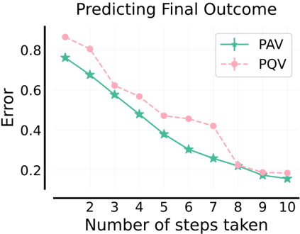
## Line Chart: Predicting Final Outcome
### Overview
The image is a line chart comparing the error rates of two methods, PAV and PQV, as the number of steps taken increases. The chart demonstrates how the prediction error for both methods decreases with more steps, with one method consistently outperforming the other until they converge.
### Components/Axes
* **Title:** "Predicting Final Outcome" (centered at the top).
* **Y-Axis:** Labeled "Error". The scale runs from 0.2 to 0.8, with major tick marks at 0.2, 0.4, 0.6, and 0.8.
* **X-Axis:** Labeled "Number of steps taken". The scale runs from 2 to 10, with integer tick marks at each step (2, 3, 4, 5, 6, 7, 8, 9, 10).
* **Legend:** Located in the top-right corner of the plot area.
* **PAV:** Represented by a solid green line with plus-sign (`+`) markers.
* **PQV:** Represented by a dashed pink line with circle (`o`) markers.
### Detailed Analysis
**Data Series Trends:**
* **PAV (Green, Solid Line):** Shows a steady, near-linear downward trend. The line slopes consistently downward from left to right.
* **PQV (Pink, Dashed Line):** Shows a steeper initial decline that gradually flattens. The line slopes downward, with the rate of decrease slowing after approximately step 5.
**Extracted Data Points (Approximate Values):**
The following table reconstructs the approximate error values for each method at each step, based on visual inspection of the chart. Values are estimated to the nearest 0.05.
| Number of Steps | PAV Error (Green, +) | PQV Error (Pink, o) |
| :--- | :--- | :--- |
| 2 | 0.75 | 0.85 |
| 3 | 0.65 | 0.80 |
| 4 | 0.55 | 0.60 |
| 5 | 0.45 | 0.55 |
| 6 | 0.35 | 0.45 |
| 7 | 0.25 | 0.40 |
| 8 | 0.20 | 0.20 |
| 9 | 0.15 | 0.18 |
| 10 | 0.15 | 0.18 |
**Spatial & Cross-Reference Check:**
* The legend is positioned in the top-right, clearly associating the green solid line with `+` markers to "PAV" and the pink dashed line with `o` markers to "PQV".
* The two lines intersect at step 8, where both have an error of approximately 0.20. Before step 8, the green PAV line is consistently below the pink PQV line. After step 8, the lines are nearly coincident, with PAV maintaining a very slight advantage.
### Key Observations
1. **Convergence:** The performance gap between PAV and PQV closes completely at step 8. From steps 8 to 10, their error rates are nearly identical.
2. **Initial Performance:** PQV starts with a significantly higher error (0.85 vs. 0.75 at step 2).
3. **Rate of Improvement:** PQV shows a more dramatic reduction in error in the early steps (e.g., a drop of 0.25 from step 2 to 4) compared to PAV's more constant rate of improvement.
4. **Plateau:** Both methods appear to plateau after step 9, showing minimal further error reduction between steps 9 and 10.
### Interpretation
The chart suggests that for the task of "Predicting Final Outcome," both the PAV and PQV methods benefit from an increased number of computational steps, as evidenced by the decreasing error. PAV demonstrates more consistent and reliable performance from the outset. PQV, while starting with higher error, improves more rapidly in the initial phase and eventually matches PAV's performance after 8 steps.
This could imply that PQV is a method that requires a "warm-up" period or a minimum number of steps to become effective, after which it is competitive. The convergence and subsequent plateau indicate a potential limit to the predictive accuracy achievable with these methods for this specific task, regardless of additional steps beyond 8 or 9. The choice between methods might depend on constraints: if steps are limited (<8), PAV is superior; if high step counts are feasible, PQV becomes a viable alternative.