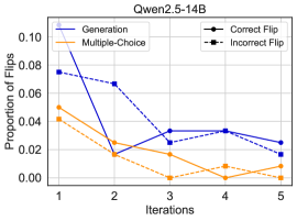
## Chart: Proportion of Flips vs. Iterations for Qwen2.5-14B
### Overview
The image is a line chart comparing the proportion of flips (presumably in a model's output) across iterations for different methods (Generation vs. Multiple-Choice) and flip types (Correct vs. Incorrect). The chart title is "Qwen2.5-14B".
### Components/Axes
* **Title:** Qwen2.5-14B
* **Y-axis:** "Proportion of Flips" (scale from 0.00 to 0.10, increments of 0.02)
* **X-axis:** "Iterations" (scale from 1 to 5, increments of 1)
* **Legend:** Located at the top-left and top-right of the chart.
* **Generation:** Solid dark blue line
* **Multiple-Choice:** Solid orange line
* **Correct Flip:** Dashed dark blue line with square markers
* **Incorrect Flip:** Dashed orange line with square markers
### Detailed Analysis
* **Generation (Solid Dark Blue Line):**
* Trend: Decreases sharply from iteration 1 to 2, then increases slightly from iteration 2 to 4, and decreases again from iteration 4 to 5.
* Data Points:
* Iteration 1: ~0.075
* Iteration 2: ~0.065
* Iteration 3: ~0.033
* Iteration 4: ~0.033
* Iteration 5: ~0.025
* **Multiple-Choice (Solid Orange Line):**
* Trend: Decreases from iteration 1 to 2, remains relatively low from iteration 2 to 4, and increases slightly from iteration 4 to 5.
* Data Points:
* Iteration 1: ~0.05
* Iteration 2: ~0.015
* Iteration 3: ~0.015
* Iteration 4: ~0.00
* Iteration 5: ~0.01
* **Correct Flip (Dashed Dark Blue Line with Square Markers):**
* Trend: Decreases sharply from iteration 1 to 2, then increases from iteration 2 to 4, and decreases again from iteration 4 to 5.
* Data Points:
* Iteration 1: ~0.075
* Iteration 2: ~0.02
* Iteration 3: ~0.025
* Iteration 4: ~0.033
* Iteration 5: ~0.015
* **Incorrect Flip (Dashed Orange Line with Square Markers):**
* Trend: Decreases from iteration 1 to 4, and increases slightly from iteration 4 to 5.
* Data Points:
* Iteration 1: ~0.042
* Iteration 2: ~0.015
* Iteration 3: ~0.00
* Iteration 4: ~0.005
* Iteration 5: ~0.00
### Key Observations
* The "Generation" and "Correct Flip" lines (both dark blue) follow a similar trend, starting high, decreasing, then increasing slightly before decreasing again.
* The "Multiple-Choice" and "Incorrect Flip" lines (both orange) also follow a similar trend, decreasing and remaining low.
* The proportion of flips is generally higher in the first iteration for all methods.
* The proportion of incorrect flips is generally lower than the proportion of correct flips.
### Interpretation
The chart illustrates how the proportion of flips changes over iterations for different methods (Generation vs. Multiple-Choice) and flip types (Correct vs. Incorrect) in the Qwen2.5-14B model. The initial high proportion of flips in the first iteration suggests that the model might be adjusting or learning during this phase. The similar trends between "Generation" and "Correct Flip" and between "Multiple-Choice" and "Incorrect Flip" suggest a correlation between the method used and the type of flip observed. The lower proportion of incorrect flips compared to correct flips indicates that the model is more likely to make correct flips than incorrect ones. The data suggests that the model's performance stabilizes after the initial iterations, with the proportion of flips remaining relatively low.