\n
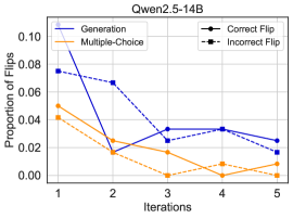
## Line Chart: Qwen2.5-14B
### Overview
The image is a line chart titled "Qwen2.5-14B". It plots the "Proportion of Flips" on the y-axis against "Iterations" on the x-axis for four different data series. The chart compares the performance or behavior of different methods or conditions over a sequence of five iterations.
### Components/Axes
* **Title:** "Qwen2.5-14B" (centered at the top).
* **Y-Axis:**
* **Label:** "Proportion of Flips"
* **Scale:** Linear, ranging from 0.00 to 0.10.
* **Major Ticks:** 0.00, 0.02, 0.04, 0.06, 0.08, 0.10.
* **X-Axis:**
* **Label:** "Iterations"
* **Scale:** Discrete, with integer values.
* **Major Ticks:** 1, 2, 3, 4, 5.
* **Legend:** Located in the top-left corner of the plot area. It defines four series:
1. **Generation:** Solid blue line.
2. **Multiple-Choice:** Solid orange line.
3. **Correct Flip:** Dashed blue line with circular markers.
4. **Incorrect Flip:** Dashed orange line with square markers.
### Detailed Analysis
The following table reconstructs the approximate data points for each series across the five iterations. Values are estimated from the chart's gridlines.
| Iteration | Generation (Blue Solid) | Multiple-Choice (Orange Solid) | Correct Flip (Blue Dashed, Circle) | Incorrect Flip (Orange Dashed, Square) |
| :--- | :--- | :--- | :--- | :--- |
| **1** | ~0.095 | ~0.050 | ~0.075 | ~0.040 |
| **2** | ~0.015 | ~0.025 | ~0.065 | ~0.020 |
| **3** | ~0.025 | ~0.010 | ~0.030 | ~0.000 |
| **4** | ~0.030 | ~0.015 | ~0.030 | ~0.010 |
| **5** | ~0.025 | ~0.000 | ~0.015 | ~0.000 |
**Trend Verification per Series:**
* **Generation (Blue Solid):** Starts as the highest value at Iteration 1. It experiences a **sharp, steep decline** between Iterations 1 and 2, then fluctuates at a low level (between ~0.015 and ~0.030) for the remaining iterations.
* **Multiple-Choice (Orange Solid):** Starts at a moderate level. It shows a **general downward trend** across all iterations, decreasing from ~0.050 to 0.000, with a slight increase at Iteration 4.
* **Correct Flip (Blue Dashed):** Starts as the second-highest value. It follows a **steady, consistent downward trend** from Iteration 1 to 5, with a notable drop between Iterations 2 and 3.
* **Incorrect Flip (Orange Dashed):** Starts as the lowest value. It shows a **declining trend**, reaching near zero by Iteration 3 and remaining at or near zero for Iterations 4 and 5.
### Key Observations
1. **Initial Dominance:** At Iteration 1, the "Generation" method has the highest proportion of flips (~0.095), significantly above the others.
2. **Convergence at Low Values:** By Iteration 5, all four series have converged to very low proportions of flips (≤0.025), with "Multiple-Choice" and "Incorrect Flip" reaching 0.000.
3. **Divergent Paths:** The "Generation" series exhibits the most volatile behavior, with a dramatic drop followed by minor fluctuations. In contrast, the "Correct Flip" series shows the smoothest, most monotonic decline.
4. **Relationship between Dashed Lines:** The "Correct Flip" (blue dashed) proportion is consistently higher than the "Incorrect Flip" (orange dashed) proportion at every iteration, suggesting a higher rate of correct flips versus incorrect ones throughout the process.
5. **Crossover Point:** Between Iterations 2 and 3, the "Generation" line drops below the "Correct Flip" line and remains below it for the rest of the chart.
### Interpretation
This chart likely visualizes the results of an experiment or evaluation involving the "Qwen2.5-14B" model. The "Proportion of Flips" metric suggests a process where outputs or answers are being changed ("flipped") from an initial state over successive iterations.
* **What the data suggests:** The process becomes more stable over time, as evidenced by the decreasing proportion of flips across all methods. The initial high rate for "Generation" indicates it was the most unstable or change-prone method at the start.
* **How elements relate:** The dashed lines ("Correct Flip" and "Incorrect Flip") may represent sub-categories or specific types of flips occurring within the broader "Generation" and "Multiple-Choice" methods. The fact that the "Correct Flip" line is always above the "Incorrect Flip" line is a positive indicator, showing that when flips occur, they are more likely to be corrections.
* **Notable trends/anomalies:** The most striking trend is the rapid stabilization of the "Generation" method after the first iteration. The near-zero values for "Incorrect Flip" and "Multiple-Choice" by the end suggest the process has reached a point of minimal change or error. The chart effectively demonstrates that iterative refinement reduces the need for flips, with different methods exhibiting distinct stabilization profiles.