## Bar Chart: Mean Token Length by Correctness
### Overview
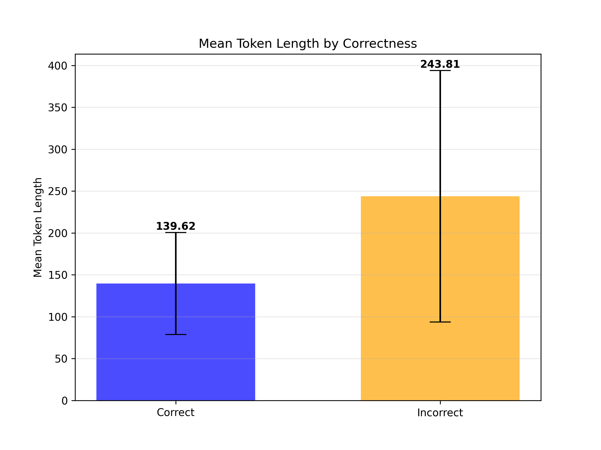
The image is a bar chart comparing the mean token length for correct and incorrect data. The chart displays the mean token length on the y-axis and correctness (correct/incorrect) on the x-axis. Error bars are included on each bar.
### Components/Axes
* **Title:** Mean Token Length by Correctness
* **X-axis:**
* Label: Correctness
* Categories: Correct, Incorrect
* **Y-axis:**
* Label: Mean Token Length
* Scale: 0 to 400, with increments of 50
* **Bars:**
* Correct: Blue bar
* Incorrect: Orange bar
### Detailed Analysis
* **Correct:**
* Mean Token Length: 139.62
* Bar Color: Blue
* Error Bar: Extends from approximately 80 to 200
* **Incorrect:**
* Mean Token Length: 243.81
* Bar Color: Orange
* Error Bar: Extends from approximately 90 to 390
### Key Observations
* The mean token length for incorrect data is significantly higher than that for correct data.
* The error bar for the incorrect data is much larger than the error bar for the correct data, indicating a greater variance in token length for incorrect data.
### Interpretation
The chart suggests that incorrect data tends to have longer tokens on average compared to correct data. The larger error bar for incorrect data implies that the token lengths in the incorrect category are more variable. This could indicate that errors are associated with more complex or lengthy tokens.