## Network Diagram: Hierarchical System with Layered Connections
### Overview
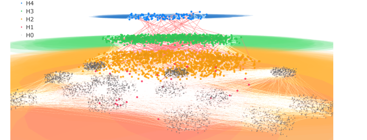
The image depicts a multi-layered network diagram with nodes and connections organized into five hierarchical levels (H4 to H0). Nodes are color-coded and clustered within distinct horizontal layers, with connections between layers represented by colored lines. The diagram emphasizes structural relationships rather than numerical data.
### Components/Axes
- **Legend**: Located on the left side of the image, labeled with hierarchical levels:
- **H4**: Blue nodes
- **H3**: Green nodes
- **H2**: Orange nodes
- **H1**: Red nodes
- **H0**: Gray nodes
- **Layers**: Five horizontal strata, ordered top-to-bottom as H4 (highest) to H0 (lowest). Nodes are densely packed within each layer, with some outliers extending into adjacent layers.
- **Connections**:
- **H4 → H3**: Red lines (connecting blue to green nodes)
- **H3 → H2**: Orange lines (connecting green to orange nodes)
- **H2 → H1**: Gray lines (connecting orange to red nodes)
- **H1 → H0**: White lines (connecting red to gray nodes)
- **No numerical axes, scales, or quantitative labels** are present.
### Detailed Analysis
- **Node Distribution**:
- **H4 (Top Layer)**: Smallest cluster of blue nodes, tightly grouped.
- **H3**: Larger green node cluster below H4, with moderate density.
- **H2**: Largest orange node cluster, spanning the widest horizontal range.
- **H1**: Smaller red node cluster, partially overlapping with H2.
- **H0 (Bottom Layer)**: Gray nodes form the largest cluster, with significant outliers extending laterally.
- **Connection Patterns**:
- Connections between layers are directional (top-down) and color-coded to match the source layer’s node color (e.g., H4→H3 connections are red, matching H1’s node color, not H4’s blue). This suggests a possible mismatch or intentional design choice.
- Connections are dense between H4→H3 and H3→H2, thinning toward H1→H0.
- Outliers in H0 nodes have sparse connections, indicating weaker integration.
### Key Observations
1. **Hierarchical Structure**: Clear top-down organization with decreasing node density from H4 to H0.
2. **Color Coding**: Nodes and connections use distinct colors, but connection colors do not align with the legend’s node color assignments (e.g., H4→H3 connections are red, not blue).
3. **Outliers**: H0 layer contains nodes dispersed far from the main cluster, suggesting potential anomalies or edge cases.
4. **Connection Density**: Strongest links between upper layers (H4→H3→H2), weakening in lower layers (H1→H0).
### Interpretation
This diagram likely represents a hierarchical system where:
- **H4→H3→H2** layers exhibit high interconnectivity, possibly indicating critical decision-making or control nodes.
- **H1→H0** layers show reduced connectivity, suggesting decentralized or autonomous subsystems.
- The mismatch in connection colors (e.g., red for H4→H3) may imply:
- A secondary classification of relationships (e.g., red = "high-priority" links).
- An error in the diagram’s labeling or legend.
- Outliers in H0 could represent edge cases, failed nodes, or specialized components outside the main system.
### Limitations
- No explicit explanation for connection colors or their significance.
- Lack of numerical data prevents quantitative analysis (e.g., node counts, connection strength).
- Unclear whether layers represent temporal stages, functional modules, or spatial hierarchies.
This structure suggests a system designed for modular interaction, with upper layers driving lower ones, though the exact purpose (e.g., organizational, technical, biological) remains ambiguous without additional context.