## Donut Chart: Distribution of Levels
### Overview
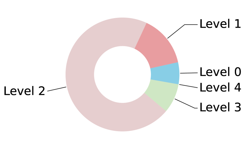
This image displays a donut chart representing the distribution of five distinct categories, labeled "Level 0" through "Level 4". The chart is heavily skewed, with one category ("Level 2") comprising the vast majority of the total area.
### Components/Axes
* **Chart Type:** Donut Chart (a circular graph with a hollow center).
* **Labels:** Five text labels are present, connected to their respective segments by thin black lines:
* **Level 0:** Light blue segment.
* **Level 1:** Salmon/light red segment.
* **Level 2:** Large light pink/beige segment.
* **Level 3:** Light green segment.
* **Level 4:** White/very light grey segment.
* **Axes:** None present.
### Detailed Analysis
The chart is divided into five segments of varying sizes. The following estimates are based on visual area coverage:
* **Level 2 (Light Pink/Beige):**
* **Position:** Occupies the entire left and bottom-left portion of the chart.
* **Trend/Size:** This is the dominant segment, covering approximately 60–65% of the total chart area.
* **Level 1 (Salmon/Light Red):**
* **Position:** Located at the top-right quadrant.
* **Trend/Size:** This is the second-largest segment, covering approximately 15–20% of the chart.
* **Level 3 (Light Green):**
* **Position:** Located at the bottom-right.
* **Trend/Size:** Covers approximately 8–10% of the chart.
* **Level 0 (Light Blue):**
* **Position:** Located at the mid-right.
* **Trend/Size:** A small segment, covering approximately 5–7% of the chart.
* **Level 4 (White/Very Light Grey):**
* **Position:** Located between Level 0 and Level 3 on the right side.
* **Trend/Size:** The smallest segment, covering approximately 2–4% of the chart.
### Key Observations
* **Dominance:** The distribution is highly non-uniform. "Level 2" acts as the overwhelming majority, suggesting it is the standard or baseline category.
* **Ordering:** The segments are not arranged in numerical order (0, 1, 2, 3, 4) around the circle. The order, moving clockwise from the top, appears to be: Level 1, Level 0, Level 4, Level 3, Level 2.
* **Visual Hierarchy:** The color palette is pastel-toned, with the exception of the "Level 4" segment, which is nearly white, making it the least visually distinct segment.
### Interpretation
The data suggests a classification system where the vast majority of entities fall into "Level 2". This is characteristic of systems where "Level 2" represents a "normal," "average," or "compliant" state, while the other levels represent deviations or specific sub-classifications.
The lack of numerical ordering around the circle implies that the chart is not intended to show a progression or a spectrum (e.g., from low to high intensity), but rather a categorical breakdown of a dataset where the specific identity of the category is more important than its relative rank. The significant disparity in size between Level 2 and the other categories suggests that the other levels (0, 1, 3, 4) might represent edge cases, errors, or specific, less-frequent sub-types.