## Network Diagram: Node Connectivity
### Overview
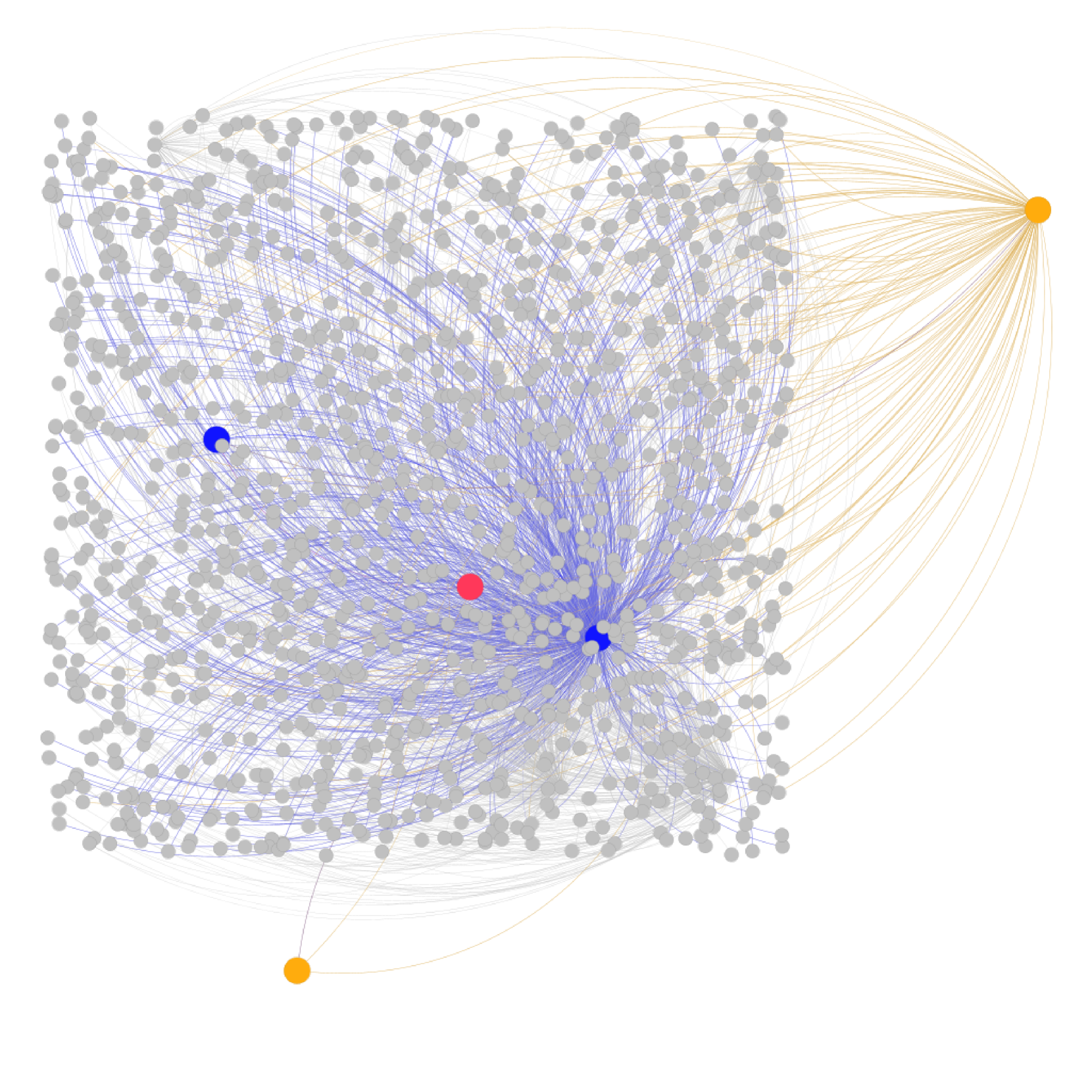
The image is a network diagram illustrating the connectivity between nodes. It features a large cluster of gray nodes, with connections to several highlighted nodes in orange, blue, and red. The density of connections varies, suggesting different levels of interaction between nodes.
### Components/Axes
* **Nodes:** Represented by circles. Most nodes are gray, while some are colored orange, blue, and red.
* **Edges:** Represented by lines connecting the nodes. The edges are colored to match the color of the node they connect to.
* **Colors:**
* Gray: Represents the majority of nodes in the network.
* Orange: Represents nodes with connections primarily to the gray cluster.
* Blue: Represents nodes with connections primarily to the gray cluster.
* Red: Represents a node with connections primarily to the gray cluster.
### Detailed Analysis
* **Gray Nodes:** There are approximately 500-700 gray nodes forming a central cluster. These nodes are interconnected with each other via gray edges.
* **Orange Nodes:** There are two orange nodes. One is located in the top-right corner, and the other is located in the bottom-left corner. These nodes are connected to the gray cluster via orange edges. The top-right orange node has a higher density of connections to the gray cluster than the bottom-left orange node.
* **Blue Nodes:** There are two blue nodes. One is located in the center-right of the gray cluster, and the other is located in the top-left of the gray cluster. These nodes are connected to the gray cluster via blue edges.
* **Red Node:** There is one red node located in the center of the gray cluster. This node is connected to the gray cluster via red edges.
### Key Observations
* The gray nodes form a dense, interconnected cluster.
* The orange nodes act as peripheral nodes with connections to the main cluster.
* The blue and red nodes are embedded within the gray cluster.
* The density of connections varies between the different colored nodes.
### Interpretation
The network diagram likely represents a system where the gray nodes are the primary components, and the colored nodes represent different types of interactions or roles within the system. The orange nodes could represent external entities interacting with the main system, while the blue and red nodes could represent key internal components or control points. The varying density of connections suggests different levels of influence or interaction between these components. The diagram could be used to visualize social networks, biological systems, or any other complex network of interconnected entities.