\n
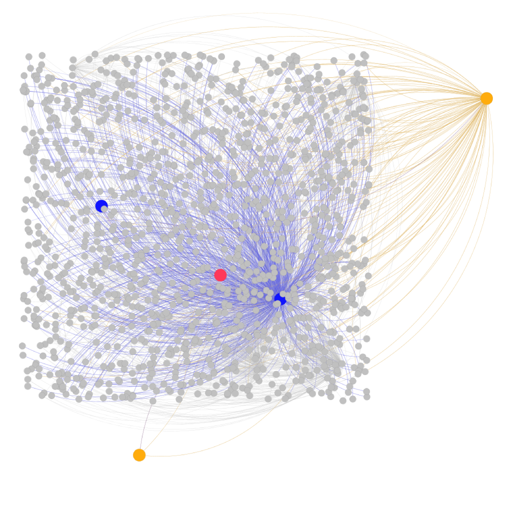
## Network Graph: Node and Edge Visualization
### Overview
The image depicts a network graph composed of nodes and edges. The majority of nodes are represented as small, light gray circles, densely packed in a roughly square arrangement. A significant number of blue lines connect these gray nodes, radiating outwards from a central cluster. There are also a few distinctly colored nodes: one red, two dark blue, and two orange. The orange nodes are connected to a subset of the gray nodes via lighter, yellow-orange lines. The graph appears to visualize relationships or connections between entities, with varying degrees of centrality and influence.
### Components/Axes
There are no explicit axes or labels in the traditional sense. The graph's structure *is* the data representation. The components are:
* **Nodes:** Represented by circles, varying in color (gray, red, dark blue, orange).
* **Edges:** Represented by lines, varying in color (blue, yellow-orange).
* **Central Cluster:** A dense concentration of gray nodes connected by blue lines.
* **Peripheral Nodes:** Gray nodes connected to the orange nodes via yellow-orange lines.
### Detailed Analysis or Content Details
The graph consists of approximately 500-600 nodes (estimated due to density).
* **Gray Nodes:** The vast majority of nodes are gray. They are distributed relatively evenly within the square area, with a higher concentration towards the center.
* **Blue Lines:** These lines connect the gray nodes, forming a complex network. The density of blue lines is highest in the central region, indicating strong connectivity among the central nodes. The lines radiate outwards, becoming sparser towards the edges of the square.
* **Red Node:** Located near the center of the graph. It is a single, isolated node.
* **Dark Blue Nodes:** Two dark blue nodes are present. One is located near the center, and the other is positioned towards the top-left corner of the square.
* **Orange Nodes:** Two orange nodes are present. One is located at the bottom center of the square, and the other is at the top-right corner.
* **Yellow-Orange Lines:** These lines connect the orange nodes to a subset of the gray nodes. The lines are less dense than the blue lines and appear to connect to nodes that are somewhat peripheral to the central cluster.
There is no numerical data associated with the nodes or edges. The visualization relies on spatial arrangement and color to convey information.
### Key Observations
* **Centrality:** The central cluster of gray nodes exhibits the highest degree of connectivity, suggesting a core group of highly interconnected entities.
* **Isolation:** The red node is isolated, indicating a lack of direct connections to other nodes.
* **Peripheral Connections:** The orange nodes and their associated yellow-orange lines represent connections to a different subset of the network, potentially indicating external influences or relationships.
* **Asymmetry:** The network is not symmetrical. The connections radiating from the central cluster are not evenly distributed.
### Interpretation
This network graph likely represents a complex system of relationships, such as social networks, communication patterns, or dependencies within a system. The central cluster could represent a core group of individuals or entities with strong internal connections. The red node might represent an outlier or a disconnected element. The orange nodes and their connections could represent external influences or connections to other networks.
The lack of numerical data makes it difficult to draw definitive conclusions. However, the visualization suggests a hierarchical structure with a central core and peripheral connections. The density of connections in the central cluster indicates a high degree of information flow or interaction within that group. The isolation of the red node suggests a lack of integration or influence within the network.
The graph could be used to identify key players, detect anomalies, or understand the overall structure of the network. Further analysis, potentially with additional data, would be needed to gain a more complete understanding of the system being represented. The visualization is a qualitative representation of relationships, and its interpretation depends on the context in which it was created.