## Stacked Area Chart: Proportion of Successful Rebuilds by Status (2018-2023)
### Overview
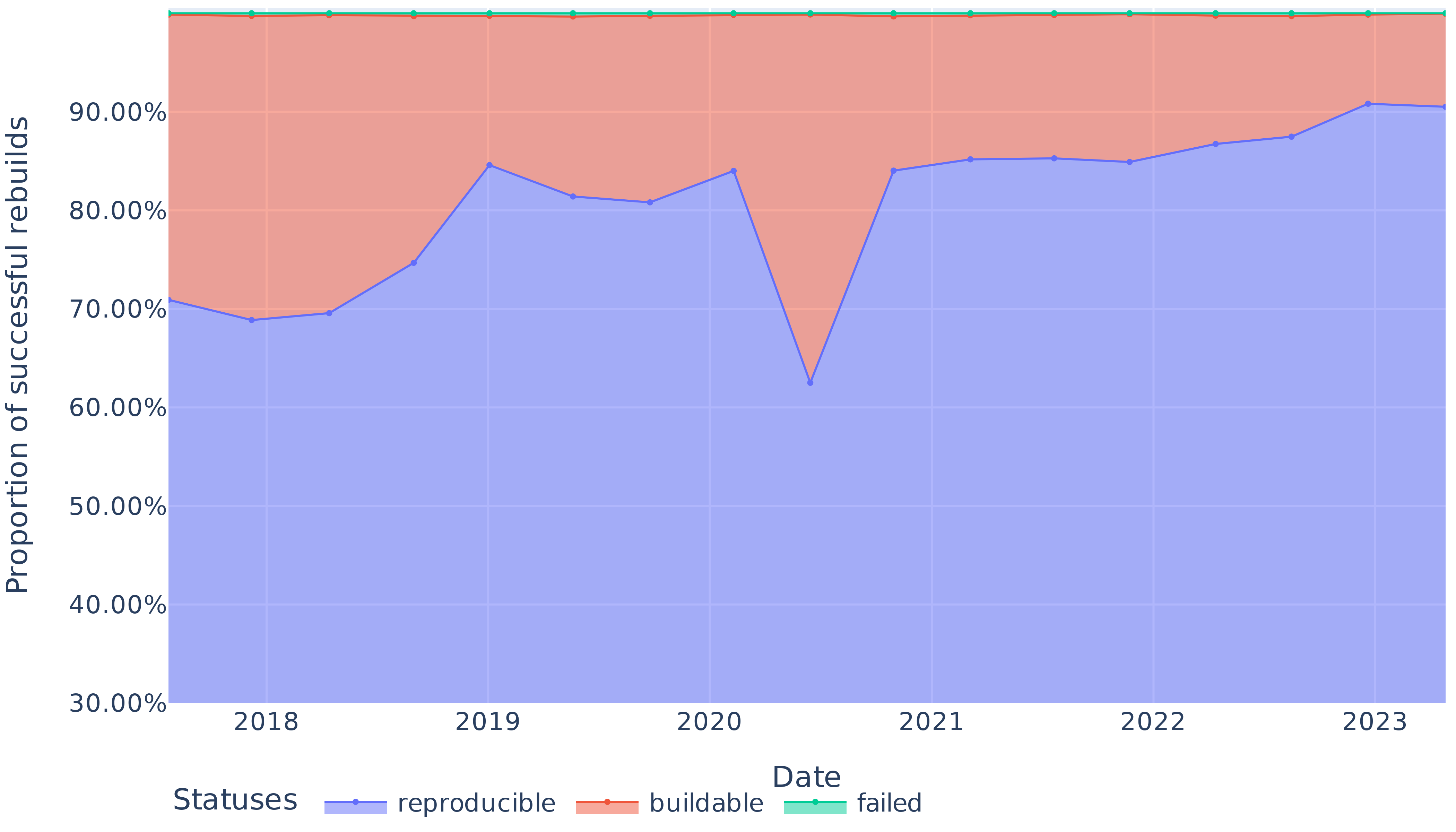
This is a stacked area chart visualizing the changing proportions of three different statuses for software or system rebuilds over a six-year period, from 2018 to 2023. The chart tracks the "Proportion of successful rebuilds" on the vertical axis against time on the horizontal axis. The three statuses are "reproducible," "buildable," and "failed," which are stacked to show their cumulative contribution to 100% of rebuild attempts.
### Components/Axes
* **Chart Type:** Stacked Area Chart.
* **Y-Axis (Vertical):**
* **Label:** "Proportion of successful rebuilds"
* **Scale:** Percentage, ranging from 30.00% to just above 90.00%. Major gridlines are at 10% intervals (30%, 40%, 50%, 60%, 70%, 80%, 90%).
* **X-Axis (Horizontal):**
* **Label:** "Date"
* **Scale:** Time in years, with markers for 2018, 2019, 2020, 2021, 2022, and 2023. Data points appear to be plotted at quarterly or semi-annual intervals within each year.
* **Legend:**
* **Position:** Bottom center of the chart.
* **Title:** "Statuses"
* **Categories & Colors:**
1. **reproducible:** Represented by a blue line and the blue-filled area at the bottom of the stack.
2. **buildable:** Represented by an orange line and the orange-filled area stacked on top of the blue area.
3. **failed:** Represented by a teal/green line at the very top of the stack. The area for "failed" is not visibly filled, suggesting its proportion is very small.
### Detailed Analysis
**Trend Verification & Data Points (Approximate Values):**
1. **"reproducible" (Blue Line/Area - Bottom Stack):**
* **Trend:** Shows significant volatility with an overall upward trend. It starts around 71%, dips slightly, rises to a peak in 2019, experiences a sharp decline in 2020, then recovers and climbs steadily to its highest point in 2023.
* **Key Points:**
* Start of 2018: ~71%
* Mid-2018: ~69% (local low)
* Early 2019: ~85% (local peak)
* Mid-2020: ~62% (significant trough)
* Early 2021: ~84%
* End of 2022: ~88%
* Mid-2023: ~91% (highest point)
2. **"buildable" (Orange Line/Area - Middle Stack):**
* **Trend:** This represents the proportion of rebuilds that were buildable but not reproducible. Its thickness (the vertical distance between the blue and orange lines) varies inversely with the "reproducible" line. It is thickest when "reproducible" is lowest (e.g., mid-2020) and thinnest when "reproducible" is highest (e.g., 2023).
* **Key Observation:** The orange line itself (the top of the "buildable" area) remains relatively stable near the 100% mark, indicating that the combined total of "reproducible" and "buildable" rebuilds consistently approaches 100%.
3. **"failed" (Teal Line - Top Stack):**
* **Trend:** The teal line is nearly flat and positioned at the very top of the chart, just above the 100% mark (implied). This indicates the proportion of failed rebuilds is consistently very small, likely in the low single-digit percentages or less, throughout the entire period.
* **Key Observation:** There is no visible filled area for "failed," confirming its minimal contribution to the total.
### Key Observations
* **The 2020 Dip:** The most prominent feature is the sharp decline in the "reproducible" proportion during 2020, dropping from over 80% to approximately 62%. This corresponds to a significant expansion of the "buildable" (orange) area.
* **Post-2020 Recovery and Growth:** Following the 2020 low, the "reproducible" proportion not only recovers to pre-dip levels but continues a steady upward trend through 2023, reaching its maximum value.
* **Stability of Total Success:** The sum of "reproducible" and "buildable" (the top of the orange area) remains consistently near 100%, suggesting that outright failures are rare. The primary dynamic is the trade-off between "reproducible" and "buildable" statuses.
* **Legend Placement:** The legend is clearly positioned at the bottom center, with labels directly adjacent to their corresponding colored line samples, ensuring unambiguous mapping.
### Interpretation
This chart likely tracks the health and maturity of a software ecosystem's build system or dependency management over time. The "reproducible" status is the gold standard, meaning a build can be perfectly recreated. "Buildable" suggests it works but may have non-deterministic elements.
* **What the Data Suggests:** The overall upward trend in "reproducible" builds from 2021 onward indicates improving practices, better tooling, or increased emphasis on deterministic builds within the ecosystem. The system is becoming more reliable and predictable.
* **The 2020 Anomaly:** The sharp dip in 2020 is a critical event. It could correlate with a major ecosystem change (e.g., a widespread dependency update, a change in build tool defaults, or the introduction of a new, initially non-reproducible package format). The quick recovery suggests the issue was identified and addressed.
* **Relationship Between Elements:** The inverse relationship between the blue and orange areas highlights a key performance indicator: the conversion of "buildable" projects into "reproducible" ones. The shrinking orange area post-2020 is a positive sign of ecosystem stabilization.
* **The "Failed" Baseline:** The consistently negligible failure rate implies that basic build functionality is well-established. The focus for improvement has rightly shifted to the higher-quality goal of reproducibility.
**In summary, the chart tells a story of an ecosystem that encountered a significant reproducibility challenge around 2020 but has since made strong, sustained progress toward achieving more deterministic and reliable builds.**