## Scatter Plot: Dimensionality Reduction of Architecture Rankings
### Overview
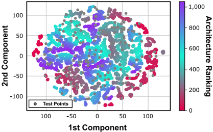
This image is a 2D scatter plot, likely generated using a dimensionality reduction technique such as t-SNE or PCA. It visualizes a dataset of "Architectures" mapped onto a 2D plane defined by "1st Component" and "2nd Component." The points are color-coded according to an "Architecture Ranking" scale (0 to 1,000). Additionally, a set of "Test Points" is overlaid across the distribution.
### Components/Axes
* **X-Axis:** Labeled "1st Component." The scale ranges from approximately -100 to +100, with grid lines at intervals of 50.
* **Y-Axis:** Labeled "2nd Component." The scale ranges from approximately -100 to +100, with grid lines at intervals of 50.
* **Color Legend (Right):** A vertical color bar labeled "Architecture Ranking."
* **Scale:** 0 (bottom) to 1,000 (top).
* **Gradient:** Transitions from Red/Magenta (0) through Purple (400-600) to Cyan/Light Blue (1,000).
* **Data Legend (Bottom-Left):** A box containing a grey circle labeled "Test Points."
* **Data Points:**
* **Colored Points:** Represent the primary dataset, colored by the "Architecture Ranking" gradient.
* **Grey Points:** Represent "Test Points," scattered throughout the plot area.
### Detailed Analysis
* **Spatial Distribution:** The data points form a large, roughly circular, diffuse cluster centered near the origin (0,0). The cluster spans the entire visible grid, extending to roughly -100 and +100 on both axes.
* **Color/Ranking Correlation:**
* **Low Ranking (0-200):** Represented by Red/Magenta. These points are primarily located on the periphery of the cluster, particularly on the far left, far right, and bottom edges.
* **Mid Ranking (400-600):** Represented by Purple. These points are distributed throughout the central and intermediate regions of the cluster.
* **High Ranking (800-1,000):** Represented by Cyan/Light Blue. These points are concentrated in the upper-left quadrant and the center-right regions of the cluster.
* **Test Points (Grey):** These points are distributed relatively uniformly across the entire cluster, appearing to overlay the colored data points. They do not seem to cluster in any specific region, suggesting they are a representative sample of the entire space.
### Key Observations
* **Gradient Continuity:** The transition of colors is smooth, suggesting that the "Architecture Ranking" is a continuous variable rather than discrete categories.
* **Density:** The density of points is highest near the center (0,0) and thins out toward the edges of the plot.
* **Overlap:** There is significant overlap between different ranking values, indicating that the two components (1st and 2nd) do not perfectly separate the architectures by rank. This implies that the "Architecture Ranking" is likely influenced by higher-dimensional features not fully captured by these two components alone.
### Interpretation
This visualization is typical of machine learning model analysis, where high-dimensional data (such as neural network architecture parameters or performance metrics) is projected into 2D space to observe clustering behavior.
* **What the data demonstrates:** The plot suggests that architectures with similar "Architecture Rankings" tend to group together in the latent space, though the boundaries are fuzzy. The presence of the "Test Points" suggests a validation or testing phase where specific architectures are being evaluated against the broader distribution of known architectures.
* **Peircean Investigative Insight:** The fact that the "Test Points" are grey and scattered throughout suggests they are being used to probe the "performance landscape" of the model space. If the grey points were clustered in a specific color region, it would indicate a bias in the test set. Since they are distributed throughout, the test set appears to be a well-sampled representation of the entire architecture space. The lack of distinct, isolated islands of color suggests that the "Architecture Ranking" is a smooth manifold within this feature space.