## Scatter Plot: Architecture Ranking vs. Principal Components
### Overview
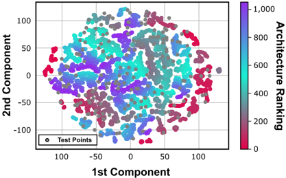
The image is a 2D scatter plot visualizing a dataset where each point represents an "Architecture." The points are colored according to an "Architecture Ranking" metric. The plot appears to be the result of a dimensionality reduction technique (like PCA or t-SNE), projecting high-dimensional data onto two principal components for visualization. The data forms a dense, roughly circular cloud with no immediately obvious linear separation or distinct clusters based on the ranking color.
### Components/Axes
* **Main Chart Area:** A square plot with a light gray grid.
* **X-Axis:** Labeled **"1st Component"**. The scale runs from approximately -120 to +120, with major tick marks at -100, -50, 0, 50, and 100.
* **Y-Axis:** Labeled **"2nd Component"**. The scale runs from approximately -120 to +120, with major tick marks at -100, -50, 0, 50, and 100.
* **Color Bar (Legend for Ranking):** Positioned vertically on the right side of the chart.
* **Title:** "Architecture Ranking"
* **Scale:** A continuous gradient from **0** (bottom, dark red/maroon) to **1,000** (top, dark purple).
* **Major Tick Marks:** 0, 200, 400, 600, 800, 1,000.
* **Color Gradient:** The gradient transitions from dark red (0) through red, orange, yellow, green, cyan, blue, to dark purple (1,000).
* **Inset Legend:** Positioned in the **bottom-left corner** of the chart area.
* **Label:** "Test Points"
* **Symbol:** A gray circle (●).
### Detailed Analysis
* **Data Points:** The plot contains several hundred data points, each represented by a small, semi-transparent circle.
* **Color Distribution & Trend Verification:**
* The points are colored across the entire spectrum of the "Architecture Ranking" color bar.
* **Visual Trend:** There is **no clear spatial trend or gradient** correlating the 1st or 2nd Component value with the Architecture Ranking. Points of all colors (red, cyan, purple, etc.) are intermixed throughout the central cloud. For example, dark purple points (high ranking ~800-1000) are found near coordinates (-50, 50), (0, -25), and (75, 0). Similarly, dark red points (low ranking ~0-200) are located near (-75, 0), (25, -75), and (100, 25).
* This intermixing suggests that the two principal components shown do not strongly separate or explain the variance in the "Architecture Ranking" metric.
* **Test Points:** A small number of points (approximately 5-7 visible) are colored solid gray, matching the "Test Points" legend. These are scattered within the main cloud (e.g., near (50, 75) and (100, 0)), indicating they are part of the same projected space but are a distinct subset.
* **Spatial Grounding & Density:** The highest density of points is in the central region, roughly between -50 and +50 on both axes. The cloud thins out towards the edges. The overall shape is amorphous and roughly circular.
### Key Observations
1. **Lack of Component-Ranking Correlation:** The primary observation is the absence of a visual relationship between the position on the 1st/2nd Component axes and the Architecture Ranking. High and low-ranked architectures are similarly distributed in this 2D projection.
2. **Dense, Intermixed Cloud:** The data forms a single, dense cluster without clear sub-clusters or separations based on the provided color dimension.
3. **Presence of Test Data:** The explicit labeling and inclusion of "Test Points" suggest this visualization is part of a machine learning or model evaluation workflow, where a model's performance (ranking) is being analyzed across a latent space.
4. **Wide Ranking Range:** The architectures span the full ranking spectrum from 0 to 1,000, indicating a diverse set of models or configurations were evaluated.
### Interpretation
This scatter plot is likely a diagnostic tool from an automated machine learning (AutoML) or neural architecture search (NAS) system. The "1st Component" and "2nd Component" are the top two dimensions from a dimensionality reduction algorithm applied to a high-dimensional feature space describing different architectures (e.g., layer types, connections, hyperparameters).
The **key takeaway** is that the two most significant axes of variation in the architecture feature space (the principal components) **do not align with the axis of performance (ranking)**. This implies that:
* The factors driving architectural performance are complex and not captured by the primary modes of variation in the design space.
* Simply moving along the main "directions" of architectural change does not predictably improve or worsen the ranking.
* The search for high-performing architectures may require exploring the space in a non-linear way, as good and bad models are neighbors in this projection.
The "Test Points" likely represent a held-out set of architectures used to validate a performance predictor model. Their integration within the main cloud suggests they are representative of the overall design space. The visualization argues for the need for more sophisticated analysis or different projection techniques to uncover any latent structure that might correlate with performance.