## Scatter Plot: Architecture Ranking Visualization
### Overview
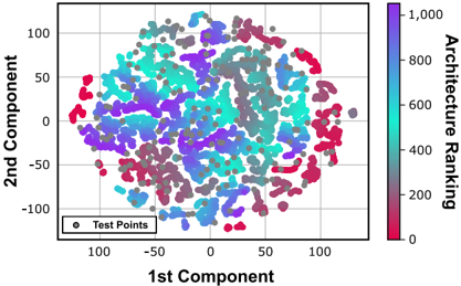
The image is a 2D scatter plot visualizing data points distributed across two principal components. Points are color-coded by "Architecture Ranking" (0–1000) and include gray test points. The plot suggests a dimensionality reduction technique (e.g., PCA) applied to high-dimensional data.
### Components/Axes
- **X-axis**: "1st Component" (ranges approximately -100 to 100).
- **Y-axis**: "2nd Component" (ranges approximately -100 to 100).
- **Legend**:
- **Color Gradient**: Red (0) to Purple (1000) for "Architecture Ranking."
- **Test Points**: Gray circles labeled "Test Points" in the bottom-left legend.
### Detailed Analysis
- **Data Points**:
- Colors correspond to architecture rankings, with red (lowest) and purple (highest) extremes.
- Clusters of similar colors (e.g., purple, blue) suggest groupings of high/medium-ranked architectures.
- Test points (gray) are interspersed across the plot but concentrated in mid-range regions.
- **Spatial Distribution**:
- High-ranked architectures (purple) dominate the upper-right quadrant (1st Component > 50, 2nd Component > 50).
- Low-ranked architectures (red) cluster in the lower-left quadrant (1st Component < -50, 2nd Component < -50).
- Test points are dispersed but avoid extreme regions, suggesting intentional sampling.
### Key Observations
1. **Color-Component Correlation**: Higher-ranked architectures (purple) tend to occupy regions with larger magnitudes in both components.
2. **Test Point Placement**: Gray test points are evenly distributed but avoid the extreme clusters, possibly indicating a validation set.
3. **Density Variations**: The central region (near 0,0) has higher density of mid-ranked architectures (blue/green).
### Interpretation
The plot demonstrates that architecture rankings correlate with their position in the reduced-dimensional space. High-ranked architectures (purple) are spatially separated from lower-ranked ones (red), suggesting distinct features or performance metrics. Test points, likely used for validation, are embedded within the mid-range clusters, indicating they represent typical or average cases. The absence of a clear gradient from red to purple implies no strong linear progression in rankings across the components. This visualization could aid in identifying architectural patterns or biases in the dataset.
**Note**: Exact numerical values for individual points cannot be extracted from the image alone. The analysis relies on visual clustering and color coding.