## Scatter Plot: Correlation of Change in Correction Marker Presence vs Change in Accuracy
### Overview
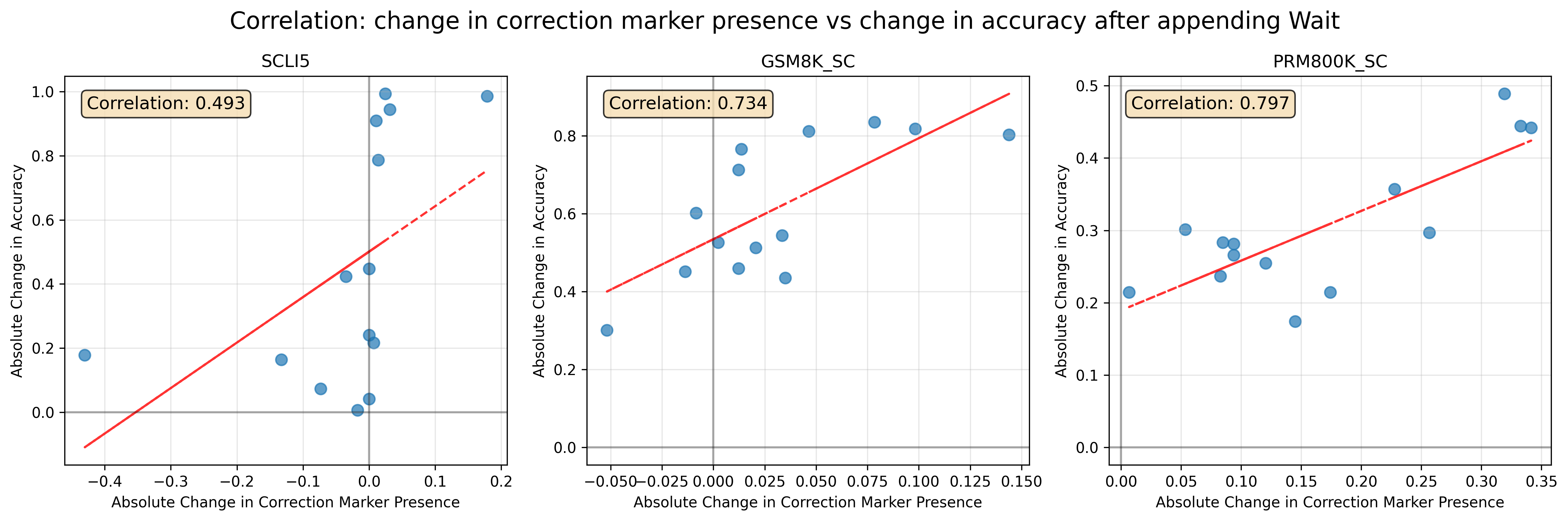
The image presents three scatter plots, each displaying the correlation between the absolute change in correction marker presence and the absolute change in accuracy after appending "Wait" for different datasets: SCLI5, GSM8K_SC, and PRM800K_SC. Each plot includes a trend line and the calculated correlation coefficient.
### Components/Axes
* **Title:** Correlation: change in correction marker presence vs change in accuracy after appending Wait
* **X-axis (all plots):** Absolute Change in Correction Marker Presence
* **Y-axis (all plots):** Absolute Change in Accuracy
* **Data Points:** Blue circles represent individual data points.
* **Trend Line:** Red line indicating the linear trend.
* **Correlation Coefficient:** Displayed in a box at the top-left of each plot.
**Plot 1: SCLI5**
* **Title:** SCLI5
* **X-axis:** Absolute Change in Correction Marker Presence, ranging from approximately -0.4 to 0.2. Markers at -0.4, -0.3, -0.2, -0.1, 0.0, 0.1, 0.2
* **Y-axis:** Absolute Change in Accuracy, ranging from 0.0 to 1.0. Markers at 0.0, 0.2, 0.4, 0.6, 0.8, 1.0
* **Correlation:** 0.493
**Plot 2: GSM8K_SC**
* **Title:** GSM8K_SC
* **X-axis:** Absolute Change in Correction Marker Presence, ranging from approximately -0.05 to 0.15. Markers at -0.050, -0.025, 0.000, 0.025, 0.050, 0.075, 0.100, 0.125, 0.150
* **Y-axis:** Absolute Change in Accuracy, ranging from 0.0 to 0.8. Markers at 0.0, 0.2, 0.4, 0.6, 0.8
* **Correlation:** 0.734
**Plot 3: PRM800K_SC**
* **Title:** PRM800K_SC
* **X-axis:** Absolute Change in Correction Marker Presence, ranging from approximately 0.00 to 0.35. Markers at 0.00, 0.05, 0.10, 0.15, 0.20, 0.25, 0.30, 0.35
* **Y-axis:** Absolute Change in Accuracy, ranging from 0.0 to 0.5. Markers at 0.0, 0.1, 0.2, 0.3, 0.4, 0.5
* **Correlation:** 0.797
### Detailed Analysis
**Plot 1: SCLI5**
* The trend line (red) shows a positive correlation, though it appears weaker than in the other plots.
* Data points are scattered, with some clustering around the 0.0 mark on the x-axis.
* At x = -0.4, y ≈ 0.1. At x = 0.2, y ≈ 0.7.
**Plot 2: GSM8K_SC**
* The trend line (red) shows a clear positive correlation.
* Data points are more tightly clustered around the trend line compared to the SCLI5 plot.
* At x = -0.05, y ≈ 0.4. At x = 0.15, y ≈ 0.8.
**Plot 3: PRM800K_SC**
* The trend line (red) shows a positive correlation.
* Data points are relatively close to the trend line.
* At x = 0.0, y ≈ 0.2. At x = 0.35, y ≈ 0.45.
### Key Observations
* All three plots show a positive correlation between the absolute change in correction marker presence and the absolute change in accuracy.
* The correlation is strongest for PRM800K_SC (0.797) and GSM8K_SC (0.734), and weaker for SCLI5 (0.493).
* The range of the x-axis (Absolute Change in Correction Marker Presence) varies across the three plots.
### Interpretation
The plots suggest that, in general, increasing the presence of correction markers is associated with an increase in accuracy after appending "Wait". The strength of this correlation varies depending on the specific dataset. The PRM800K_SC dataset shows the strongest positive relationship, indicating that correction markers are particularly effective in improving accuracy for this dataset. The SCLI5 dataset shows a weaker correlation, suggesting that correction markers may have a less consistent impact on accuracy for this dataset. The GSM8K_SC dataset falls in between, showing a moderate positive correlation.