TECHNICAL ASSET FINGERPRINT
d1acdb3ab330cf495fa111a6
Click to view fullscreen
Press ESC or click to close
FOUND IN PAPERS
EXPERT: healer-alpha-free VERSION 1
RUNTIME: free/openrouter/healer-alpha
INTEL_VERIFIED
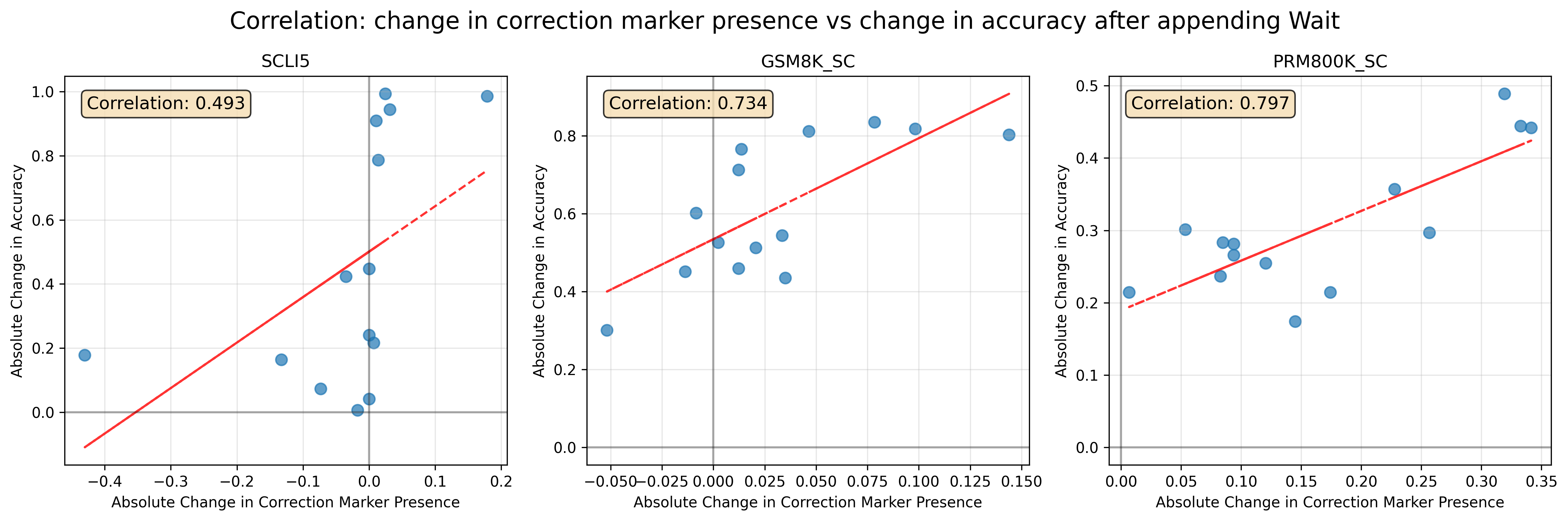
## Scatter Plot Series: Correlation Analysis of Correction Marker Presence vs. Accuracy Change
### Overview
The image displays a series of three scatter plots arranged horizontally. The overall title is "Correlation: change in correction marker presence vs change in accuracy after appending Wait". Each individual plot represents a different dataset or experimental condition, as indicated by its subtitle. The plots visualize the relationship between the absolute change in the presence of a "correction marker" (x-axis) and the absolute change in accuracy (y-axis) following an intervention described as "appending Wait". A red dashed trend line and a calculated correlation coefficient are provided for each dataset.
### Components/Axes
**Main Title:** "Correlation: change in correction marker presence vs change in accuracy after appending Wait"
**Plot 1 (Left):**
* **Subtitle:** "SCLI5"
* **X-axis Label:** "Absolute Change in Correction Marker Presence"
* **Scale:** Linear, ranging from approximately -0.4 to 0.2. Major tick marks at -0.4, -0.3, -0.2, -0.1, 0.0, 0.1, 0.2.
* **Y-axis Label:** "Absolute Change in Accuracy"
* **Scale:** Linear, ranging from 0.0 to 1.0. Major tick marks at 0.0, 0.2, 0.4, 0.6, 0.8, 1.0.
* **Correlation Annotation:** A beige box in the top-left corner contains the text "Correlation: 0.493".
* **Visual Elements:**
* Blue circular data points (n ≈ 15).
* A red dashed trend line with a positive slope.
* A vertical gray reference line at x=0.
* A horizontal gray reference line at y=0.
* A light gray grid.
**Plot 2 (Center):**
* **Subtitle:** "GSM8K_SC"
* **X-axis Label:** "Absolute Change in Correction Marker Presence"
* **Scale:** Linear, ranging from approximately -0.050 to 0.150. Major tick marks at -0.050, -0.025, 0.000, 0.025, 0.050, 0.075, 0.100, 0.125, 0.150.
* **Y-axis Label:** "Absolute Change in Accuracy"
* **Scale:** Linear, ranging from 0.0 to 0.8. Major tick marks at 0.0, 0.2, 0.4, 0.6, 0.8.
* **Correlation Annotation:** A beige box in the top-left corner contains the text "Correlation: 0.734".
* **Visual Elements:**
* Blue circular data points (n ≈ 15).
* A red dashed trend line with a positive slope, steeper than in the SCLI5 plot.
* A vertical gray reference line at x=0.
* A horizontal gray reference line at y=0.
* A light gray grid.
**Plot 3 (Right):**
* **Subtitle:** "PRM800K_SC"
* **X-axis Label:** "Absolute Change in Correction Marker Presence"
* **Scale:** Linear, ranging from 0.00 to 0.35. Major tick marks at 0.00, 0.05, 0.10, 0.15, 0.20, 0.25, 0.30, 0.35.
* **Y-axis Label:** "Absolute Change in Accuracy"
* **Scale:** Linear, ranging from 0.0 to 0.5. Major tick marks at 0.0, 0.1, 0.2, 0.3, 0.4, 0.5.
* **Correlation Annotation:** A beige box in the top-left corner contains the text "Correlation: 0.797".
* **Visual Elements:**
* Blue circular data points (n ≈ 15).
* A red dashed trend line with a positive slope, the steepest of the three plots.
* A vertical gray reference line at x=0.
* A horizontal gray reference line at y=0.
* A light gray grid.
### Detailed Analysis
**SCLI5 Plot:**
* **Trend:** The red dashed line shows a clear positive slope, indicating that as the absolute change in correction marker presence increases, the absolute change in accuracy also tends to increase.
* **Data Distribution:** Data points are scattered widely around the trend line. Several points show a large positive change in accuracy (>0.8) with a small positive change in marker presence (~0.0 to 0.05). One notable point shows a negative change in marker presence (~-0.38) with a small positive change in accuracy (~0.18). The correlation coefficient of 0.493 suggests a moderate positive linear relationship.
**GSM8K_SC Plot:**
* **Trend:** The red dashed line has a steeper positive slope than the SCLI5 plot.
* **Data Distribution:** Data points are more tightly clustered around the trend line compared to SCLI5. Most points fall within a narrower x-axis range (-0.05 to 0.15). The correlation coefficient of 0.734 indicates a strong positive linear relationship.
**PRM800K_SC Plot:**
* **Trend:** The red dashed line has the steepest positive slope of the three.
* **Data Distribution:** All data points are located in the positive quadrant (x>0, y>0). The points show a clear upward trend with relatively less scatter than SCLI5. The correlation coefficient of 0.797 indicates the strongest positive linear relationship among the three datasets.
### Key Observations
1. **Increasing Correlation Strength:** The correlation coefficient increases progressively from left to right: SCLI5 (0.493) < GSM8K_SC (0.734) < PRM800K_SC (0.797). This suggests the relationship between the change in correction marker presence and the change in accuracy becomes more consistent and predictable across these different conditions or datasets.
2. **Differing Data Ranges:** The scales of the axes differ significantly between plots. The SCLI5 plot includes negative changes in marker presence, while the PRM800K_SC plot shows only positive changes. The magnitude of accuracy change (y-axis) is highest in SCLI5 (up to 1.0) and lowest in PRM800K_SC (up to 0.5).
3. **Consistent Positive Relationship:** All three plots show a positive trend line and a positive correlation coefficient, indicating that an increase in the correction marker's presence is generally associated with an increase in accuracy after the "Wait" intervention.
4. **Reference Lines:** All plots include gray reference lines at x=0 and y=0, which help to visually anchor the data points and show whether changes are positive or negative.
### Interpretation
The data suggests a positive causal or associative link between the intervention ("appending Wait") and two outcomes: an increase in the presence of a correction marker and an improvement in accuracy. The strength of this association varies by dataset.
* **SCLI5:** The moderate correlation and wide scatter imply that while the trend exists, other factors likely have a significant influence on the outcome in this condition. The presence of points with negative marker change but positive accuracy change is an anomaly that warrants further investigation.
* **GSM8K_SC & PRM800K_SC:** The strong to very strong correlations suggest that in these conditions, the change in correction marker presence is a reliable predictor of the change in accuracy. The steeper slopes indicate that a unit increase in marker presence is associated with a larger gain in accuracy for these datasets compared to SCLI5.
* **Overall Implication:** The "Wait" intervention appears to be effective in promoting both self-correction (as measured by the marker) and final accuracy. The mechanism or context (represented by the different dataset names) significantly modulates the strength of this effect. The PRM800K_SC condition shows the most consistent and pronounced benefit. This analysis could inform which types of problems or models (e.g., those represented by PRM800K_SC) are most responsive to the "Wait" strategy.
DECODING INTELLIGENCE...