TECHNICAL ASSET FINGERPRINT
d1b413e7c33b47c902b61d60
Click to view fullscreen
Press ESC or click to close
FOUND IN PAPERS
EXPERT: gemini-2.0-flash VERSION 1
RUNTIME: nugit/gemini/gemini-2.0-flash
INTEL_VERIFIED
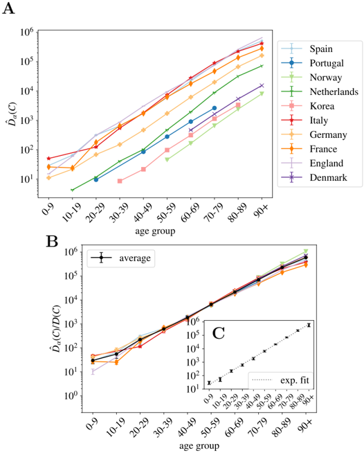
## Chart: Age-Related Trends in Data
### Overview
The image presents three line charts (A, B, and C) that explore age-related trends in some data, likely related to a disease or condition. Chart A compares trends across different countries, Chart B shows an average trend, and Chart C provides a zoomed-in view with an exponential fit. The y-axis is logarithmic in all charts.
### Components/Axes
**Chart A:**
* **Title:** Implicit, but the chart compares data across different countries by age group.
* **X-axis:** "age group" with categories: 0-9, 10-19, 20-29, 30-39, 40-49, 50-59, 60-69, 70-79, 80-89, 90+
* **Y-axis:** "$\hat{D}_a(C)$" (logarithmic scale from 10^1 to 10^6)
* **Legend (top-right):**
* Spain (light blue)
* Portugal (dark blue)
* Norway (green)
* Netherlands (light pink)
* Korea (dark green)
* Italy (red)
* Germany (orange)
* France (light orange)
* England (pink)
* Denmark (purple)
**Chart B:**
* **Title:** Implicit, shows the average trend across all countries.
* **X-axis:** "age group" with categories: 0-9, 10-19, 20-29, 30-39, 40-49, 50-59, 60-69, 70-79, 80-89, 90+
* **Y-axis:** "$\hat{D}_a(C)/D(C)$" (logarithmic scale from 10^0 to 10^6)
* **Legend (top-left):** average (black) with error bars.
**Chart C (inset):**
* **Title:** Implicit, zoomed-in view of the average trend.
* **X-axis:** "age group" with categories: 0-9, 10-19, 20-29, 30-39, 40-49, 50-59, 60-69, 70-79, 80-89, 90+
* **Y-axis:** Logarithmic scale from 10^1 to 10^6
* **Legend:** exp. fit (dotted line)
### Detailed Analysis
**Chart A:**
* **Spain (light blue):** Starts around 10^1.5 for the 0-9 age group and increases to approximately 10^3.5 for the 90+ age group.
* **Portugal (dark blue):** Starts around 10^1 for the 0-9 age group and increases to approximately 10^4 for the 90+ age group.
* **Norway (green):** Starts around 10^1 for the 0-9 age group and increases to approximately 10^4.5 for the 90+ age group.
* **Netherlands (light pink):** Starts around 10^1 for the 0-9 age group and increases to approximately 10^3 for the 90+ age group.
* **Korea (dark green):** Starts around 10^1.5 for the 0-9 age group and increases to approximately 10^4.5 for the 90+ age group.
* **Italy (red):** Starts around 10^2 for the 0-9 age group and increases to approximately 10^5.5 for the 90+ age group.
* **Germany (orange):** Starts around 10^1.5 for the 0-9 age group and increases to approximately 10^5 for the 90+ age group.
* **France (light orange):** Starts around 10^1.5 for the 0-9 age group and increases to approximately 10^5 for the 90+ age group.
* **England (pink):** Starts around 10^1 for the 0-9 age group and increases to approximately 10^3 for the 90+ age group.
* **Denmark (purple):** Starts around 10^2 for the 0-9 age group and increases to approximately 10^3.5 for the 90+ age group.
**Chart B:**
* **Average (black):** Starts around 10^1.5 for the 0-9 age group and increases to approximately 10^5.5 for the 90+ age group. The error bars are relatively small, indicating consistent trends across the averaged data.
**Chart C:**
* The data points are the same as the average in Chart B, but the scale is smaller. The dotted line represents an exponential fit to the data.
### Key Observations
* All countries show an increasing trend of $\hat{D}_a(C)$ with age.
* Italy, Germany, and France have the highest values of $\hat{D}_a(C)$ across all age groups.
* Spain, Netherlands, England, and Denmark have the lowest values of $\hat{D}_a(C)$ across all age groups.
* The average trend in Chart B closely follows an exponential pattern, as indicated by the exponential fit in Chart C.
### Interpretation
The charts suggest a strong correlation between age and the value of $\hat{D}_a(C)$. The exponential increase observed in the average trend indicates that the rate of increase accelerates with age. The differences between countries in Chart A could be due to various factors, such as healthcare systems, environmental factors, or genetic predispositions. The exponential fit in Chart C suggests that the underlying process may be related to exponential growth, such as cell division or accumulation of damage over time. The data suggests that age is a significant risk factor, and further research is needed to understand the underlying mechanisms and the reasons for the differences between countries.
DECODING INTELLIGENCE...
EXPERT: gemma-3-27b-it-free VERSION 1
RUNTIME: google-free/gemma-3-27b-it
INTEL_VERIFIED
## Line Chart: Age-Specific Disease Burden (D<sub>a</sub>(C))
### Overview
The image presents three line charts (A, B, and C) illustrating the relationship between age group and a metric denoted as D<sub>a</sub>(C), representing age-specific disease burden. Chart A displays individual country data, Chart B shows the average across countries, and Chart C presents an experimental fit. The y-axis is on a logarithmic scale.
### Components/Axes
* **X-axis (all charts):** Age group, categorized as 0-9, 10-19, 20-29, 30-39, 40-49, 50-59, 60-69, 70-79, 80-89, 90+.
* **Y-axis (A & B):** D<sub>a</sub>(C), with a logarithmic scale ranging from 10<sup>1</sup> to 10<sup>6</sup>.
* **Y-axis (C):** D<sub>a</sub>(C)/D(C), with a logarithmic scale ranging from 10<sup>1</sup> to 10<sup>6</sup>.
* **Legend (A):** Lists the countries represented by each line: Spain, Portugal, Norway, Netherlands, Korea, Italy, Germany, France, England, Denmark. The legend is positioned in the top-right corner.
* **Chart A:** Displays individual lines for each country.
* **Chart B:** Displays a single line representing the average D<sub>a</sub>(C) across all countries, with error bars.
* **Chart C:** Displays a single line representing an experimental fit, with error bars.
### Detailed Analysis or Content Details
**Chart A: Country-Specific Data**
* **Spain (dark grey line):** Starts at approximately 10<sup>2</sup> for age 0-9, increases steadily to approximately 10<sup>5</sup> for age 80-89, and plateaus around 10<sup>5</sup> for age 90+.
* **Portugal (light blue line):** Starts at approximately 10<sup>1</sup> for age 0-9, increases to approximately 10<sup>4</sup> for age 50-59, then rises more steeply to approximately 10<sup>5</sup> for age 80-89, and plateaus around 10<sup>5</sup> for age 90+.
* **Norway (light green line):** Starts at approximately 10<sup>1</sup> for age 0-9, increases to approximately 10<sup>3</sup> for age 30-39, then rises more steeply to approximately 10<sup>5</sup> for age 70-79, and plateaus around 10<sup>5</sup> for age 90+.
* **Netherlands (pink line):** Starts at approximately 10<sup>1</sup> for age 0-9, increases to approximately 10<sup>3</sup> for age 30-39, then rises more steeply to approximately 10<sup>5</sup> for age 70-79, and plateaus around 10<sup>5</sup> for age 90+.
* **Korea (red line):** Starts at approximately 10<sup>1</sup> for age 0-9, increases to approximately 10<sup>3</sup> for age 30-39, then rises more steeply to approximately 10<sup>5</sup> for age 70-79, and plateaus around 10<sup>5</sup> for age 90+.
* **Italy (orange line):** Starts at approximately 10<sup>1</sup> for age 0-9, increases to approximately 10<sup>3</sup> for age 30-39, then rises more steeply to approximately 10<sup>5</sup> for age 70-79, and plateaus around 10<sup>5</sup> for age 90+.
* **Germany (yellow line):** Starts at approximately 10<sup>1</sup> for age 0-9, increases to approximately 10<sup>3</sup> for age 30-39, then rises more steeply to approximately 10<sup>5</sup> for age 70-79, and plateaus around 10<sup>5</sup> for age 90+.
* **France (cyan line):** Starts at approximately 10<sup>1</sup> for age 0-9, increases to approximately 10<sup>3</sup> for age 30-39, then rises more steeply to approximately 10<sup>5</sup> for age 70-79, and plateaus around 10<sup>5</sup> for age 90+.
* **England (brown line):** Starts at approximately 10<sup>1</sup> for age 0-9, increases to approximately 10<sup>3</sup> for age 30-39, then rises more steeply to approximately 10<sup>5</sup> for age 70-79, and plateaus around 10<sup>5</sup> for age 90+.
* **Denmark (black line):** Starts at approximately 10<sup>1</sup> for age 0-9, increases to approximately 10<sup>3</sup> for age 30-39, then rises more steeply to approximately 10<sup>5</sup> for age 70-79, and plateaus around 10<sup>5</sup> for age 90+.
**Chart B: Average Data**
* The average line (black) starts at approximately 10<sup>2</sup> for age 0-9, increases to approximately 10<sup>3</sup> for age 30-39, then rises more steeply to approximately 10<sup>5</sup> for age 70-79, and plateaus around 10<sup>5</sup> for age 90+. Error bars are present, indicating variability around the average.
**Chart C: Experimental Fit**
* The experimental fit line (dashed black) starts at approximately 10<sup>1</sup> for age 0-9, increases to approximately 10<sup>3</sup> for age 30-39, then rises more steeply to approximately 10<sup>5</sup> for age 70-79, and plateaus around 10<sup>5</sup> for age 90+. Error bars are present, indicating variability around the fit.
### Key Observations
* All countries exhibit a similar trend: a relatively slow increase in D<sub>a</sub>(C) until approximately age 30-39, followed by a steep increase with age.
* There is considerable variability between countries, particularly at younger ages.
* The average (Chart B) closely follows the trend of many individual countries.
* The experimental fit (Chart C) aligns well with the average data.
* The logarithmic scale emphasizes the exponential growth of D<sub>a</sub>(C) with age.
### Interpretation
The data suggests a strong age-related increase in disease burden (D<sub>a</sub>(C)) across the studied countries. The initial slow increase may represent a period of relatively low risk, while the subsequent steep increase indicates a growing vulnerability to disease with advancing age. The variability between countries suggests that factors beyond age, such as healthcare access, lifestyle, and genetic predisposition, also play a role in disease burden. The experimental fit provides a mathematical model that captures the overall trend, potentially useful for predicting disease burden in different populations. The use of a logarithmic scale highlights the exponential nature of the relationship, indicating that even small increases in age can lead to substantial increases in disease burden. The error bars in Charts B and C indicate the uncertainty associated with the average and the experimental fit, respectively. The data suggests that interventions aimed at mitigating age-related disease risk could have a significant impact on public health.
DECODING INTELLIGENCE...
EXPERT: healer-alpha-free VERSION 1
RUNTIME: free/openrouter/healer-alpha
INTEL_VERIFIED
## Line Charts: Age-Group Diversity Measures Across Countries
### Overview
The image contains two primary line charts (labeled A and B) and one inset chart (C). Both main charts plot a diversity measure (on a logarithmic scale) against age groups for multiple countries. Chart A shows the raw measure, while Chart B shows a conditional measure, with an inset (C) displaying an exponential fit to the average data from Chart B.
### Components/Axes
**Chart A (Top Panel):**
* **Y-axis:** Label is "$\hat{D}_A(C)$". Scale is logarithmic, ranging from $10^0$ to $10^6$.
* **X-axis:** Label is "age group". Categories are: 0-9, 10-19, 20-29, 30-39, 40-49, 50-59, 60-69, 70-79, 80-89, 90+.
* **Legend (Top-right):** Lists 10 countries with corresponding line colors and markers:
* Spain (light blue, '+')
* Portugal (blue, circle)
* Norway (light green, downward triangle)
* Netherlands (green, 'x')
* Korea (pink, square)
* Italy (red, diamond)
* Germany (orange, upward triangle)
* France (orange, downward triangle)
* England (purple, '+')
* Denmark (purple, 'x')
**Chart B (Bottom Panel):**
* **Y-axis:** Label is "$\hat{D}_A(C|D(C))$". Scale is logarithmic, ranging from $10^0$ to $10^6$.
* **X-axis:** Label is "age group". Same categories as Chart A.
* **Legend (Top-left):** Contains a single entry: "average" represented by a black line with error bars.
* **Inset Chart C (Bottom-right of Chart B):**
* **Y-axis:** Logarithmic scale from $10^1$ to $10^6$.
* **X-axis:** Same age group categories as the main charts.
* **Data:** Black points with error bars, labeled "exp. fit" with a dotted trend line.
### Detailed Analysis
**Chart A - $\hat{D}_A(C)$ by Country:**
* **Trend Verification:** All 10 country lines show a strong, consistent upward trend from the youngest to the oldest age groups. The slope is steep and approximately linear on the log-linear plot, indicating exponential growth with age.
* **Data Points (Approximate Values):**
* **0-9 age group:** Values cluster between ~$10^1$ and ~$10^2$. Korea (~$10^1$) and Portugal (~$10^1$) are among the lowest. Italy (~$5 \times 10^1$) and Germany (~$3 \times 10^1$) are among the highest.
* **90+ age group:** Values range from ~$10^4$ to ~$5 \times 10^5$. England and Denmark (purple lines) are the highest, near $5 \times 10^5$. Norway and the Netherlands (green lines) are the lowest, near $10^4$.
* **Cross-Reference:** The ordering of countries is not perfectly consistent across age groups, but a general pattern holds. For example, the purple lines (England, Denmark) start in the middle range but end at the top. The green lines (Norway, Netherlands) start low and remain relatively low.
**Chart B - $\hat{D}_A(C|D(C))$ and Inset C:**
* **Trend Verification:** The individual country lines (faintly visible) and the black "average" line all show a strong upward trend, similar to Chart A.
* **Key Difference:** The spread between country lines is dramatically reduced compared to Chart A. All lines converge tightly around the average line, especially for older age groups.
* **Average Line:** The black line with error bars represents the average across countries. It starts at ~$3 \times 10^1$ for age 0-9 and rises to ~$5 \times 10^5$ for age 90+. The error bars (standard deviation or error) are relatively small, indicating low variance between countries for this conditional measure.
* **Inset Chart C:** This plots the average data points from Chart B against an exponential fit ("exp. fit"). The data points align very closely with the dotted fit line across all age groups, confirming the exponential relationship.
### Key Observations
1. **Exponential Growth:** Both diversity measures ($\hat{D}_A(C)$ and $\hat{D}_A(C|D(C))$) increase exponentially with age group.
2. **Country Variance Reduction:** The primary difference between Chart A and Chart B is the massive reduction in variance between countries. Chart A shows significant spread, while Chart B shows tight clustering. This suggests that the conditional measure $\hat{D}_A(C|D(C))$ normalizes for a factor (likely population size or base diversity) that varies greatly between countries.
3. **Consistent Ranking in Chart A:** Despite some crossing, countries like England and Denmark consistently show higher raw diversity ($\hat{D}_A(C)$) in older age groups, while Norway and the Netherlands show lower values.
4. **Robust Average Trend:** The exponential fit in Inset C is excellent, indicating a universal, predictable pattern in the conditional diversity measure across the studied populations.
### Interpretation
The data demonstrates a fundamental pattern: the measured diversity ($\hat{D}_A(C)$) within age cohorts grows exponentially as the population ages. This is likely driven by cumulative processes over a lifetime.
The critical insight comes from comparing Chart A and Chart B. The raw diversity (Chart A) varies substantially between countries, reflecting differences in population structure, size, or other demographic factors. However, when the measure is conditioned on $D(C)$ (Chart B), which likely represents the total diversity or size of the country's population, the differences between nations largely disappear. This reveals a **universal scaling law**: the age-dependent growth of conditional diversity follows the same exponential trajectory across all 10 countries studied.
Therefore, while the absolute level of age-cohort diversity is country-specific, the *relative growth pattern* with age is a shared characteristic. The exponential fit in Inset C quantifies this universal relationship. This finding suggests that the underlying mechanisms driving the increase in this diversity measure with age are consistent across different national populations.
DECODING INTELLIGENCE...
EXPERT: nemotron-free VERSION 1
RUNTIME: free/nvidia/nemotron-nano-12b-v2-vl:free
INTEL_VERIFIED
## Line Graphs: Age-Dependent D̂α(C) Across Countries and Trends
### Overview
The image contains three interconnected line graphs (A, B, C) analyzing age-dependent values of D̂α(C) across different countries and age groups. Chart A shows country-specific trends, Chart B presents an average trend, and Chart C provides an exponential fit for a subset of data.
### Components/Axes
**Chart A (Main Panel):**
- **Y-axis (left):** D̂α(C) (log scale: 10¹ to 10⁶)
- **X-axis:** Age groups (0-9, 10-19, ..., 90+)
- **Legend (top-right):**
- Spain (light blue), Portugal (dark blue), Norway (green), Netherlands (dark green), Korea (pink), Italy (red), Germany (orange), France (yellow), England (purple), Denmark (dark purple)
- **Inset Chart C (bottom-right of Chart B):**
- Y-axis: D̂α(C) (log scale: 10¹ to 10⁶)
- X-axis: Age groups (0-9 to 90+)
- Dotted line labeled "exp. fit"
**Chart B (Average Trend):**
- **Y-axis (left):** D̂α(C)/D(C) (log scale: 10⁰ to 10⁶)
- **X-axis:** Age groups (0-9 to 90+)
- **Legend:** "average" (black line with error bars)
### Detailed Analysis
**Chart A Trends:**
- All countries show **upward trends** with age, but slopes vary:
- **Italy (red)** and **France (yellow)** have the steepest increases, reaching ~10⁵ by 90+.
- **Norway (green)** and **Netherlands (dark green)** show moderate growth (~10³ to 10⁴).
- **Korea (pink)** and **Denmark (dark purple)** exhibit slower growth (~10² to 10³).
- **Spain (light blue)** and **Portugal (dark blue)** start low but accelerate sharply after 60-69.
- **Germany (orange)** and **England (purple)** follow intermediate trajectories.
**Chart B (Average):**
- The **black "average" line** rises exponentially, doubling roughly every 10-year age group (e.g., ~10¹ at 0-9 to ~10⁶ at 90+).
- Error bars (vertical lines) indicate uncertainty, smallest for younger age groups and largest for 90+.
**Chart C (Exponential Fit):**
- Data points align closely with the **dotted exponential curve**, confirming a power-law relationship: D̂α(C) ∝ exp(k·age).
### Key Observations
1. **Country-Specific Variability:** Italy and France show significantly higher D̂α(C) values across all age groups compared to other nations.
2. **Exponential Scaling:** Both the average trend (Chart B) and inset fit (Chart C) confirm exponential growth with age.
3. **Data Uncertainty:** Larger error bars in older age groups (e.g., 90+) suggest less reliable measurements or higher variability.
### Interpretation
The data suggests that D̂α(C) scales exponentially with age across populations, with country-specific factors (e.g., healthcare systems, lifestyle) influencing the magnitude. Italy and France’s elevated values may reflect demographic or epidemiological differences. The exponential fit in Chart C implies a universal mechanistic relationship, potentially tied to biological aging processes. Discrepancies between countries highlight the need for region-specific public health strategies.
DECODING INTELLIGENCE...