\n
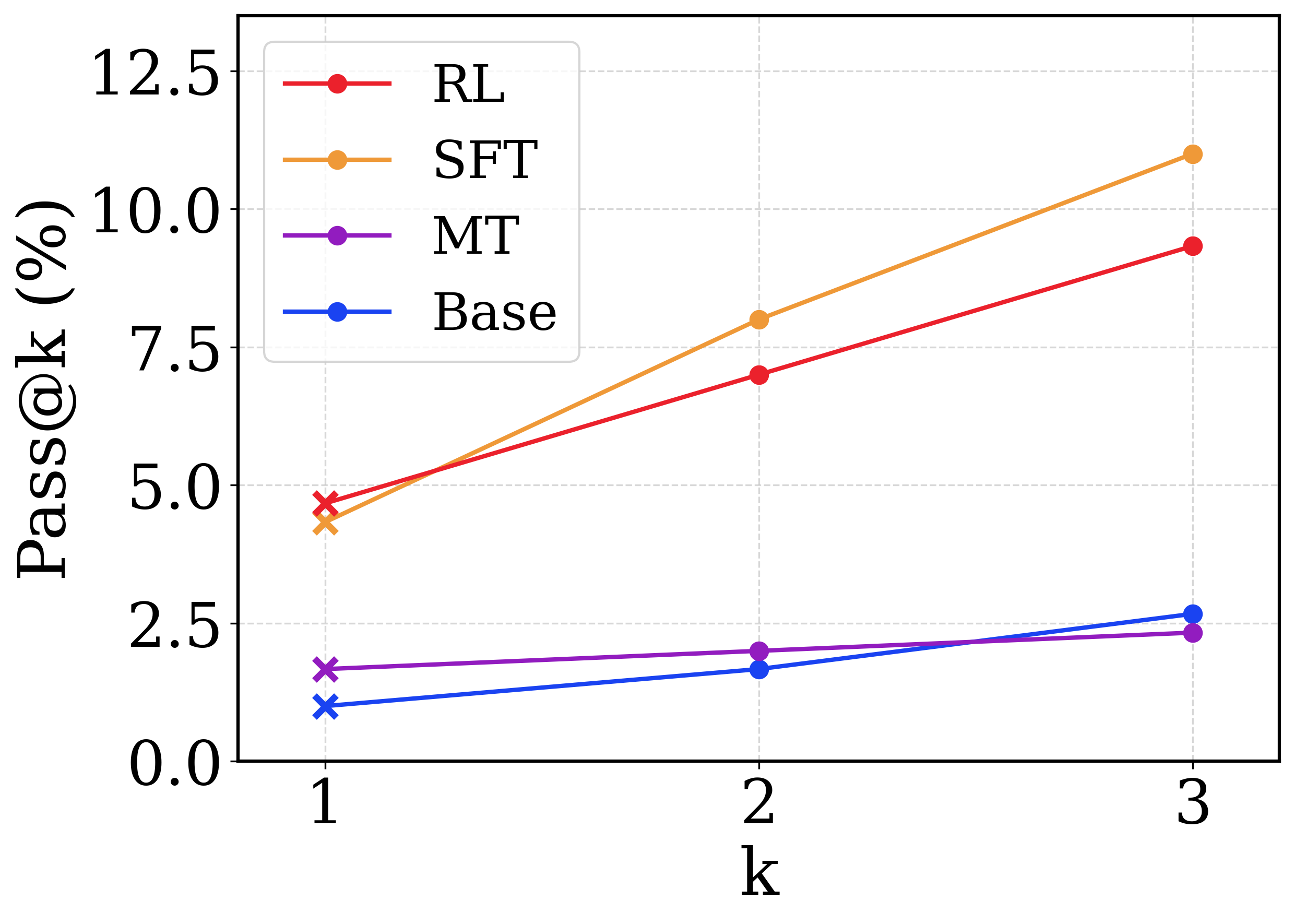
## Line Chart: Pass@k vs. k for Different Models
### Overview
This image presents a line chart illustrating the relationship between the 'k' value (likely representing the number of samples or candidates considered) and the 'Pass@k' metric (likely representing the percentage of successful passes or correct predictions) for four different models: RL, SFT, MT, and Base. The chart visually compares the performance of these models as 'k' increases from 1 to 3.
### Components/Axes
* **X-axis:** Labeled "k", ranging from 1 to 3. The axis represents the number of samples or candidates.
* **Y-axis:** Labeled "Pass@k (%)", ranging from 0.0 to 12.5. The axis represents the percentage of successful passes or correct predictions.
* **Legend:** Located in the top-left corner of the chart. It identifies the four data series:
* RL (Red line with circular markers)
* SFT (Orange line with circular markers)
* MT (Magenta line with circular markers)
* Base (Blue line with circular markers)
* **Gridlines:** Light gray vertical and horizontal lines provide a visual reference for data point values.
### Detailed Analysis
* **RL (Red):** The line slopes upward consistently.
* At k=1, Pass@k is approximately 4.8%.
* At k=2, Pass@k is approximately 7.4%.
* At k=3, Pass@k is approximately 9.4%.
* **SFT (Orange):** The line shows an initial increase, then flattens.
* At k=1, Pass@k is approximately 4.2%.
* At k=2, Pass@k is approximately 5.2%.
* At k=3, Pass@k is approximately 5.8%.
* **MT (Magenta):** The line shows a slight upward trend.
* At k=1, Pass@k is approximately 2.2%.
* At k=2, Pass@k is approximately 2.4%.
* At k=3, Pass@k is approximately 2.6%.
* **Base (Blue):** The line is relatively flat, with a slight upward trend.
* At k=1, Pass@k is approximately 1.2%.
* At k=2, Pass@k is approximately 1.6%.
* At k=3, Pass@k is approximately 2.0%.
### Key Observations
* The RL model consistently outperforms the other models across all values of 'k'.
* The SFT model shows a small initial improvement as 'k' increases, but its performance plateaus.
* The MT and Base models exhibit the lowest Pass@k values and the smallest changes in performance as 'k' increases.
* The gap between the RL model and the other models widens as 'k' increases, suggesting that the RL model benefits more from considering a larger number of samples.
### Interpretation
The data suggests that the RL model is the most effective at achieving successful passes or correct predictions, and its performance improves significantly as the number of samples considered ('k') increases. The SFT model shows some improvement with increasing 'k', but its gains are limited. The MT and Base models appear to be less sensitive to the value of 'k', indicating that they may be limited by other factors.
The chart demonstrates the impact of sample size on model performance. The RL model's strong positive correlation between 'k' and Pass@k suggests that it is capable of leveraging additional information to improve its predictions. The relatively flat lines for the SFT, MT, and Base models suggest that they may have reached a performance ceiling or that their performance is constrained by other factors, such as model capacity or data quality.
The differences in performance between the models could be due to variations in their training data, architectures, or optimization algorithms. Further investigation would be needed to determine the specific factors that contribute to these differences.