\n
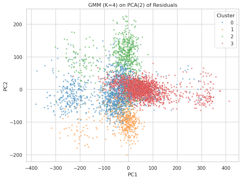
## Scatter Plot: GMM (K=4) on PCA(2) of Residuals
### Overview
This image presents a scatter plot visualizing the results of a Gaussian Mixture Model (GMM) with 4 components (K=4) applied to the first two Principal Components (PCA(2)) of residuals. The plot displays the distribution of data points across these two principal components, with each point colored according to its assigned cluster.
### Components/Axes
* **Title:** "GMM (K=4) on PCA(2) of Residuals" - positioned at the top-center of the image.
* **X-axis:** "PC1" - ranging approximately from -400 to 400.
* **Y-axis:** "PC2" - ranging approximately from -200 to 200.
* **Legend:** Located in the top-right corner, defining the color mapping for each cluster:
* Cluster 0: Blue (represented by small, opaque dots)
* Cluster 1: Green (represented by small, opaque dots)
* Cluster 2: Orange (represented by small, opaque dots)
* Cluster 3: Red (represented by small, opaque dots)
### Detailed Analysis
The plot shows four distinct clusters of data points.
* **Cluster 0 (Blue):** This cluster is concentrated in the bottom-left quadrant of the plot. The points are spread roughly between PC1 values of -350 to -50 and PC2 values of -150 to 50. The density appears highest around PC1 = -200 and PC2 = -50.
* **Cluster 1 (Green):** This cluster is located in the top-left quadrant. The points are distributed between PC1 values of -300 to 50 and PC2 values of 50 to 200. The density is highest around PC1 = -100 and PC2 = 150.
* **Cluster 2 (Orange):** This cluster is centered around the origin (0,0) and extends into the bottom-right quadrant. The points range from PC1 values of -50 to 150 and PC2 values of -100 to 50. The highest density is around PC1 = 0 and PC2 = 0.
* **Cluster 3 (Red):** This cluster is located in the top-right quadrant. The points are distributed between PC1 values of 50 to 400 and PC2 values of -50 to 100. The density is highest around PC1 = 200 and PC2 = 0.
The clusters are not perfectly separated, with some overlap between Cluster 2 (Orange) and Clusters 0 (Blue) and 3 (Red). There is also some overlap between Cluster 1 (Green) and Cluster 2 (Orange).
### Key Observations
* The clusters are relatively well-defined, suggesting that the GMM has successfully identified distinct groups within the data.
* The clusters are not equally sized. Cluster 3 (Red) appears to be the largest, while Cluster 0 (Blue) appears to be the smallest.
* The clusters are distributed across the entire range of PC1 and PC2 values, indicating that the first two principal components capture a significant amount of the variance in the data.
### Interpretation
The scatter plot demonstrates the results of dimensionality reduction (PCA) followed by clustering (GMM). The PCA step reduces the dimensionality of the original data to two principal components, while the GMM step identifies four distinct clusters within this reduced space.
The fact that the GMM is able to identify four clusters suggests that the original data contains four underlying groups or patterns. The distribution of these clusters across the PC1 and PC2 axes provides insights into the characteristics of each group. For example, Cluster 3 (Red) is characterized by high values of PC1 and moderate values of PC2, while Cluster 0 (Blue) is characterized by low values of PC1 and moderate values of PC2.
The overlap between the clusters suggests that there is some degree of similarity between the groups, or that the boundaries between them are not well-defined. Further analysis would be needed to determine the nature of these similarities and to refine the clustering results. The relative sizes of the clusters may indicate that some groups are more prevalent in the data than others.