\n
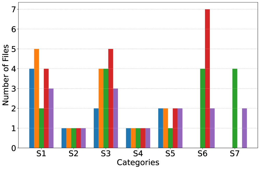
## Bar Chart: Number of Files per Category
### Overview
The image presents a bar chart illustrating the number of files associated with different categories, labeled S1 through S7. Each category has multiple data series represented by different colored bars. The y-axis represents the "Number of Files," ranging from 0 to 7, while the x-axis represents the "Categories" (S1 to S7).
### Components/Axes
* **X-axis:** "Categories" with markers S1, S2, S3, S4, S5, S6, S7.
* **Y-axis:** "Number of Files" with a scale from 0 to 7, incrementing by 1.
* **Data Series:** Represented by the following colors:
* Red
* Green
* Purple
* Orange
* Blue
### Detailed Analysis
Let's analyze each category and its corresponding data series:
* **S1:**
* Red: Approximately 5.0
* Green: Approximately 4.2
* Purple: Approximately 3.0
* Orange: Approximately 2.0
* Blue: Approximately 1.0
* **S2:**
* Red: Approximately 1.2
* Green: Approximately 1.0
* Purple: Approximately 1.2
* Orange: Approximately 1.0
* Blue: Approximately 1.0
* **S3:**
* Red: Approximately 5.0
* Green: Approximately 4.2
* Purple: Approximately 3.0
* Orange: Approximately 2.0
* Blue: Approximately 2.0
* **S4:**
* Red: Approximately 1.0
* Green: Approximately 1.0
* Purple: Approximately 1.2
* Orange: Approximately 1.0
* Blue: Approximately 1.0
* **S5:**
* Red: Approximately 2.0
* Green: Approximately 2.2
* Purple: Approximately 2.0
* Orange: Approximately 2.0
* Blue: Approximately 2.0
* **S6:**
* Red: Approximately 7.0
* Green: Approximately 4.0
* Purple: Approximately 2.0
* Orange: Approximately 2.0
* Blue: Approximately 2.0
* **S7:**
* Red: Approximately 4.0
* Green: Approximately 4.2
* Purple: Approximately 2.0
* Orange: Approximately 2.0
* Blue: Approximately 2.0
### Key Observations
* Category S6 exhibits the highest number of files for the red data series, reaching approximately 7.0.
* Categories S2 and S4 have the lowest number of files across all data series, generally around 1.0.
* The red and green data series generally show higher values compared to the purple, orange, and blue series.
* S1 and S3 have similar profiles across all data series.
### Interpretation
The chart suggests a varying distribution of files across the seven categories. Category S6 is significantly more populated with files (specifically, of the 'red' type) than other categories. The consistent low values in S2 and S4 might indicate these categories contain fewer files overall, or that the files are categorized differently. The similarity between S1 and S3 suggests a potential relationship or commonality between these two categories in terms of file distribution. The differences in the height of the bars within each category indicate that different data series (represented by colors) contribute differently to the total number of files in each category. This could represent different file types, sources, or attributes. Further investigation would be needed to understand the meaning of each color and the underlying reasons for these observed patterns.