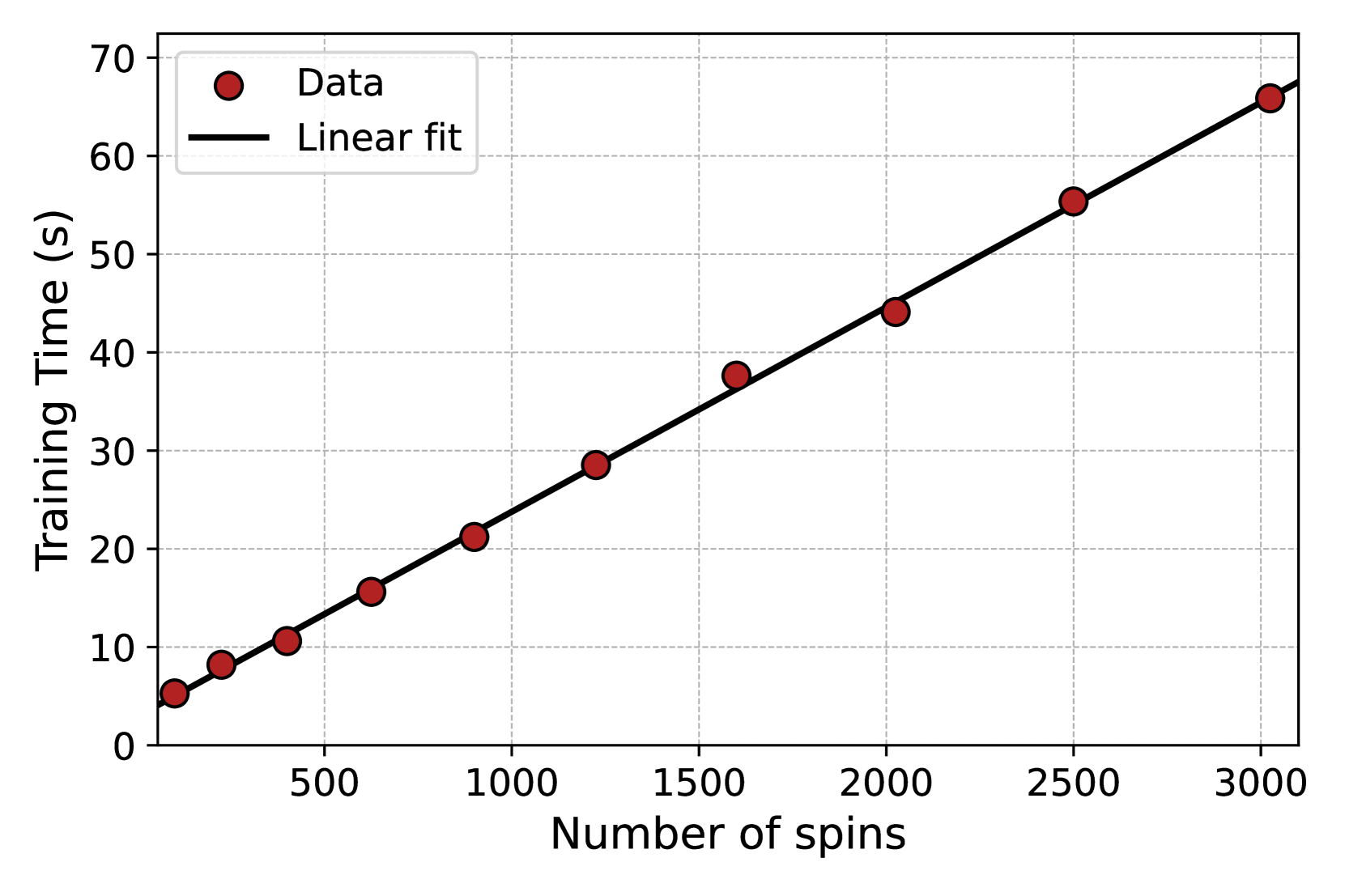
## Chart: Training Time vs. Number of Spins
### Overview
The image is a scatter plot showing the relationship between the number of spins and the training time. The plot includes data points and a linear fit line. The x-axis represents the number of spins, and the y-axis represents the training time in seconds.
### Components/Axes
* **X-axis:** Number of spins, ranging from 0 to 3000, with markers at 500, 1000, 1500, 2000, 2500, and 3000.
* **Y-axis:** Training Time (s), ranging from 0 to 70, with markers at 10, 20, 30, 40, 50, 60, and 70.
* **Data:** Represented by red circles.
* **Linear fit:** Represented by a black line.
* **Legend:** Located in the top-left corner, indicating "Data" as red circles and "Linear fit" as a black line.
### Detailed Analysis
The data points and the linear fit show a positive correlation between the number of spins and the training time. As the number of spins increases, the training time also increases.
* **Data Points:**
* Approximately (200, 6)
* Approximately (400, 10)
* Approximately (600, 15)
* Approximately (900, 21)
* Approximately (1450, 38)
* Approximately (1950, 44)
* Approximately (2500, 56)
* Approximately (3000, 67)
* **Linear Fit:** The black line starts at approximately (0, 4) and extends to approximately (3000, 67). The line appears to closely follow the trend of the data points.
### Key Observations
* The relationship between the number of spins and training time is approximately linear.
* The linear fit line closely matches the data points, suggesting a good fit.
* There are no obvious outliers.
### Interpretation
The chart demonstrates that the training time increases linearly with the number of spins. This suggests that the computational complexity of the training process is directly proportional to the number of spins. The linear fit provides a model to predict the training time for a given number of spins. The absence of significant outliers indicates a consistent relationship between these two variables.