## Line Chart: Mean Pass Rate vs. Mean Number of Tokens Generated
### Overview
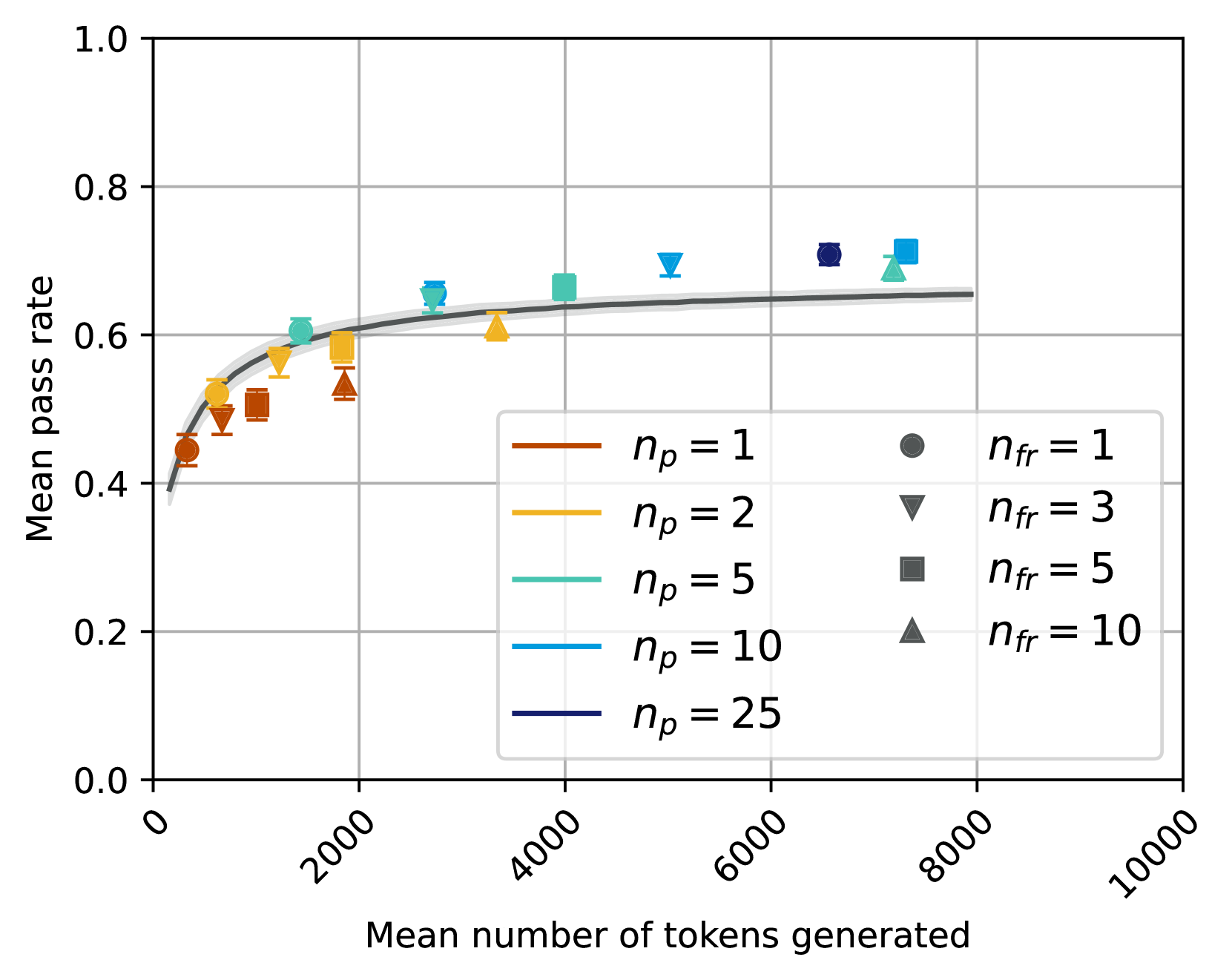
The image is a line chart that plots the mean pass rate against the mean number of tokens generated. The chart displays multiple data series, each representing a different configuration of parameters denoted as *n<sub>p</sub>* and *n<sub>fr</sub>*. The chart aims to show how the mean pass rate changes as the number of tokens generated increases, under different parameter settings.
### Components/Axes
* **X-axis:** Mean number of tokens generated, ranging from 0 to 10000, with tick marks at intervals of 2000.
* **Y-axis:** Mean pass rate, ranging from 0.0 to 1.0, with tick marks at intervals of 0.2.
* **Legend:** Located in the center-right of the chart, it identifies the different data series based on the parameters *n<sub>p</sub>* and *n<sub>fr</sub>*.
* *n<sub>p</sub>* = 1 (brown line)
* *n<sub>p</sub>* = 2 (yellow line)
* *n<sub>p</sub>* = 5 (light blue line)
* *n<sub>p</sub>* = 10 (darker blue line)
* *n<sub>p</sub>* = 25 (darkest blue line)
* *n<sub>fr</sub>* = 1 (dark gray circles)
* *n<sub>fr</sub>* = 3 (dark gray downward triangles)
* *n<sub>fr</sub>* = 5 (dark gray squares)
* *n<sub>fr</sub>* = 10 (dark gray upward triangles)
### Detailed Analysis
**Data Series Trends and Values:**
* **n<sub>p</sub> = 1 (Brown Line):** The line starts at approximately 0.45 at 0 tokens and increases to approximately 0.52 at 1000 tokens, 0.55 at 2000 tokens, 0.59 at 4000 tokens, and plateaus around 0.65 at 8000 tokens.
* **n<sub>p</sub> = 2 (Yellow Line):** The line starts at approximately 0.40 at 0 tokens and increases to approximately 0.58 at 1000 tokens, 0.60 at 2000 tokens, 0.62 at 4000 tokens, and plateaus around 0.65 at 8000 tokens.
* **n<sub>p</sub> = 5 (Light Blue Line):** The line starts at approximately 0.40 at 0 tokens and increases to approximately 0.60 at 1000 tokens, 0.62 at 2000 tokens, 0.67 at 4000 tokens, and plateaus around 0.70 at 8000 tokens.
* **n<sub>p</sub> = 10 (Darker Blue Line):** The line starts at approximately 0.40 at 0 tokens and increases to approximately 0.60 at 1000 tokens, 0.63 at 2000 tokens, 0.68 at 4000 tokens, and plateaus around 0.71 at 8000 tokens.
* **n<sub>p</sub> = 25 (Darkest Blue Line):** The line starts at approximately 0.40 at 0 tokens and increases to approximately 0.62 at 1000 tokens, 0.64 at 2000 tokens, 0.70 at 4000 tokens, and plateaus around 0.72 at 8000 tokens.
* **n<sub>fr</sub> = 1 (Dark Gray Circles):** The data points are scattered. At 0 tokens, the mean pass rate is approximately 0.45. At 6000 tokens, the mean pass rate is approximately 0.72. At 8000 tokens, the mean pass rate is approximately 0.70.
* **n<sub>fr</sub> = 3 (Dark Gray Downward Triangles):** The data points are scattered. At 1000 tokens, the mean pass rate is approximately 0.50. At 4000 tokens, the mean pass rate is approximately 0.60. At 6000 tokens, the mean pass rate is approximately 0.70.
* **n<sub>fr</sub> = 5 (Dark Gray Squares):** The data points are scattered. At 1000 tokens, the mean pass rate is approximately 0.52. At 2000 tokens, the mean pass rate is approximately 0.55. At 7000 tokens, the mean pass rate is approximately 0.72.
* **n<sub>fr</sub> = 10 (Dark Gray Upward Triangles):** The data points are scattered. At 1000 tokens, the mean pass rate is approximately 0.48. At 4000 tokens, the mean pass rate is approximately 0.61. At 7000 tokens, the mean pass rate is approximately 0.71.
### Key Observations
* The mean pass rate generally increases with the mean number of tokens generated for all values of *n<sub>p</sub>*.
* The rate of increase diminishes as the number of tokens generated increases, suggesting a saturation effect.
* Higher values of *n<sub>p</sub>* generally result in higher mean pass rates.
* The data points for *n<sub>fr</sub>* are scattered, making it difficult to discern a clear trend.
### Interpretation
The chart suggests that increasing the number of tokens generated initially improves the mean pass rate, but this improvement plateaus as the number of tokens continues to increase. The parameter *n<sub>p</sub>* appears to have a positive correlation with the mean pass rate, indicating that higher values of *n<sub>p</sub>* lead to better performance. The scattered data points for *n<sub>fr</sub>* suggest that this parameter may have a less predictable or consistent impact on the mean pass rate compared to *n<sub>p</sub>*. The gray shaded region around each line indicates the uncertainty or variability in the data.