\n
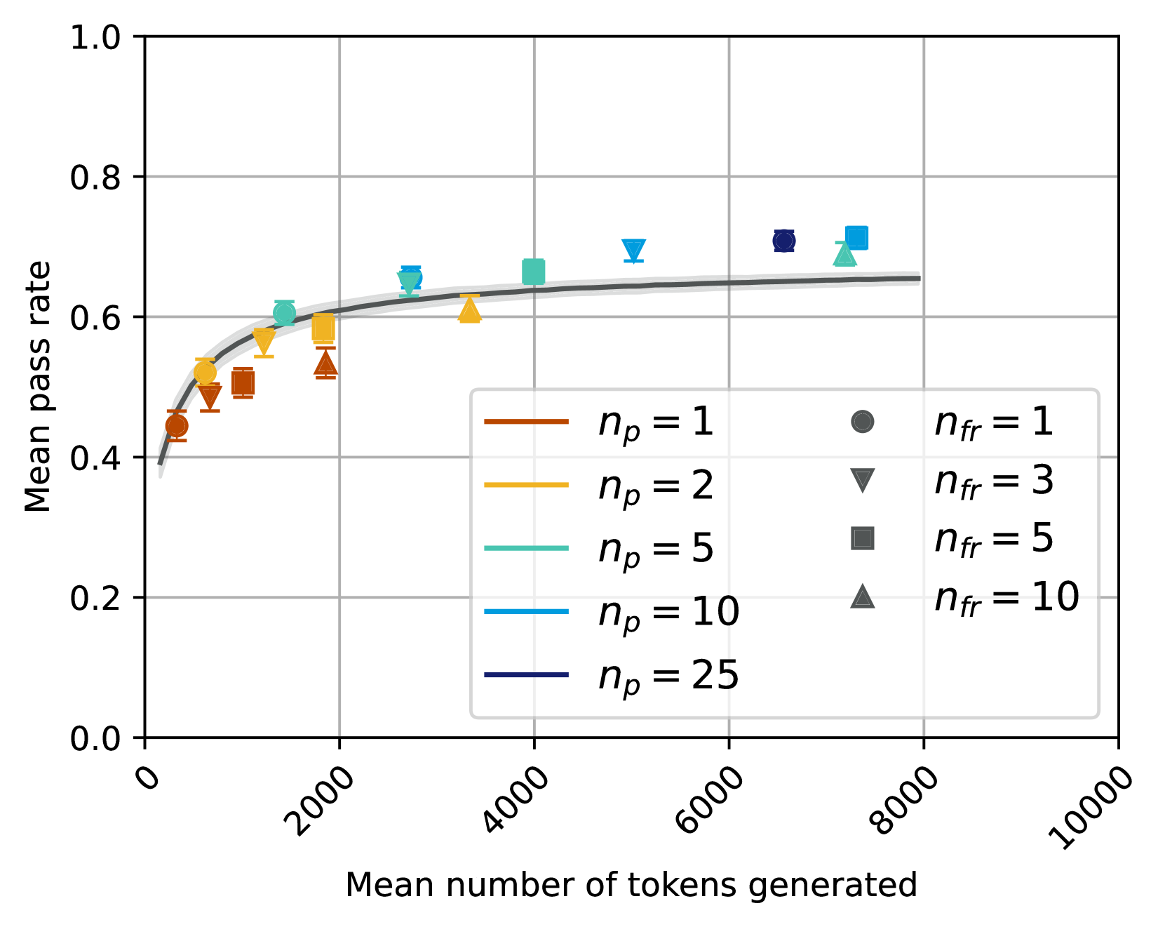
## Line Chart: Mean Pass Rate vs. Mean Number of Tokens Generated
### Overview
This chart displays the relationship between the mean pass rate and the mean number of tokens generated, with different lines representing different values of *n<sub>p</sub>* (likely a parameter related to prompt engineering or model configuration) and data points colored according to different values of *n<sub>fr</sub>* (likely a parameter related to feedback or reinforcement learning). The chart appears to demonstrate how pass rate improves with increasing token generation, and how this relationship is affected by the *n<sub>p</sub>* parameter.
### Components/Axes
* **X-axis:** Mean number of tokens generated, ranging from 0 to 10000. The scale is linear.
* **Y-axis:** Mean pass rate, ranging from 0.0 to 1.0. The scale is linear.
* **Lines:** Represent different values of *n<sub>p</sub>*: 1, 2, 5, 10, and 25. Each line is a different color.
* **Data Points:** Represent individual data observations, colored according to different values of *n<sub>fr</sub>*: 1, 3, 5, and 10.
* **Legend (Top-Right):** Two separate legends are present. The first legend (brown, orange, light blue, dark blue, purple) maps colors to *n<sub>p</sub>* values. The second legend (grey, brown, dark blue, dark green) maps colors to *n<sub>fr</sub>* values.
* **Grid:** A light grey grid is present to aid in reading values.
### Detailed Analysis
The chart shows several lines representing different *n<sub>p</sub>* values. Each line is accompanied by shaded regions representing the uncertainty around the mean.
* **n<sub>p</sub> = 1 (Brown):** The line starts at approximately 0.42 pass rate at 0 tokens generated, rises rapidly to around 0.65 at 1000 tokens, and then plateaus, reaching approximately 0.72 at 8000 tokens.
* **n<sub>p</sub> = 2 (Orange):** The line starts at approximately 0.45 pass rate at 0 tokens generated, rises to around 0.67 at 1000 tokens, and then plateaus, reaching approximately 0.73 at 8000 tokens.
* **n<sub>p</sub> = 5 (Light Blue):** The line starts at approximately 0.50 pass rate at 0 tokens generated, rises to around 0.68 at 1000 tokens, and then plateaus, reaching approximately 0.74 at 8000 tokens.
* **n<sub>p</sub> = 10 (Dark Blue):** The line starts at approximately 0.55 pass rate at 0 tokens generated, rises to around 0.70 at 1000 tokens, and then plateaus, reaching approximately 0.76 at 8000 tokens.
* **n<sub>p</sub> = 25 (Purple):** The line starts at approximately 0.60 pass rate at 0 tokens generated, rises to around 0.72 at 1000 tokens, and then plateaus, reaching approximately 0.78 at 8000 tokens.
Data points are overlaid on the lines, colored according to *n<sub>fr</sub>*:
* **n<sub>fr</sub> = 1 (Grey):** Located at approximately (0, 0.42), (1000, 0.62), (4000, 0.68), (8000, 0.72).
* **n<sub>fr</sub> = 3 (Brown):** Located at approximately (0, 0.45), (1000, 0.65), (4000, 0.70), (8000, 0.74).
* **n<sub>fr</sub> = 5 (Dark Blue):** Located at approximately (0, 0.52), (1000, 0.68), (4000, 0.72), (8000, 0.76).
* **n<sub>fr</sub> = 10 (Dark Green):** Located at approximately (0, 0.58), (1000, 0.70), (4000, 0.74), (8000, 0.77).
### Key Observations
* The pass rate generally increases with the number of tokens generated, but the rate of increase diminishes as the number of tokens increases.
* Higher values of *n<sub>p</sub>* consistently result in higher pass rates.
* Higher values of *n<sub>fr</sub>* consistently result in higher pass rates.
* The shaded regions around the lines indicate uncertainty in the mean pass rate.
* The data points generally fall close to the corresponding lines, suggesting that the lines are good representations of the underlying data.
### Interpretation
The chart suggests that increasing the number of tokens generated can improve the pass rate, up to a point of diminishing returns. The parameters *n<sub>p</sub>* and *n<sub>fr</sub>* appear to have a positive impact on the pass rate, with higher values leading to better performance. *n<sub>p</sub>* likely controls the diversity or complexity of the prompts, while *n<sub>fr</sub>* likely controls the strength or frequency of feedback signals.
The convergence of the lines at higher token counts suggests that the effect of *n<sub>p</sub>* becomes less pronounced as the model generates more text. This could indicate that the model is able to overcome the limitations imposed by lower *n<sub>p</sub>* values as it has more opportunities to refine its output.
The data points provide individual observations that support the trends observed in the lines. The consistency between the lines and the data points suggests that the model is behaving predictably. The chart provides valuable insights into the relationship between model parameters, token generation, and pass rate, which can be used to optimize model performance.