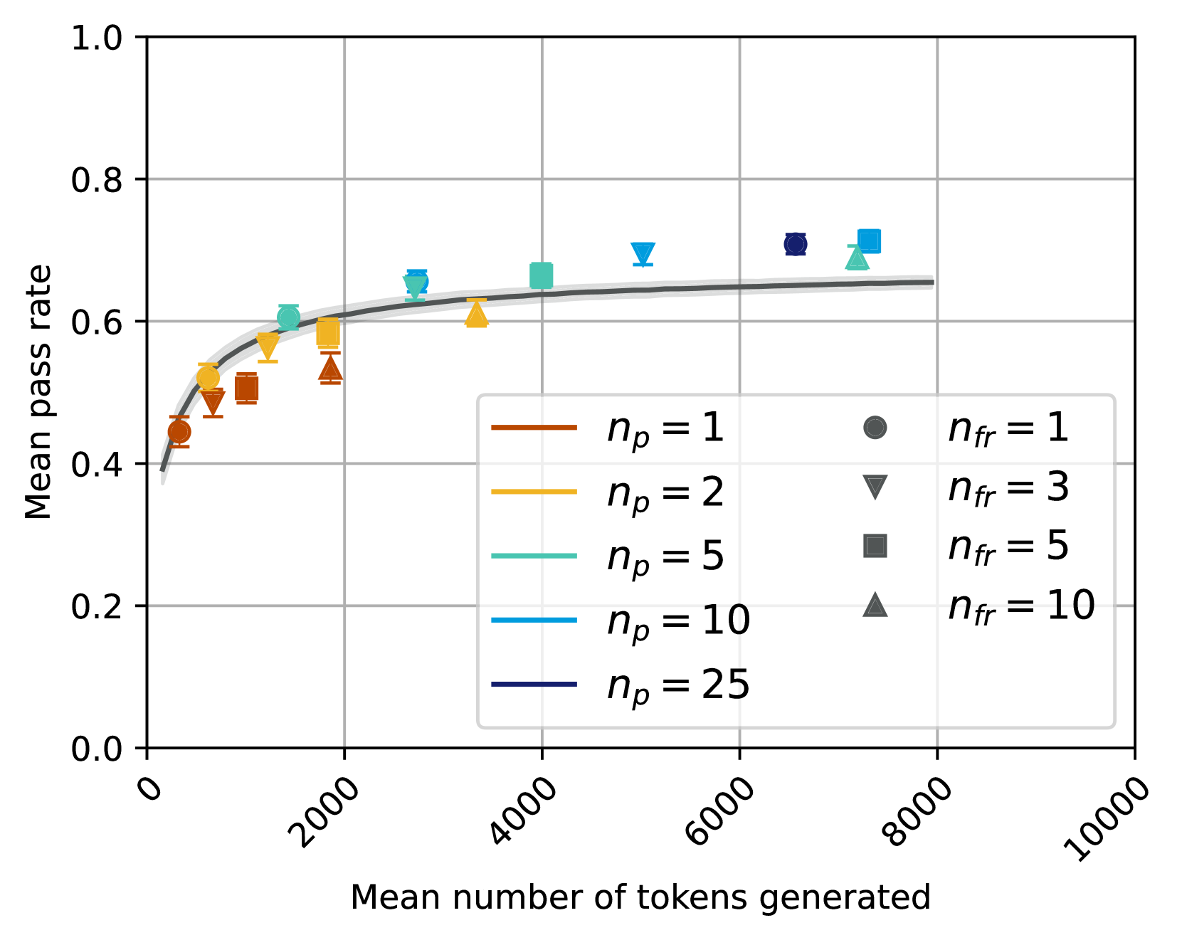
## Scatter Plot: Mean Pass Rate vs. Mean Number of Tokens Generated
### Overview
This is a scatter plot with a fitted trend line, illustrating the relationship between the mean number of tokens generated (x-axis) and the mean pass rate (y-axis). The plot compares multiple experimental conditions defined by two parameters: `n_p` (represented by color) and `n_fr` (represented by marker shape). The data suggests a logarithmic or diminishing returns relationship, where pass rate increases rapidly with initial token generation and then plateaus.
### Components/Axes
* **X-Axis:** "Mean number of tokens generated". Scale is linear, ranging from 0 to 10,000, with major tick marks at 0, 2000, 4000, 6000, 8000, and 10000.
* **Y-Axis:** "Mean pass rate". Scale is linear, ranging from 0.0 to 1.0, with major tick marks at 0.0, 0.2, 0.4, 0.6, 0.8, and 1.0.
* **Legend (Bottom-Right Quadrant):** A two-column legend box.
* **Left Column (Color Key for `n_p`):**
* Brown line: `n_p = 1`
* Yellow line: `n_p = 2`
* Teal line: `n_p = 5`
* Light Blue line: `n_p = 10`
* Dark Blue line: `n_p = 25`
* **Right Column (Marker Key for `n_fr`):**
* Circle (●): `n_fr = 1`
* Inverted Triangle (▼): `n_fr = 3`
* Square (■): `n_fr = 5`
* Triangle (▲): `n_fr = 10`
* **Trend Line:** A solid gray curve is fitted through the aggregate data, showing the overall trend.
### Detailed Analysis
Data points are plotted as combinations of the above colors and markers. Each point includes vertical error bars (standard deviation or confidence interval). Below is an approximate reconstruction of the data series, grouped by `n_p` (color).
**Series: `n_p = 1` (Brown)**
* **Trend:** This series occupies the lowest pass rate region for a given token count.
* **Data Points (Approximate):**
* `n_fr=1` (●): (~500 tokens, ~0.44 pass rate)
* `n_fr=3` (▼): (~800 tokens, ~0.48 pass rate)
* `n_fr=5` (■): (~1200 tokens, ~0.50 pass rate)
* `n_fr=10` (▲): (~1800 tokens, ~0.52 pass rate)
**Series: `n_p = 2` (Yellow)**
* **Trend:** Slightly higher pass rates than `n_p=1` for similar token counts.
* **Data Points (Approximate):**
* `n_fr=1` (●): (~600 tokens, ~0.52 pass rate)
* `n_fr=3` (▼): (~1400 tokens, ~0.57 pass rate)
* `n_fr=5` (■): (~1800 tokens, ~0.58 pass rate)
* `n_fr=10` (▲): (~3500 tokens, ~0.61 pass rate)
**Series: `n_p = 5` (Teal)**
* **Trend:** Shows a clear jump in pass rate compared to lower `n_p` values.
* **Data Points (Approximate):**
* `n_fr=1` (●): (~1500 tokens, ~0.60 pass rate)
* `n_fr=3` (▼): (~2800 tokens, ~0.65 pass rate)
* `n_fr=5` (■): (~4000 tokens, ~0.67 pass rate)
* `n_fr=10` (▲): (~7500 tokens, ~0.69 pass rate)
**Series: `n_p = 10` (Light Blue)**
* **Trend:** Achieves high pass rates, clustering near the top of the chart.
* **Data Points (Approximate):**
* `n_fr=3` (▼): (~5000 tokens, ~0.69 pass rate)
* `n_fr=5` (■): (~7500 tokens, ~0.71 pass rate)
**Series: `n_p = 25` (Dark Blue)**
* **Trend:** The highest `n_p` value shown, with a data point at the highest observed pass rate.
* **Data Points (Approximate):**
* `n_fr=1` (●): (~6500 tokens, ~0.71 pass rate)
### Key Observations
1. **Diminishing Returns:** All series follow a logarithmic-like curve. The initial increase in tokens generated yields a steep rise in pass rate, which then flattens significantly after approximately 2000-4000 tokens.
2. **Parameter Hierarchy:** The parameter `n_p` (color) has a stronger effect on the pass rate ceiling than `n_fr` (marker). For any given `n_fr`, a higher `n_p` results in a higher pass rate.
3. **Clustering by `n_p`:** Data points group vertically by color. For example, all brown points (`n_p=1`) are below all yellow points (`n_p=2`), which are below the teal points (`n_p=5`), and so on.
4. **Token Cost of Higher `n_p`:** Achieving the higher pass rates associated with larger `n_p` values generally requires generating a larger mean number of tokens.
5. **Plateau Region:** The fitted gray trend line suggests the overall system performance approaches a maximum mean pass rate of approximately 0.65-0.70 as the mean number of tokens generated exceeds ~4000.
### Interpretation
This chart likely evaluates the performance of a generative AI system (e.g., for code, text, or reasoning tasks) under different configurations. The "pass rate" is a metric of success or correctness.
* **Trade-off Demonstrated:** The plot visualizes a fundamental trade-off between **efficiency** (mean tokens generated, a proxy for cost/latency) and **effectiveness** (mean pass rate). Spending more computational resources (more tokens) improves results, but with sharply diminishing returns.
* **Role of Parameters:** `n_p` and `n_fr` are likely hyperparameters controlling aspects like the number of parallel attempts, refinement steps, or sampling diversity. The data suggests `n_p` is a more powerful lever for improving quality than `n_fr`, but it comes at a higher token cost.
* **Practical Implication:** For resource-constrained applications, operating in the "knee" of the curve (around 1000-3000 tokens) may offer the best balance. For applications where maximum quality is paramount and cost is secondary, using a high `n_p` (e.g., 10 or 25) is justified, as it pushes the pass rate towards the observed ceiling of ~0.71.
* **System Limit:** The plateau of the trend line around 0.65-0.70 may indicate an inherent limitation of the base model or task difficulty, beyond which simply generating more tokens provides minimal benefit.