## Heatmap: Mean Pass Rate vs. Mean Number of Tokens Generated
### Overview
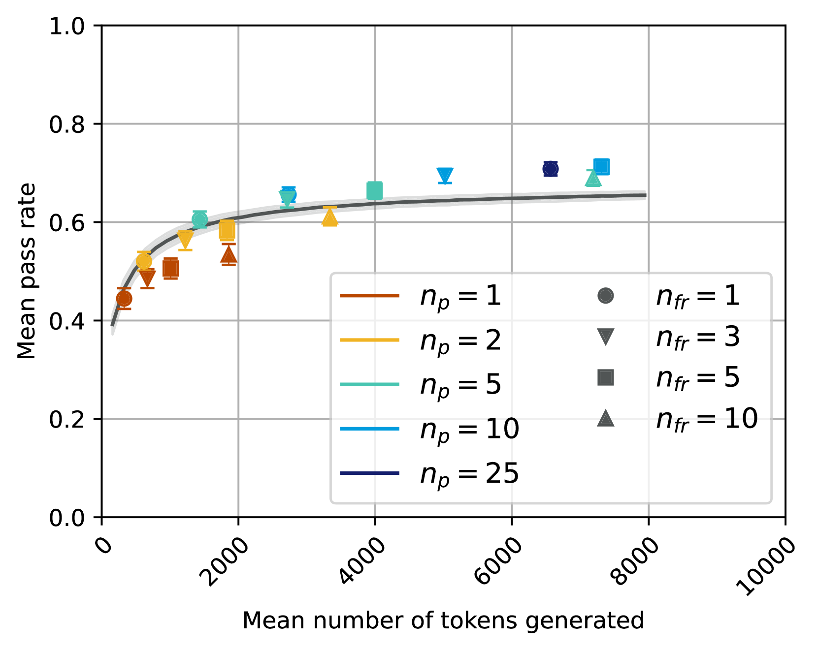
The heatmap illustrates the mean pass rate of a system as a function of the mean number of tokens generated. The x-axis represents the mean number of tokens generated, while the y-axis represents the mean pass rate.
### Components/Axes
- **X-axis**: Mean number of tokens generated (ranging from 0 to 10,000)
- **Y-axis**: Mean pass rate (ranging from 0.0 to 1.0)
- **Legend**:
- **n_p = 1**: Brown circles
- **n_p = 2**: Yellow triangles
- **n_p = 5**: Green squares
- **n_p = 10**: Blue diamonds
- **n_p = 25**: Purple hexagons
- **n_fr = 1**: Black circles
- **n_fr = 3**: Gray triangles
- **n_fr = 5**: Light blue squares
- **n_fr = 10**: Dark blue diamonds
- **n_fr = 25**: Orange hexagons
### Detailed Analysis or ### Content Details
The heatmap shows that as the mean number of tokens generated increases, the mean pass rate generally increases as well. However, the rate of increase varies depending on the number of parameters (n_p) and the number of features (n_fr). For example, with n_p = 1 and n_fr = 1, the mean pass rate increases more slowly compared to n_p = 2 and n_fr = 1. Similarly, with n_p = 25 and n_fr = 25, the mean pass rate increases more rapidly compared to n_p = 1 and n_fr = 1.
### Key Observations
- The highest mean pass rate is observed with n_p = 25 and n_fr = 25.
- The lowest mean pass rate is observed with n_p = 1 and n_fr = 1.
- There is a noticeable trend of increasing mean pass rate with increasing mean number of tokens generated for all combinations of n_p and n_fr.
### Interpretation
The heatmap suggests that increasing the mean number of tokens generated generally improves the mean pass rate of the system. However, the improvement is not uniform across all combinations of parameters. The optimal combination of parameters (n_p and n_fr) for the highest mean pass rate is n_p = 25 and n_fr = 25. This indicates that the system performs best when it has a high number of parameters and features.