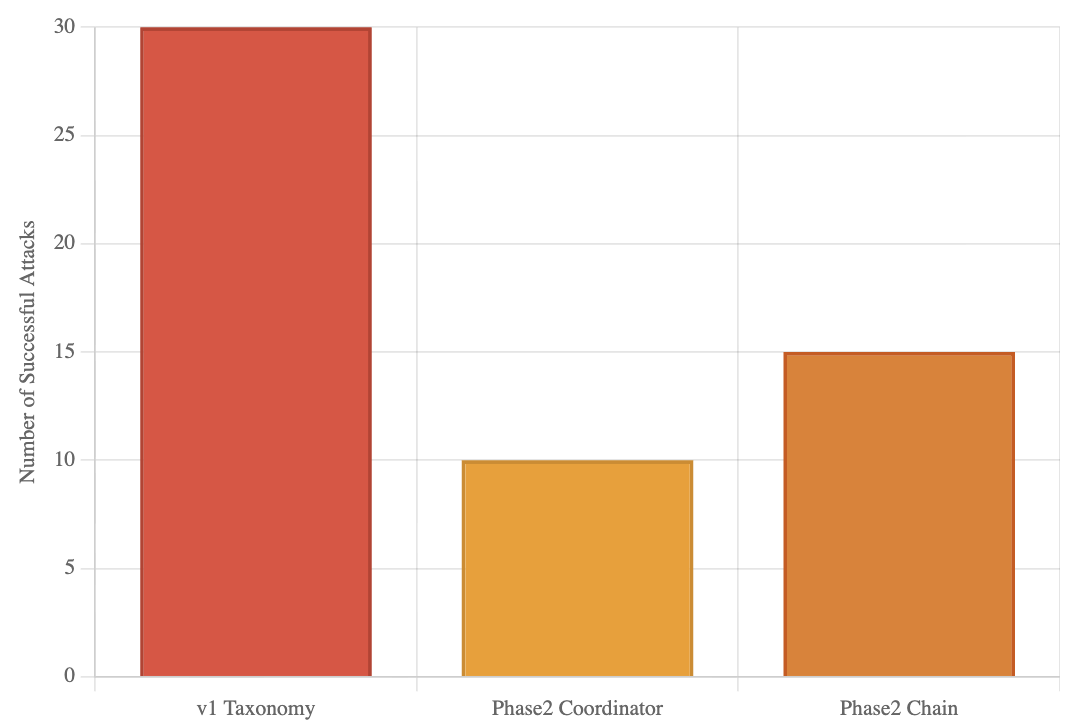
## Bar Chart: Successful Attacks by Taxonomy/Phase
### Overview
This is a vertical bar chart comparing the number of successful attacks across three different categories or phases of a system or study. The chart visually demonstrates a significant disparity in success rates, with one category showing double the attacks of another.
### Components/Axes
* **Y-Axis (Vertical):** Labeled "Number of Successful Attacks". The scale is linear, ranging from 0 to 30, with major gridlines at intervals of 5 (0, 5, 10, 15, 20, 25, 30).
* **X-Axis (Horizontal):** Contains three categorical labels:
1. `v1 Taxonomy`
2. `Phase2 Coordinator`
3. `Phase2 Chain`
* **Data Series:** Represented by three distinct colored bars, each corresponding to one of the x-axis categories.
* **Legend:** Not explicitly present. The categories are identified by their labels directly beneath each bar on the x-axis.
* **Spatial Layout:** The chart has a white background with light gray horizontal gridlines. The bars are centered above their respective labels.
### Detailed Analysis
The chart presents the following data points, extracted by aligning the top of each bar with the y-axis scale:
1. **v1 Taxonomy (Red Bar):**
* **Visual Trend:** This is the tallest bar, indicating the highest value.
* **Data Point:** The top of the bar aligns exactly with the `30` gridline.
* **Value:** 30 successful attacks.
2. **Phase2 Coordinator (Yellow Bar):**
* **Visual Trend:** This is the shortest bar, indicating the lowest value.
* **Data Point:** The top of the bar aligns exactly with the `10` gridline.
* **Value:** 10 successful attacks.
3. **Phase2 Chain (Orange Bar):**
* **Visual Trend:** This bar is of intermediate height.
* **Data Point:** The top of the bar aligns exactly with the `15` gridline.
* **Value:** 15 successful attacks.
### Key Observations
* **Primary Outlier:** The `v1 Taxonomy` category is a clear outlier, with a success count (30) that is **triple** that of `Phase2 Coordinator` (10) and **double** that of `Phase2 Chain` (15).
* **Trend Between Phases:** Within the "Phase2" categories, the `Chain` variant (15) shows a 50% higher number of successful attacks compared to the `Coordinator` variant (10).
* **Data Precision:** The values appear to be exact integers, as each bar's height matches a major gridline precisely. There is no visual uncertainty in the presented values.
### Interpretation
This chart likely compares the effectiveness or vulnerability of different system architectures, security models, or experimental phases in defending against attacks (or, conversely, in executing them successfully).
* **What the data suggests:** The `v1 Taxonomy` represents a significantly less secure or more attack-prone configuration compared to the subsequent "Phase2" iterations. The transition from `v1` to `Phase2` appears to have reduced successful attacks by 50-67%.
* **Relationship between elements:** The two "Phase2" categories suggest a comparison of sub-components or strategies within a second development phase. The `Chain` mechanism, while an improvement over `v1`, is notably less effective (or more targeted) than the `Coordinator` mechanism, allowing 50% more successful attacks.
* **Notable Implications:** The data strongly argues for the adoption of the `Phase2 Coordinator` approach if the goal is to minimize successful attacks. The stark difference between `v1` and `Phase2` highlights the impact of the architectural or methodological changes implemented in the second phase. The chart lacks a title and broader context (e.g., what constitutes an "attack," the time period, or the system under test), which is necessary for a full technical assessment.