## Bar Chart: Successful Attacks
### Overview
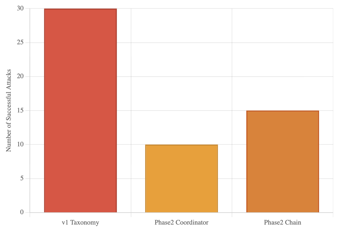
The image is a bar chart comparing the number of successful attacks across three categories: "v1 Taxonomy", "Phase2 Coordinator", and "Phase2 Chain". The y-axis represents the number of successful attacks, ranging from 0 to 30.
### Components/Axes
* **X-axis:** Categories of attacks: "v1 Taxonomy", "Phase2 Coordinator", "Phase2 Chain".
* **Y-axis:** "Number of Successful Attacks", with a scale from 0 to 30, incrementing by 5.
* **Bars:**
* "v1 Taxonomy": Red-orange bar.
* "Phase2 Coordinator": Yellow-orange bar.
* "Phase2 Chain": Orange bar.
### Detailed Analysis
* **v1 Taxonomy:** The red-orange bar reaches the 30 mark, indicating approximately 30 successful attacks.
* **Phase2 Coordinator:** The yellow-orange bar reaches the 10 mark, indicating approximately 10 successful attacks.
* **Phase2 Chain:** The orange bar reaches the 15 mark, indicating approximately 15 successful attacks.
### Key Observations
* "v1 Taxonomy" has significantly more successful attacks compared to the other two categories.
* "Phase2 Chain" has a moderate number of successful attacks, higher than "Phase2 Coordinator".
* "Phase2 Coordinator" has the lowest number of successful attacks among the three categories.
### Interpretation
The bar chart suggests that the "v1 Taxonomy" attack method is significantly more successful than "Phase2 Coordinator" and "Phase2 Chain". "Phase2 Chain" is moderately successful, while "Phase2 Coordinator" is the least successful. This could be due to various factors, such as the complexity of the attack, the vulnerabilities targeted, or the defenses in place. The large difference in successful attacks between "v1 Taxonomy" and the other two categories warrants further investigation to understand the reasons behind its higher success rate.