## Scatter Plot: Dataset Distribution
### Overview
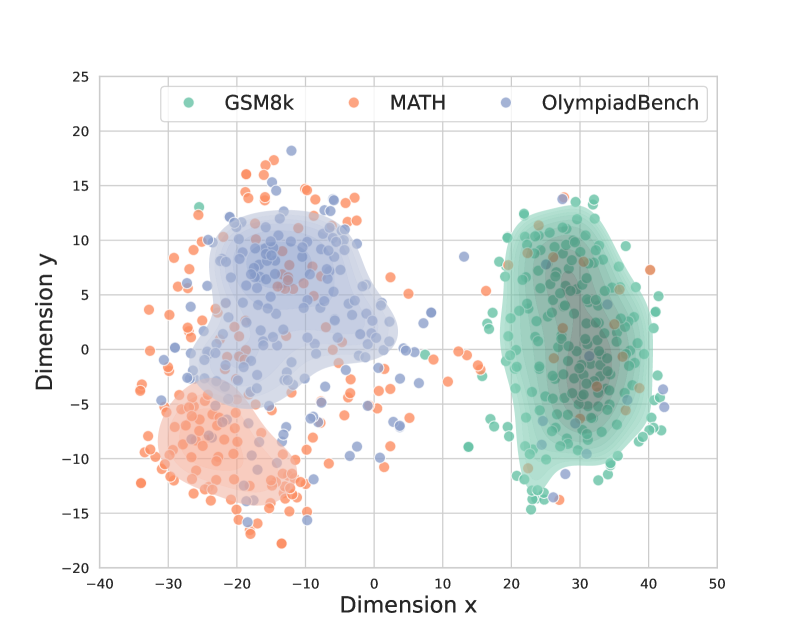
The image is a scatter plot visualizing the distribution of three datasets: GSM8k, MATH, and OlympiadBench. The plot uses two dimensions (Dimension x and Dimension y) to represent the data points, with each dataset distinguished by color (GSM8k - light green, MATH - light orange, OlympiadBench - light blue). Density contours are overlaid on each dataset to highlight areas of high concentration.
### Components/Axes
* **X-axis:** Dimension x, ranging from -40 to 50, with tick marks at -40, -30, -20, -10, 0, 10, 20, 30, 40, and 50.
* **Y-axis:** Dimension y, ranging from -20 to 25, with tick marks at -20, -15, -10, -5, 0, 5, 10, 15, 20, and 25.
* **Legend:** Located in the top-left corner, the legend identifies the datasets:
* GSM8k (light green)
* MATH (light orange)
* OlympiadBench (light blue)
### Detailed Analysis
* **GSM8k (light green):** The GSM8k data points are clustered primarily in the positive x and y quadrant. The density contour is centered around x=30 and y=0, with points ranging approximately from x=15 to x=45 and y=-15 to y=15.
* Trend: Cluster in the positive quadrant.
* **MATH (light orange):** The MATH data points are clustered primarily in the negative x and y quadrant. The density contour is centered around x=-30 and y=-10, with points ranging approximately from x=-40 to x=-15 and y=-20 to y=0. There is also a scattering of orange points within the blue cluster.
* Trend: Cluster in the negative quadrant.
* **OlympiadBench (light blue):** The OlympiadBench data points are clustered primarily in the negative x and positive y quadrant. The density contour is centered around x=-10 and y=5, with points ranging approximately from x=-25 to x=10 and y=-5 to y=15.
* Trend: Cluster in the negative x, positive y quadrant.
### Key Observations
* The three datasets occupy distinct regions in the two-dimensional space, suggesting different characteristics or properties.
* There is some overlap between the OlympiadBench and MATH datasets.
* The GSM8k dataset appears to be the most concentrated, while the MATH dataset is the most dispersed.
### Interpretation
The scatter plot visualizes the distribution of three datasets (GSM8k, MATH, and OlympiadBench) in a two-dimensional space. The clustering of each dataset suggests that they possess unique characteristics that differentiate them along the two dimensions represented by the x and y axes. The density contours highlight the areas where data points are most concentrated for each dataset. The plot suggests that the datasets are separable to some extent, but there is some overlap, particularly between OlympiadBench and MATH. This visualization could be used to inform further analysis or modeling of these datasets.