## Line Charts: Mean and Maximum Betweenness Centrality Over Iterations
### Overview
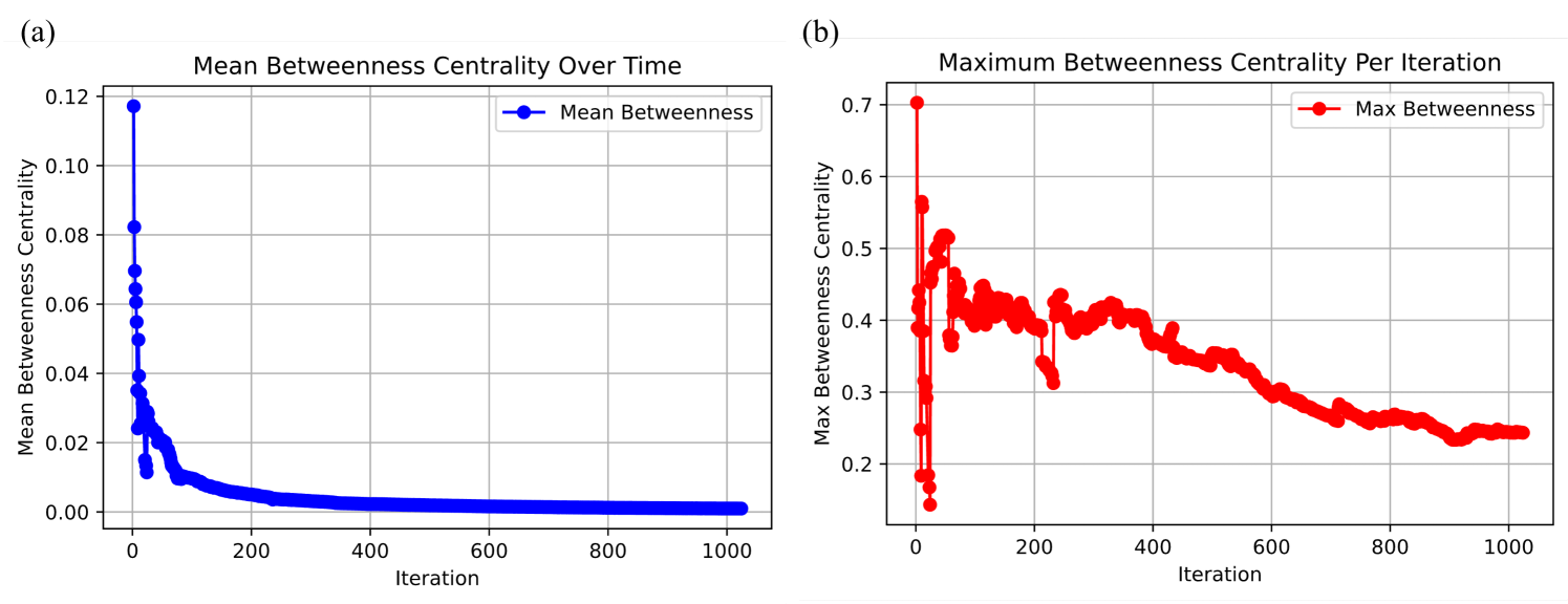
The image displays two side-by-side line charts, labeled (a) and (b), illustrating the evolution of "Betweenness Centrality" metrics over the course of 1,000 iterations.
* **Chart (a)** tracks the **Mean Betweenness Centrality**, showing a rapid decay from a high initial value to near-zero.
* **Chart (b)** tracks the **Maximum Betweenness Centrality**, showing high initial volatility followed by a gradual decline and stabilization.
### Components/Axes
**Chart (a) - Left Panel**
* **Title:** "Mean Betweenness Centrality Over Time"
* **X-Axis:** Labeled "Iteration", ranging from 0 to 1000, with major grid lines at intervals of 200.
* **Y-Axis:** Labeled "Mean Betweenness Centrality", ranging from 0.00 to 0.12, with major grid lines at intervals of 0.02.
* **Legend:** Located at the top-right, labeled "Mean Betweenness" with a blue line and circular marker.
**Chart (b) - Right Panel**
* **Title:** "Maximum Betweenness Centrality Per Iteration"
* **X-Axis:** Labeled "Iteration", ranging from 0 to 1000, with major grid lines at intervals of 200.
* **Y-Axis:** Labeled "Max Betweenness Centrality", ranging from 0.2 to 0.7, with major grid lines at intervals of 0.1.
* **Legend:** Located at the top-right, labeled "Max Betweenness" with a red line and circular marker.
---
### Detailed Analysis
#### Chart (a): Mean Betweenness Centrality
* **Visual Trend:** The blue line exhibits a sharp, near-vertical drop from the start (Iteration 0) to approximately Iteration 50. Following this, the slope flattens significantly, transitioning into a long, slow decay that approaches 0.00 as the iterations increase toward 1000.
* **Data Points:**
* **Start (Iteration 0):** The value peaks at approximately 0.115.
* **Early Phase (Iteration 0–100):** A rapid decline occurs. By iteration 50, the value drops to roughly 0.025. By iteration 100, it is below 0.02.
* **Late Phase (Iteration 200–1000):** The line remains consistently low, hovering just above 0.00, indicating that the average centrality of nodes in the network becomes negligible.
#### Chart (b): Maximum Betweenness Centrality
* **Visual Trend:** The red line shows high volatility in the first 250 iterations, characterized by sharp spikes and drops. After iteration 250, the trend shifts to a more gradual, steady decline, with smaller fluctuations, eventually stabilizing around 0.25 by iteration 1000.
* **Data Points:**
* **Start (Iteration 0):** The value begins at approximately 0.7.
* **Volatility Phase (Iteration 0–250):** The value fluctuates significantly. It drops to ~0.15 (the lowest point) around iteration 30, spikes back up to ~0.55, and continues to oscillate between 0.3 and 0.5.
* **Stabilization Phase (Iteration 250–1000):** The volatility decreases. The value trends downward from ~0.4 at iteration 250 to ~0.25 at iteration 1000.
---
### Key Observations
* **Divergence in Metrics:** There is a stark contrast between the Mean and Max values. While the Mean (Chart a) effectively hits zero, the Max (Chart b) remains significantly higher (approx. 0.25). This indicates a highly skewed distribution of centrality.
* **Network Structure:** The data suggests the formation of a network with a "hub-and-spoke" or scale-free topology. Most nodes have very low betweenness (low mean), while a few specific nodes (the hubs) retain high betweenness (the max).
* **System Evolution:** The initial high volatility in the Max chart suggests the network is undergoing significant structural reorganization or growth in the early stages. The subsequent stabilization suggests the network reaches a steady state or equilibrium.
### Interpretation
This data likely represents a simulation of network growth or a dynamic graph optimization process.
1. **The "Dilution" Effect:** The rapid drop in Mean Betweenness (Chart a) suggests that as the simulation progresses, the network is likely adding many new nodes that are not central, thereby diluting the average centrality of the entire graph.
2. **Persistence of Hubs:** The fact that the Maximum Betweenness (Chart b) remains relatively high (0.25) even when the mean is near zero confirms that the network is not becoming a uniform mesh. Instead, it is maintaining "bottleneck" or "hub" nodes that act as critical bridges for information flow, even as the network grows larger or more complex.
3. **System Maturity:** The flattening of both curves toward the end of the 1000 iterations indicates that the network structure has reached a mature, stable state where the addition of new nodes or edges no longer drastically alters the global centrality distribution.