TECHNICAL ASSET FINGERPRINT
d369a5639bdec71a486f93fc
Click to view fullscreen
Press ESC or click to close
FOUND IN PAPERS
EXPERT: gemini-3.1-pro-preview VERSION 1
RUNTIME: gemini/gemini-3.1-pro-preview
INTEL_VERIFIED
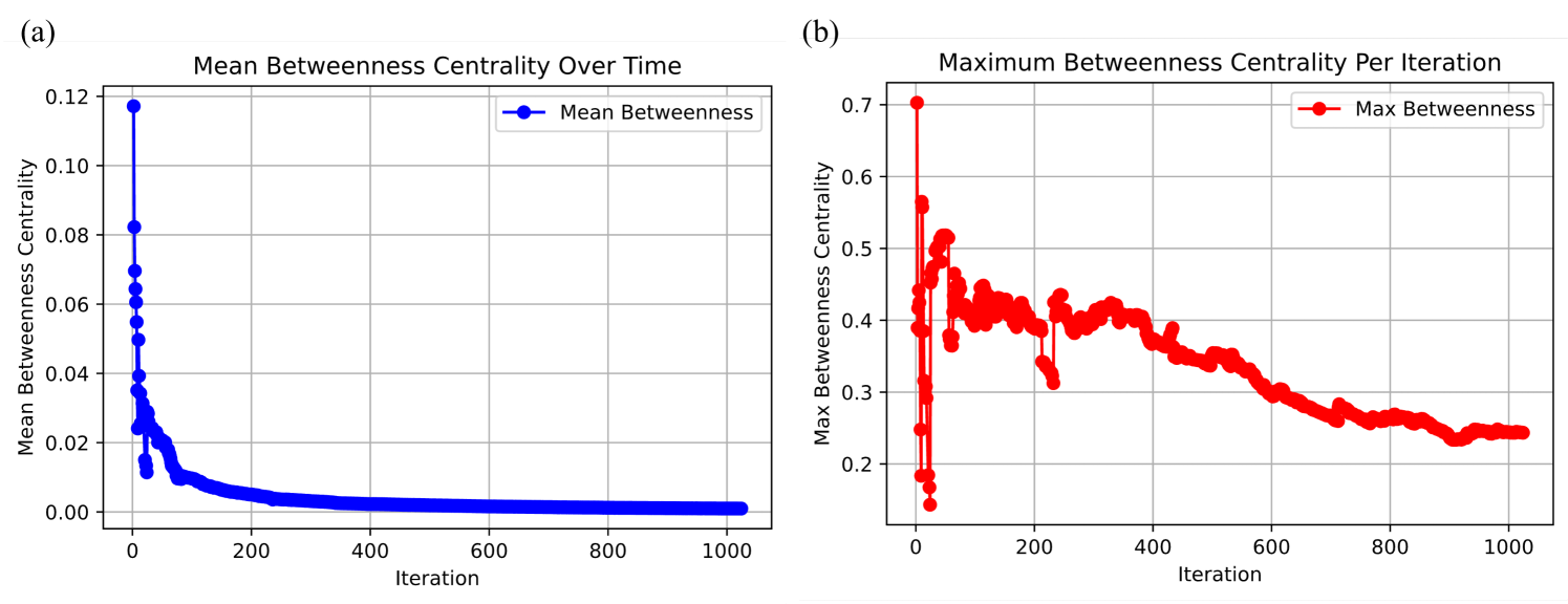
## Line Charts: Mean and Maximum Betweenness Centrality Over Time
### Overview
The image consists of two side-by-side line charts, labeled (a) on the left and (b) on the right. Both charts plot a network metric ("Betweenness Centrality") against a measure of time ("Iteration"). The left chart displays the mean value across the network, while the right chart displays the maximum value. The language used in the image is entirely English.
---
### Component Isolation: Chart (a) - Left Panel
#### Components/Axes
* **Panel Label:** "(a)" located in the top-left corner, outside the chart boundary.
* **Chart Title:** "Mean Betweenness Centrality Over Time" located at the top center, above the chart area.
* **Y-axis Title:** "Mean Betweenness Centrality" positioned vertically along the left edge.
* **Y-axis Scale:** Ranges from 0.00 to 0.12, with major gridline markers at 0.00, 0.02, 0.04, 0.06, 0.08, 0.10, and 0.12.
* **X-axis Title:** "Iteration" positioned horizontally centered below the axis.
* **X-axis Scale:** Ranges from 0 to 1000, with major gridline markers at 0, 200, 400, 600, 800, and 1000.
* **Legend:** Located in the top-right corner inside the chart area. It displays a solid blue line with a blue circular marker, labeled "Mean Betweenness".
* **Grid:** A standard rectangular grid is visible, corresponding to the major axis markers.
#### Trend Verification & Content Details
* **Visual Trend:** The blue line (matching the legend for "Mean Betweenness") exhibits a classic exponential decay curve with extreme initial volatility. It starts near the absolute maximum of the Y-axis, drops precipitously within the first 50 iterations, and then forms a long, thick, asymptotic tail that flattens out just above the 0.00 line for the remainder of the 1000 iterations. The line is rendered very thickly due to the high density of circular data points.
* **Data Points (Approximate values with uncertainty):**
* **Iteration ~0-5:** The data begins with a sharp vertical spike, reaching a peak value of approximately ~0.118.
* **Iteration ~10-50:** The value plummets rapidly, oscillating sharply between ~0.08 and ~0.01.
* **Iteration ~100:** The curve begins to smooth out, dropping to approximately ~0.01.
* **Iteration ~200:** The value is approximately ~0.005.
* **Iteration ~400 to 1000:** The line becomes nearly flat, asymptotically approaching a value of approximately ~0.001 to ~0.002.
---
### Component Isolation: Chart (b) - Right Panel
#### Components/Axes
* **Panel Label:** "(b)" located in the top-left corner, outside the chart boundary.
* **Chart Title:** "Maximum Betweenness Centrality Per Iteration" located at the top center, above the chart area.
* **Y-axis Title:** "Max Betweenness Centrality" positioned vertically along the left edge.
* **Y-axis Scale:** Ranges from 0.2 to 0.7, with major gridline markers at 0.2, 0.3, 0.4, 0.5, 0.6, and 0.7. *(Note: The scale is vastly different from chart a).*
* **X-axis Title:** "Iteration" positioned horizontally centered below the axis.
* **X-axis Scale:** Ranges from 0 to 1000, with major gridline markers at 0, 200, 400, 600, 800, and 1000. *(Identical to chart a).*
* **Legend:** Located in the top-right corner inside the chart area. It displays a solid red line with a red circular marker, labeled "Max Betweenness".
* **Grid:** A standard rectangular grid is visible, corresponding to the major axis markers.
#### Trend Verification & Content Details
* **Visual Trend:** The red line (matching the legend for "Max Betweenness") shows high volatility and a gradual, jagged downward trend. Unlike the smooth asymptote in chart (a), this line experiences massive swings in the early iterations, followed by a noisy, undulating decline. It never approaches zero.
* **Data Points (Approximate values with uncertainty):**
* **Iteration ~0-5:** A massive initial spike reaches exactly ~0.70.
* **Iteration ~10-25:** The value crashes dramatically to a global minimum of approximately ~0.14.
* **Iteration ~30-60:** The value spikes back up rapidly, reaching a secondary peak of approximately ~0.56.
* **Iteration ~100-200:** The data oscillates heavily between ~0.38 and ~0.45.
* **Iteration ~220:** A sharp, brief dip occurs down to approximately ~0.31.
* **Iteration ~400:** The value stabilizes slightly around ~0.40.
* **Iteration ~600:** The downward trend continues, reaching approximately ~0.30.
* **Iteration ~800:** The value is approximately ~0.26.
* **Iteration ~900-1000:** The curve flattens out slightly, ending at approximately ~0.24 to ~0.25.
---
### Key Observations
1. **Scale Discrepancy:** While both charts share an identical X-axis (0-1000 iterations), their Y-axes are drastically different. The maximum value for the Mean (Chart a) is ~0.12, whereas the maximum value for the Max (Chart b) is ~0.70.
2. **Volatility:** Both metrics experience their most extreme volatility within the first 100 iterations.
3. **Convergence:** The Mean Betweenness (blue) converges to a near-zero steady state very quickly (by iteration 200). The Max Betweenness (red) takes much longer to settle and remains highly elevated relative to the mean, ending around ~0.25.
### Interpretation
In network science and graph theory, "Betweenness Centrality" measures how often a node acts as a bridge along the shortest path between two other nodes. A high betweenness centrality indicates a "bottleneck" or a highly critical hub in the network.
* **Network Evolution:** The X-axis ("Iteration") suggests this data represents a dynamic network undergoing a generative process, an optimization algorithm (like network rewiring), or a simulation over time.
* **The Early Chaos (Iterations 0-100):** The extreme spikes and crashes in both charts during the early iterations indicate that the network's topology is undergoing radical restructuring. The initial state has at least one massive bottleneck (Max = 0.7), which is quickly dismantled, rebuilt, and dismantled again.
* **Decentralization (Chart a):** The rapid collapse of the *Mean* Betweenness to near-zero suggests that the network is becoming highly interconnected or decentralized overall. As more edges are added or optimized, the average node is no longer required to act as a bridge; there are many alternative paths.
* **Persistent Hubs (Chart b):** Despite the average node losing its bridging role, the *Maximum* Betweenness remains relatively high (ending at ~0.25). This indicates that while the network as a whole is well-connected, there is still at least one (or a few) dominant hub nodes that control a significant portion of the shortest paths.
* **Conclusion:** The data demonstrates a system evolving from a highly centralized, fragile, and volatile state into a more stable, decentralized state that still retains a distinct hierarchical structure (a core-periphery or scale-free topology), where a few hubs remain important despite the average node becoming structurally redundant.
DECODING INTELLIGENCE...