## 2D Parametric Plot: Trajectory/Phase-Space Diagram
### Overview
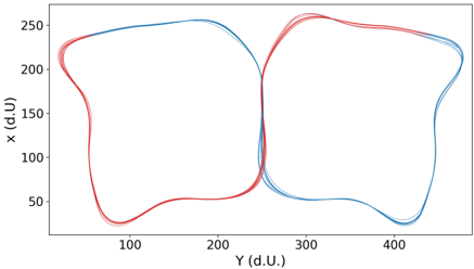
The image displays a 2D parametric plot featuring two closed, overlapping loops that resemble a butterfly or a figure-eight pattern. The plot visualizes a trajectory or a set of trajectories within a coordinate system. The axes are labeled "x (d.U)" for the vertical axis and "Y (d.U)" for the horizontal axis. The lines are rendered in gradients of red and blue, with multiple faint lines suggesting slight variations or multiple trials of the same process.
### Components/Axes
* **Vertical Axis (Y-axis in standard plotting, but labeled "x (d.U)"):**
* Scale: Ranges from 50 to 250.
* Ticks: 50, 100, 150, 200, 250.
* **Horizontal Axis (X-axis in standard plotting, but labeled "Y (d.U)"):**
* Scale: Ranges from approximately 50 to 470.
* Ticks: 100, 200, 300, 400.
* **Data Series:**
* Two distinct, symmetrical loops.
* **Left Loop:** Centered horizontally around Y ≈ 150.
* **Right Loop:** Centered horizontally around Y ≈ 350.
* **Crossing Point:** The two loops intersect near the center of the plot at coordinates Y ≈ 250, x ≈ 150.
* **Color Coding:**
* The lines utilize a color gradient. The left loop is predominantly blue, transitioning to red at the extreme left and the central crossing point. The right loop is predominantly red, transitioning to blue at the extreme right and the central crossing point.
### Detailed Analysis
* **Left Loop (Blue-dominant):**
* **Trend:** The path starts from the central crossing point (Y≈250, x≈150), moves upward and leftward to a peak near x≈255, Y≈200, curves downward to a local minimum near x≈30, Y≈80, and returns to the center.
* **Variance:** Multiple faint lines indicate high repeatability with minor deviations in the trajectory.
* **Right Loop (Red-dominant):**
* **Trend:** The path starts from the central crossing point (Y≈250, x≈150), moves upward and rightward to a peak near x≈260, Y≈300, curves downward to a local minimum near x≈30, Y≈420, and returns to the center.
* **Variance:** Similar to the left loop, there is a slight "fuzziness" to the lines, indicating multiple data runs.
* **Crossing Point:**
* Located at Y ≈ 250, x ≈ 150. This is the point of convergence for both loops.
### Key Observations
* **Inverted Axis Labeling:** The plot uses "x" for the vertical axis and "Y" for the horizontal axis, which is the inverse of standard Cartesian convention.
* **Symmetry:** The two loops are highly symmetrical across the vertical line Y = 250.
* **Color Transition:** The color shift (Blue to Red and Red to Blue) suggests that the color may represent a third variable, such as time, phase, or a control parameter, rather than just distinct datasets.
* **Unit Labeling:** The "(d.U)" likely stands for "dimensionless units" or "data units," indicating that the values are normalized or derived from a specific experimental setup rather than physical measurements like meters or seconds.
### Interpretation
This diagram represents a closed-loop dynamical system, likely a phase-space plot of an oscillating system (such as a double pendulum, a robotic arm trajectory, or a fluid flow pattern).
* **System Stability:** The fact that the lines overlap so closely suggests a highly stable, repeatable system. The "fuzziness" or multiple lines represent the noise or slight variations between experimental runs.
* **The "Figure-Eight":** The crossing point at (250, 150) acts as a central attractor or a point of equilibrium through which the system passes during each cycle.
* **Color Significance:** The color gradient is likely a temporal mapping. If the system moves from blue to red, it suggests a continuous evolution of the state variable over time. The transition at the crossing point indicates a phase change or a switch in the system's behavior as it moves from the left-hand domain to the right-hand domain.
* **Conclusion:** This is a visualization of a periodic or quasi-periodic motion where the system oscillates between two distinct states or spatial regions.