\n
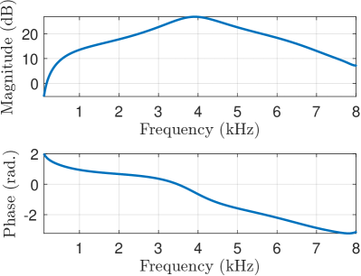
## Charts: Frequency Response - Magnitude and Phase
### Overview
The image presents two charts stacked vertically. Both charts depict the relationship between Frequency (kHz) and another variable. The top chart shows Magnitude (dB) versus Frequency, while the bottom chart shows Phase (rad.) versus Frequency. Both charts use a blue line to represent the data.
### Components/Axes
* **Top Chart:**
* X-axis: Frequency (kHz), ranging from 0 to 8 kHz. Markers are present at 1, 2, 3, 4, 5, 6, 7, and 8 kHz.
* Y-axis: Magnitude (dB), ranging from 0 to 20 dB. Markers are present at 0, 5, 10, 15, and 20 dB.
* **Bottom Chart:**
* X-axis: Frequency (kHz), ranging from 0 to 8 kHz. Markers are present at 1, 2, 3, 4, 5, 6, 7, and 8 kHz.
* Y-axis: Phase (rad.), ranging from -2 to 2 rad. Markers are present at -1, 0, 1, and 2 rad.
### Detailed Analysis
* **Top Chart (Magnitude vs. Frequency):**
* The blue line starts at approximately 6 dB at 0 kHz.
* The line slopes upward, reaching a peak of approximately 21 dB at around 4 kHz.
* After the peak, the line slopes downward, decreasing to approximately 8 dB at 8 kHz.
* Approximate data points:
* 0 kHz: 6 dB
* 1 kHz: 11 dB
* 2 kHz: 16 dB
* 3 kHz: 19 dB
* 4 kHz: 21 dB
* 5 kHz: 19 dB
* 6 kHz: 14 dB
* 7 kHz: 10 dB
* 8 kHz: 8 dB
* **Bottom Chart (Phase vs. Frequency):**
* The blue line starts at approximately 1.8 rad. at 0 kHz.
* The line decreases, becoming approximately 0.2 rad. at 8 kHz.
* The line exhibits a relatively smooth, downward trend.
* Approximate data points:
* 0 kHz: 1.8 rad.
* 1 kHz: 1.4 rad.
* 2 kHz: 1.0 rad.
* 3 kHz: 0.7 rad.
* 4 kHz: 0.4 rad.
* 5 kHz: 0.2 rad.
* 6 kHz: 0.1 rad.
* 7 kHz: 0.05 rad.
* 8 kHz: 0.2 rad.
### Key Observations
* The magnitude response shows a peak around 4 kHz, indicating a resonant frequency or amplification in that region.
* The phase response decreases with increasing frequency, suggesting a time delay that increases as frequency increases.
* Both charts show smooth curves without any abrupt changes or discontinuities.
### Interpretation
The charts likely represent the frequency response of a filter or system. The magnitude plot indicates the gain or attenuation of the system at different frequencies, while the phase plot shows the phase shift introduced by the system. The peak in the magnitude response suggests that the system is particularly sensitive to frequencies around 4 kHz. The decreasing phase response indicates that higher frequencies experience a greater time delay. This could be a characteristic of a low-pass filter, a band-pass filter, or a more complex system. The data suggests a system that boosts frequencies around 4kHz and introduces a frequency-dependent phase shift. The smooth curves suggest a well-behaved system without significant non-linearities.