## Line Chart: Epsilon Opt vs. Alpha
### Overview
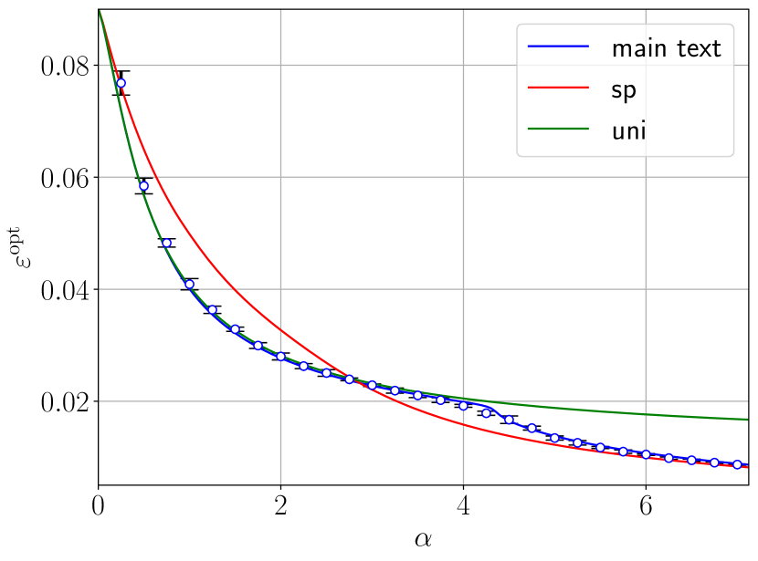
The image is a line chart comparing the relationship between epsilon optimal (εopt) and alpha (α) for three different data series: "main text", "sp", and "uni". The chart includes data points with error bars for the "main text" series. The x-axis represents alpha (α), and the y-axis represents epsilon optimal (εopt).
### Components/Axes
* **X-axis:**
* Label: α
* Scale: 0 to 7, with tick marks at every integer value.
* **Y-axis:**
* Label: εopt
* Scale: 0 to 0.08, with tick marks at 0.02 intervals.
* **Legend:** Located in the top-right corner.
* "main text" - Blue line with blue data points and error bars.
* "sp" - Red line.
* "uni" - Green line.
### Detailed Analysis
* **"main text" (Blue):** The blue line with circular data points shows a decreasing trend as alpha increases. The data points have error bars, indicating a range of uncertainty.
* α = 0, εopt ≈ 0.078 ± 0.002
* α = 1, εopt ≈ 0.042 ± 0.003
* α = 2, εopt ≈ 0.029 ± 0.002
* α = 3, εopt ≈ 0.025 ± 0.001
* α = 4, εopt ≈ 0.021 ± 0.001
* α = 5, εopt ≈ 0.019 ± 0.001
* α = 6, εopt ≈ 0.013 ± 0.001
* α = 7, εopt ≈ 0.010 ± 0.001
* **"sp" (Red):** The red line also shows a decreasing trend as alpha increases, but it is consistently above the "main text" line.
* α = 0, εopt ≈ 0.085
* α = 1, εopt ≈ 0.058
* α = 2, εopt ≈ 0.038
* α = 3, εopt ≈ 0.027
* α = 4, εopt ≈ 0.020
* α = 5, εopt ≈ 0.015
* α = 6, εopt ≈ 0.012
* α = 7, εopt ≈ 0.009
* **"uni" (Green):** The green line shows a decreasing trend initially, but it flattens out as alpha increases.
* α = 0, εopt ≈ 0.090
* α = 1, εopt ≈ 0.060
* α = 2, εopt ≈ 0.040
* α = 3, εopt ≈ 0.030
* α = 4, εopt ≈ 0.022
* α = 5, εopt ≈ 0.020
* α = 6, εopt ≈ 0.019
* α = 7, εopt ≈ 0.018
### Key Observations
* All three data series ("main text", "sp", and "uni") show a decreasing trend of εopt as α increases.
* The "sp" series consistently has higher εopt values compared to the "main text" series for the same α values.
* The "uni" series initially decreases more rapidly than the "sp" series, but it flattens out at higher α values.
* The "main text" series has error bars, indicating the uncertainty in the measurements.
### Interpretation
The chart illustrates the relationship between epsilon optimal (εopt) and alpha (α) for three different scenarios represented by "main text", "sp", and "uni". The decreasing trend in all three series suggests that as alpha increases, epsilon optimal decreases. The differences in the curves indicate that the relationship between epsilon optimal and alpha varies depending on the specific scenario. The error bars on the "main text" series provide an indication of the precision of the measurements. The flattening of the "uni" curve at higher alpha values suggests that there may be a lower limit to epsilon optimal in that scenario.