## Line Chart: Optimal Error (ε_opt) vs. Parameter α
### Overview
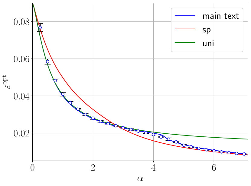
This is a line chart plotting the optimal error, denoted as ε_opt, against a parameter α. It compares three different datasets or models labeled "main text", "sp", and "uni". The chart shows a decreasing trend for all three series as α increases, with distinct crossover points between the lines.
### Components/Axes
* **X-Axis (Horizontal):**
* **Label:** α (alpha)
* **Scale:** Linear, ranging from 0 to approximately 7.
* **Major Tick Marks:** 0, 2, 4, 6.
* **Y-Axis (Vertical):**
* **Label:** ε_opt (epsilon_opt)
* **Scale:** Linear, ranging from approximately 0.01 to 0.09.
* **Major Tick Marks:** 0.02, 0.04, 0.06, 0.08.
* **Legend:**
* **Position:** Top-right corner of the chart area.
* **Entries:**
1. **Blue line:** "main text"
2. **Red line:** "sp"
3. **Green line:** "uni"
* **Grid:** A light gray grid is present, aiding in value estimation.
### Detailed Analysis
**Data Series Trends & Approximate Values:**
1. **"main text" (Blue Line with Error Bars):**
* **Trend:** Starts at the highest point and decreases monotonically, flattening as α increases. It exhibits small vertical error bars at each data point, indicating measurement or calculation uncertainty.
* **Key Points (Approximate):**
* α ≈ 0: ε_opt ≈ 0.08
* α ≈ 1: ε_opt ≈ 0.045
* α ≈ 2: ε_opt ≈ 0.03
* α ≈ 4: ε_opt ≈ 0.02
* α ≈ 6: ε_opt ≈ 0.01
2. **"sp" (Red Line):**
* **Trend:** Starts at a similar high point as the blue line but decreases more steeply initially. It crosses below the blue line at approximately α ≈ 3.5 and continues to decline, becoming the lowest of the three lines for α > 3.5.
* **Key Points (Approximate):**
* α ≈ 0: ε_opt ≈ 0.08
* α ≈ 1: ε_opt ≈ 0.055
* α ≈ 2: ε_opt ≈ 0.035
* α ≈ 4: ε_opt ≈ 0.015
* α ≈ 6: ε_opt ≈ 0.008
3. **"uni" (Green Line):**
* **Trend:** Starts slightly lower than the other two lines at α=0. It decreases at a slower, more gradual rate. It crosses above the blue line at approximately α ≈ 4.5 and remains the highest line for larger α values.
* **Key Points (Approximate):**
* α ≈ 0: ε_opt ≈ 0.075
* α ≈ 1: ε_opt ≈ 0.05
* α ≈ 2: ε_opt ≈ 0.04
* α ≈ 4: ε_opt ≈ 0.02
* α ≈ 6: ε_opt ≈ 0.018
### Key Observations
* **Crossover Points:** The most significant feature is the interaction between the lines. The "sp" (red) line becomes superior (lower ε_opt) to the "main text" (blue) line around α ≈ 3.5. The "uni" (green) line becomes inferior (higher ε_opt) to the "main text" line around α ≈ 4.5.
* **Error Bars:** Only the "main text" (blue) series displays error bars, suggesting it may represent empirical or stochastic results, while the "sp" and "uni" lines could represent theoretical bounds or deterministic models.
* **Asymptotic Behavior:** All three lines appear to approach a non-zero asymptote as α increases, with "sp" approaching the lowest value and "uni" the highest.
### Interpretation
This chart likely compares the performance of three different methods, models, or theoretical predictions ("main text", "sp", "uni") in minimizing an optimal error (ε_opt) as a function of a control parameter α.
* **Performance Ranking:** The relative effectiveness of the methods depends critically on the value of α. For low α (< 3.5), "main text" and "sp" are best. For intermediate α (3.5 to 4.5), "sp" is best. For high α (> 4.5), "sp" remains best, but "uni" becomes worse than "main text".
* **Underlying Meaning:** The parameter α could represent a resource (like data size, computation time, or signal strength), a regularization term, or a system property. The decreasing ε_opt indicates that increasing α generally improves performance (reduces error). The different slopes suggest the methods have different sensitivities to α. The "sp" method benefits the most from increasing α, while the "uni" method is the most robust or least sensitive to changes in α.
* **Investigative Insight:** The presence of error bars only on the "main text" line invites questions. Is "main text" the primary method under study, with "sp" and "uni" serving as theoretical benchmarks? The crossover points are critical for practical application, defining the regimes where one method should be chosen over another. The chart effectively communicates that there is no single best method across all conditions; the optimal choice is parameter-dependent.