# Technical Document Extraction
## Top Row: Bar Charts (Token i vs log(1 + p_i))
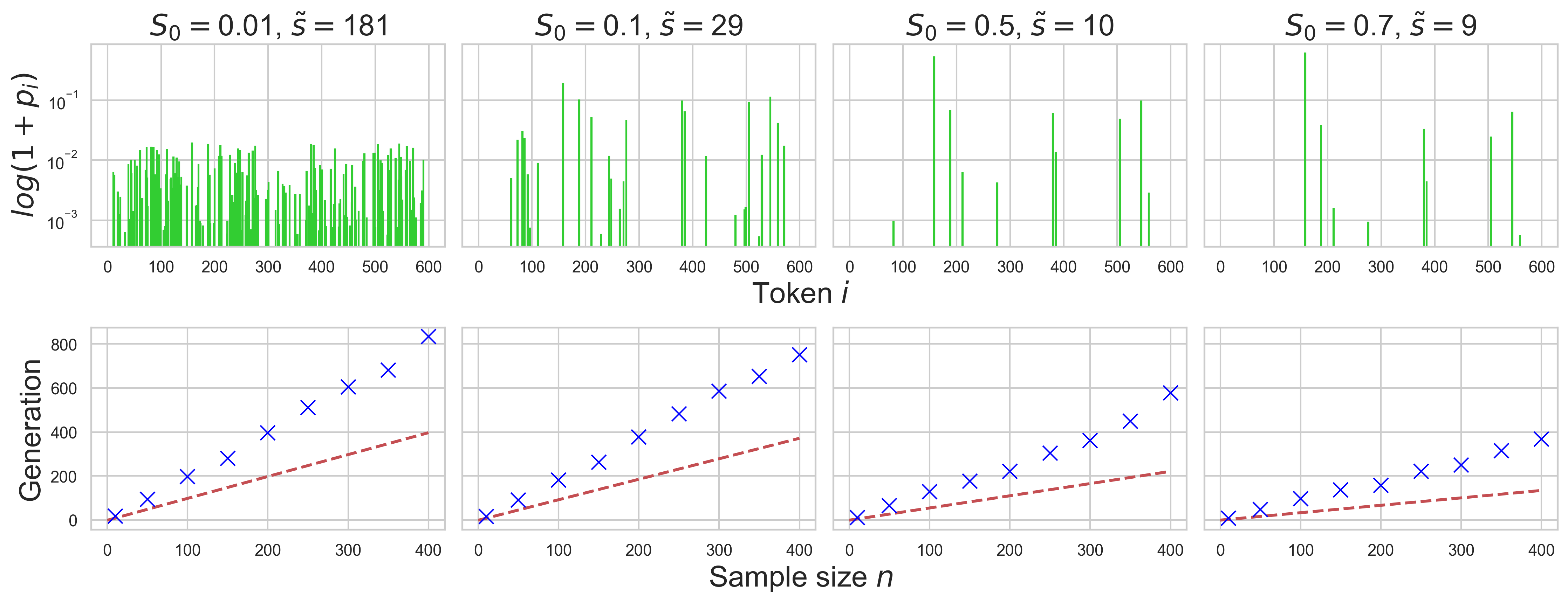
### Chart 1: S₀ = 0.01, s̃ = 181
- **Title**: S₀ = 0.01, s̃ = 181
- **X-axis**: Token i (0–600)
- **Y-axis**: log(1 + p_i) (10⁻³ to 10⁻¹)
- **Bars**: Green vertical bars with varying heights (no legend provided)
- **Key Observations**:
- Bars show irregular distribution across token indices.
- No clear pattern; density fluctuates significantly.
### Chart 2: S₀ = 0.1, s̃ = 29
- **Title**: S₀ = 0.1, s̃ = 29
- **X-axis**: Token i (0–600)
- **Y-axis**: log(1 + p_i) (10⁻³ to 10⁻¹)
- **Bars**: Green vertical bars with varying heights (no legend provided)
- **Key Observations**:
- Sparse bars at lower token indices (0–100).
- Increased density in mid-range tokens (200–400).
### Chart 3: S₀ = 0.5, s̃ = 10
- **Title**: S₀ = 0.5, s̃ = 10
- **X-axis**: Token i (0–600)
- **Y-axis**: log(1 + p_i) (10⁻³ to 10⁻¹)
- **Bars**: Green vertical bars with varying heights (no legend provided)
- **Key Observations**:
- Dominant peaks at token indices ~200, 400, and 500.
- Sparse bars at lower and higher token indices.
### Chart 4: S₀ = 0.7, s̃ = 9
- **Title**: S₀ = 0.7, s̃ = 9
- **X-axis**: Token i (0–600)
- **Y-axis**: log(1 + p_i) (10⁻³ to 10⁻¹)
- **Bars**: Green vertical bars with varying heights (no legend provided)
- **Key Observations**:
- Peaks at token indices ~200, 400, and 500.
- Fewer bars overall compared to S₀ = 0.5.
---
## Bottom Row: Line Graphs (Sample size n vs Generation)
### Chart 1: S₀ = 0.01, s̃ = 181
- **Title**: S₀ = 0.01, s̃ = 181
- **X-axis**: Sample size n (0–400)
- **Y-axis**: Generation (0–800)
- **Data Series**:
- **Blue crosses**: Discrete data points showing exponential growth.
- **Red dashed line**: Trend line (linear fit) with slope ~0.005.
- **Legend**: Red dashed line labeled "Trend" (bottom-right corner).
- **Key Observations**:
- Generation increases linearly with sample size.
- Blue crosses align closely with the red trend line.
### Chart 2: S₀ = 0.1, s̃ = 29
- **Title**: S₀ = 0.1, s̃ = 29
- **X-axis**: Sample size n (0–400)
- **Y-axis**: Generation (0–800)
- **Data Series**:
- **Blue crosses**: Discrete data points showing exponential growth.
- **Red dashed line**: Trend line (linear fit) with slope ~0.007.
- **Legend**: Red dashed line labeled "Trend" (bottom-right corner).
- **Key Observations**:
- Steeper growth rate compared to S₀ = 0.01.
- Blue crosses align with the trend line.
### Chart 3: S₀ = 0.5, s̃ = 10
- **Title**: S₀ = 0.5, s̃ = 10
- **X-axis**: Sample size n (0–400)
- **Y-axis**: Generation (0–800)
- **Data Series**:
- **Blue crosses**: Discrete data points showing exponential growth.
- **Red dashed line**: Trend line (linear fit) with slope ~0.003.
- **Legend**: Red dashed line labeled "Trend" (bottom-right corner).
- **Key Observations**:
- Slower growth rate compared to S₀ = 0.1.
- Blue crosses align with the trend line.
### Chart 4: S₀ = 0.7, s̃ = 9
- **Title**: S₀ = 0.7, s̃ = 9
- **X-axis**: Sample size n (0–400)
- **Y-axis**: Generation (0–800)
- **Data Series**:
- **Blue crosses**: Discrete data points showing exponential growth.
- **Red dashed line**: Trend line (linear fit) with slope ~0.002.
- **Legend**: Red dashed line labeled "Trend" (bottom-right corner).
- **Key Observations**:
- Slowest growth rate among all charts.
- Blue crosses align with the trend line.
---
## Notes
1. **Legend Placement**: All line graphs have the legend in the bottom-right corner.
2. **Color Consistency**:
- Blue crosses represent discrete data points.
- Red dashed lines represent trend lines.
3. **Missing Elements**:
- No legend for bar charts (top row).
- No numerical values for individual bars or data points.
4. **Trend Verification**:
- All line graphs show linear trends (red dashed lines) with slopes increasing as S₀ increases.
5. **Spatial Grounding**:
- Legends are consistently placed in the bottom-right corner of line graphs.