## Line Chart: Pass@k (%) Performance Comparison of Four Methods
### Overview
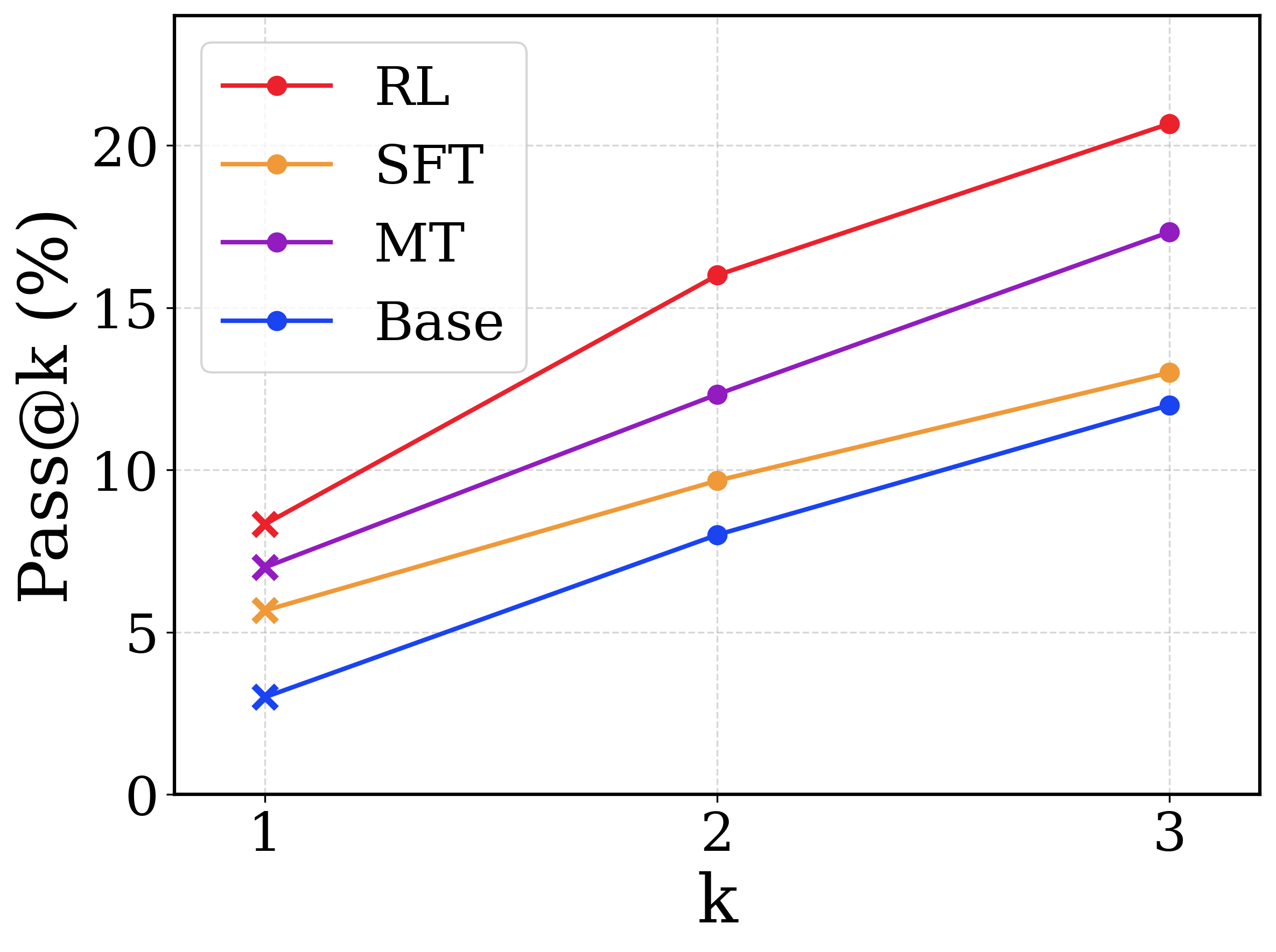
The image is a line chart comparing the performance of four different methods (RL, SFT, MT, Base) on a metric called "Pass@k (%)". The chart plots this metric against three discrete values of `k` (1, 2, and 3). All four methods show a positive, linear trend, with performance improving as `k` increases.
### Components/Axes
* **Chart Type:** Line chart with markers.
* **X-Axis:**
* **Label:** `k`
* **Scale/Ticks:** Discrete values at 1, 2, and 3.
* **Y-Axis:**
* **Label:** `Pass@k (%)`
* **Scale/Ticks:** Linear scale from 0 to 20, with major ticks at 0, 5, 10, 15, and 20.
* **Legend:**
* **Position:** Top-left corner of the plot area.
* **Entries (from top to bottom):**
1. **RL** - Red line with circular markers.
2. **SFT** - Orange line with circular markers.
3. **MT** - Purple line with circular markers.
4. **Base** - Blue line with circular markers.
* **Data Series:** Four distinct lines, each corresponding to a legend entry. Each line connects three data points (at k=1, 2, 3). The data points at k=1 are marked with an 'x' symbol, while points at k=2 and k=3 are marked with filled circles.
### Detailed Analysis
**Trend Verification:** All four lines (RL, SFT, MT, Base) slope upward from left to right, indicating that the Pass@k (%) score increases for all methods as `k` increases from 1 to 3.
**Data Point Extraction (Approximate Values):**
| Method (Legend Color) | k=1 (Pass@k %) | k=2 (Pass@k %) | k=3 (Pass@k %) |
| :--- | :--- | :--- | :--- |
| **RL (Red)** | ~8.5 | ~16.0 | ~20.5 |
| **MT (Purple)** | ~7.0 | ~12.5 | ~17.5 |
| **SFT (Orange)** | ~5.5 | ~9.5 | ~13.0 |
| **Base (Blue)** | ~3.0 | ~8.0 | ~12.0 |
**Component Isolation & Spatial Grounding:**
* **Header/Title:** No explicit chart title is present.
* **Main Plot Area:** Contains the four data lines and gridlines.
* **Axes:** X-axis at the bottom, Y-axis on the left.
* **Legend:** Positioned in the upper-left quadrant, overlapping slightly with the gridlines but not obscuring data points. The order in the legend (RL, SFT, MT, Base) corresponds to the vertical order of the lines at k=3 (RL highest, Base lowest).
### Key Observations
1. **Consistent Hierarchy:** The performance ranking of the methods is consistent across all values of `k`. From highest to lowest Pass@k (%): **RL > MT > SFT > Base**.
2. **Linear Improvement:** The relationship between `k` and Pass@k (%) appears approximately linear for all methods within the range shown (k=1 to 3).
3. **Performance Gap:** The absolute performance gap between the top method (RL) and the bottom method (Base) widens as `k` increases. At k=1, the gap is ~5.5 percentage points; at k=3, it is ~8.5 percentage points.
4. **Marker Distinction:** The use of an 'x' marker for the k=1 data point for all series is a notable visual distinction from the circular markers used for k=2 and k=3.
### Interpretation
This chart demonstrates the comparative effectiveness of four different training or modeling approaches (likely Reinforcement Learning, Supervised Fine-Tuning, a method labeled MT, and a Baseline) on a task measured by the Pass@k metric. Pass@k is a common metric in code generation and problem-solving tasks, representing the probability that at least one of `k` generated samples is correct.
The data suggests that the **RL method is the most effective** of the four, consistently achieving the highest Pass@k scores. The **Base model performs the worst**, indicating that any of the other training methods (SFT, MT, RL) provide a significant improvement over the baseline.
The positive slope for all lines indicates that allowing the model to generate more samples (increasing `k`) increases the chance of obtaining a correct solution, which is the expected behavior for the Pass@k metric. The fact that the RL line has the steepest slope suggests its performance benefits the most from an increased sample budget (`k`), or that its top-1 performance (k=1) is particularly strong relative to its top-k performance.
The consistent ranking implies a clear hierarchy in the efficacy of these methods for the specific task and evaluation setup used to generate this chart. The MT method occupies a middle ground, outperforming SFT but not reaching the level of RL.