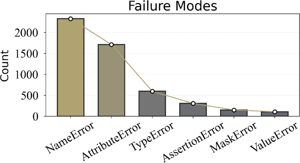
## Chart Type: Pareto Chart of Failure Modes
### Overview
This image displays a Pareto chart titled "Failure Modes," which combines a bar chart and an overlaid line graph. The bar chart illustrates the frequency (Count) of different failure modes, ordered from most frequent to least frequent. The line graph, which connects the top of each bar, visually represents the cumulative distribution of these failure modes.
### Components/Axes
The chart is composed of a main plotting area with a title at the top, a vertical Y-axis on the left, and a horizontal X-axis at the bottom.
* **Title**: "Failure Modes" is centered at the top of the chart.
* **Y-axis (left)**: Labeled "Count", oriented vertically. The axis markers are numerical, ranging from 0 to 2500, with major grid lines at intervals of 500 (0, 500, 1000, 1500, 2000, 2500).
* **X-axis (bottom)**: Represents different categories of "Failure Modes". The labels are rotated approximately 45 degrees counter-clockwise for readability. The categories, from left to right (highest frequency to lowest), are:
* NameError
* AttributeError
* TypeError
* AssertionError
* MaskError
* ValueError
* **Bars**: Six vertical bars represent the count for each failure mode. The first two bars (NameError, AttributeError) are colored a light brown/khaki. The remaining four bars (TypeError, AssertionError, MaskError, ValueError) are colored a dark grey. All bars have a thin black outline.
* **Line Graph**: An overlaid line graph, colored a light brown/khaki (similar to the first two bars), connects the top-center of each bar. Each data point on the line is marked with a small white circle with a black outline. There is no explicit legend for the line, but its purpose in a Pareto chart is typically to show cumulative frequency or percentage.
### Detailed Analysis
The chart presents the frequency of six distinct failure modes. The bars show a clear downward trend in frequency from left to right. The overlaid line graph also demonstrates a continuous downward slope, indicating the cumulative nature of the frequencies.
Here are the approximate counts for each failure mode, derived from the bar heights and corresponding line graph points:
1. **NameError**:
* Bar color: Light brown/khaki.
* Count: Approximately 2250. The top of the bar is slightly above the 2000 mark, roughly halfway to 2500.
* Line point: The first point on the line graph is at this count, marked with a white circle.
2. **AttributeError**:
* Bar color: Light brown/khaki.
* Count: Approximately 1700. The top of the bar is between 1500 and 2000, closer to 1500.
* Line point: The second point on the line graph is at this count, marked with a white circle.
3. **TypeError**:
* Bar color: Dark grey.
* Count: Approximately 600. The top of the bar is slightly above the 500 mark.
* Line point: The third point on the line graph is at this count, marked with a white circle.
4. **AssertionError**:
* Bar color: Dark grey.
* Count: Approximately 300. The top of the bar is between 0 and 500, closer to 500.
* Line point: The fourth point on the line graph is at this count, marked with a white circle.
5. **MaskError**:
* Bar color: Dark grey.
* Count: Approximately 150. The top of the bar is well below the 500 mark.
* Line point: The fifth point on the line graph is at this count, marked with a white circle.
6. **ValueError**:
* Bar color: Dark grey.
* Count: Approximately 100. The top of the bar is just above the 0 mark.
* Line point: The sixth and final point on the line graph is at this count, marked with a white circle.
### Key Observations
* **Dominant Failure Modes**: "NameError" is by far the most frequent failure mode, followed by "AttributeError". These two modes together account for a significant majority of all reported failures.
* **Steep Decline**: There is a very steep drop-off in frequency after the first two failure modes. "TypeError" is significantly less frequent than "AttributeError", and subsequent modes show progressively smaller counts.
* **Visual Grouping**: The change in bar color from light brown/khaki for the top two modes to dark grey for the remaining four visually emphasizes the distinction between the most prevalent failures and the less common ones.
* **Pareto Principle Indication**: The shape of the line graph, which drops sharply initially and then flattens out, is characteristic of a Pareto distribution, suggesting that a "vital few" failure modes contribute to the "trivial many" problems.
### Interpretation
This Pareto chart effectively highlights the most critical "Failure Modes" by presenting their frequencies in descending order. The data strongly suggests that efforts to reduce failures should primarily focus on addressing "NameError" and "AttributeError." These two categories represent the largest opportunities for improvement, as their combined count (approximately 2250 + 1700 = 3950) far outweighs the sum of all other failure modes (approximately 600 + 300 + 150 + 100 = 1150).
The visual distinction in bar colors for the top two failure modes further reinforces their importance. If this chart is used for quality improvement or debugging, it clearly indicates that optimizing code or processes to prevent "NameError" and "AttributeError" would yield the most significant reduction in overall failures. The remaining failure modes, while still present, occur with much lower frequency, implying that addressing them might offer diminishing returns compared to tackling the top two. This type of analysis is crucial for resource allocation and strategic decision-making in areas like software development, system reliability, or error handling.