## Scatter Plot with Error Bars and Fitted Curves: Dimension vs. Gradient Updates
### Overview
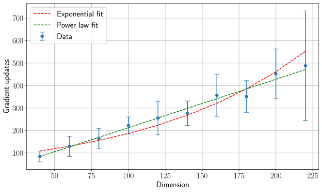
The image is a 2D scatter plot with error bars, displaying the relationship between "Dimension" (x-axis) and "Gradient updates" (y-axis). It includes two fitted trend lines: an exponential fit and a power law fit. The plot is presented on a white background with a light gray grid.
### Components/Axes
* **X-Axis:**
* **Label:** "Dimension"
* **Scale:** Linear, ranging from approximately 40 to 225.
* **Major Tick Marks:** 50, 75, 100, 125, 150, 175, 200, 225.
* **Y-Axis:**
* **Label:** "Gradient updates"
* **Scale:** Linear, ranging from approximately 50 to 750.
* **Major Tick Marks:** 100, 200, 300, 400, 500, 600, 700.
* **Legend:**
* **Position:** Top-left corner of the plot area.
* **Entries:**
1. `--- Exponential fit` (Red dashed line)
2. `--- Power law fit` (Green dashed line)
3. `• Data` (Blue dot with vertical error bar)
* **Data Series:**
* **Data Points:** 8 blue circular markers, each with vertical error bars representing uncertainty or variance.
* **Fitted Lines:** Two dashed curves (red and green) representing mathematical models fitted to the data.
### Detailed Analysis
**Data Points (Approximate Values):**
The following table lists the approximate coordinates for each data point (blue dot) and the extent of its error bars. Values are estimated from the grid.
| Dimension (x) | Gradient Updates (y) | Error Bar Range (y_min to y_max) |
| :--- | :--- | :--- |
| ~50 | ~80 | ~60 to ~100 |
| ~75 | ~120 | ~100 to ~140 |
| ~100 | ~160 | ~140 to ~180 |
| ~125 | ~220 | ~180 to ~260 |
| ~150 | ~260 | ~220 to ~300 |
| ~175 | ~280 | ~240 to ~320 |
| ~200 | ~360 | ~300 to ~420 |
| ~225 | ~480 | ~240 to ~720 |
**Fitted Curves:**
* **Exponential Fit (Red Dashed Line):** Starts near y=100 at x=50. It curves upward, passing slightly above most data points in the mid-range and ending near y=550 at x=225. The trend is accelerating growth.
* **Power Law Fit (Green Dashed Line):** Starts near y=90 at x=50. It follows a more gradual, concave-upward curve, passing close to the data points and ending near y=470 at x=225. The trend is also increasing but at a slower rate than the exponential model at higher dimensions.
**Trend Verification:**
* **Data Trend:** The blue data points show a clear, positive, non-linear trend. As Dimension increases, Gradient updates increase. The rate of increase appears to grow with dimension.
* **Error Bar Trend:** The vertical spread of the error bars generally increases with Dimension. The uncertainty is smallest at low dimensions and becomes very large at the highest dimension (x=225), where the error bar spans nearly 480 units.
### Key Observations
1. **Positive Correlation:** There is a strong positive correlation between Dimension and Gradient updates.
2. **Increasing Variance:** The uncertainty (error bar size) in the Gradient updates measurement grows substantially as Dimension increases, peaking dramatically at the final data point (Dimension ~225).
3. **Model Comparison:** Both the exponential and power law models capture the increasing trend. The exponential fit predicts higher values at the upper end of the dimension range compared to the power law fit.
4. **Outlier/Uncertainty:** The data point at Dimension ~225 is notable for its extremely large error bar, suggesting high variability or measurement difficulty at this scale.
### Interpretation
The data suggests that the computational cost or effort required for a process (measured in "Gradient updates") increases non-linearly with the problem's "Dimension." This is a common pattern in optimization and machine learning, where higher-dimensional spaces are more complex to navigate.
The choice between an exponential or power law model has implications. An exponential increase would indicate that costs become prohibitively expensive very quickly as dimensions grow. A power law increase, while still growing, suggests a more manageable, albeit still significant, scaling behavior. The large error at the highest dimension indicates that predictions become much less reliable at the extremes of the tested range, which could be due to increased stochasticity, numerical instability, or simply fewer samples at that scale.
The plot effectively communicates that dimensionality is a critical factor impacting the measured outcome, and that any model or system operating in this space must account for this non-linear scaling and the associated increase in uncertainty.