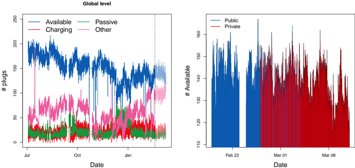
## Time Series Charts: Global Pug Availability and Public/Private Breakdown
### Overview
The image displays two side-by-side time series charts under the main title "Global level." The left chart tracks the number of "pugs" in four different states over several months. The right chart provides a more granular, zoomed-in view of the "# Available" count, comparing "Public" versus "Private" availability over a shorter period in February and March.
### Components/Axes
**Left Chart:**
* **Title:** Global level
* **Y-axis Label:** `# pugs`
* **Y-axis Scale:** Linear, ranging from 0 to 250, with major ticks at 0, 50, 100, 150, 200, 250.
* **X-axis Label:** `Date`
* **X-axis Scale:** Time, with major month labels: `Jul`, `Oct`, `Jan`. The data spans from approximately July to late January/early February.
* **Legend:** Located in the top-left quadrant of the plot area.
* `Available` - Blue line
* `Charging` - Red line
* `Passive` - Green line
* `Other` - Pink line
* **Annotation:** A vertical dashed black line is positioned near the end of the time series, approximately in late January.
**Right Chart:**
* **Y-axis Label:** `# Available`
* **Y-axis Scale:** Linear, ranging from 110 to 160, with major ticks at 110, 120, 130, 140, 150, 160.
* **X-axis Label:** `Date`
* **X-axis Scale:** Time, with specific date labels: `Feb 22`, `Mar 01`, `Mar 08`. The data appears to cover a period from mid-February to mid-March.
* **Legend:** Located in the top-left quadrant of the plot area.
* `Public` - Blue bars/line
* `Private` - Red bars/line
### Detailed Analysis
**Left Chart - "# pugs" over Time (Jul - Jan):**
* **Available (Blue):** This is the dominant series. It starts high (around 180-200) in July, shows a general downward trend with significant volatility, and ends in the 100-150 range by late January. There are several sharp, temporary drops (e.g., around October, December).
* **Other (Pink):** This is the second-highest series. It fluctuates primarily between 50 and 100, with a notable increase in volatility and a slight upward trend starting around December.
* **Charging (Red):** This series is consistently lower, generally fluctuating between 20 and 50. It shows a slight upward trend in the latter half of the period.
* **Passive (Green):** This is the lowest series, mostly staying between 10 and 30. It remains relatively stable with minor fluctuations.
* **Trend Verification:** The blue "Available" line clearly slopes downward over the full period. The pink "Other" line shows a gradual increase in both level and volatility in the final months. The red "Charging" and green "Passive" lines are relatively flat with minor upward drifts.
**Right Chart - "# Available" Breakdown (Feb-Mar):**
* **Data Representation:** This appears to be a high-frequency (likely daily) bar or area chart.
* **Public (Blue):** The blue series represents the count of publicly available pugs. It shows high daily variability, with values frequently ranging between 130 and 160. There is a notable gap or period of very low values in late February.
* **Private (Red):** The red series represents privately available pugs. Its values are generally lower than the public series, mostly ranging between 110 and 140. It also exhibits high daily volatility.
* **Spatial Grounding & Cross-Reference:** The blue (Public) bars are consistently positioned to the left of the red (Private) bars for each date cluster. The legend correctly maps blue to Public and red to Private. The overall height of the blue bars is typically greater than the red bars, indicating a higher count of public availability.
### Key Observations
1. **Dominance of "Available":** In the global view, the "Available" state constitutes the majority of pugs, though its share declines over time.
2. **Rise of "Other":** The "Other" category shows a marked increase in both quantity and variability towards the end of the observed period (Dec-Jan).
3. **Public vs. Private Availability:** The zoomed-in view reveals that public availability is generally higher than private availability, but both are highly volatile on a day-to-day basis.
4. **Data Gaps/Anomalies:** The left chart shows several sharp, temporary drops in the "Available" count. The right chart shows a significant dip or gap in the "Public" (blue) series around late February.
### Interpretation
The data suggests a system (likely related to computing resources, service instances, or connected devices termed "pugs") where the primary state is "Available." The gradual decline in available units, coupled with the rise in the "Other" category, could indicate a shift in system state, increased maintenance, or a change in classification criteria over the observed months.
The right chart's focus on "Available" units reveals a critical operational distinction: a significant portion of available resources are public, but private availability is also substantial. The high daily volatility in both suggests a dynamic environment with frequent allocation and deallocation. The dip in public availability in late February could point to a specific event, maintenance window, or system issue.
The vertical dashed line in the left chart likely marks a significant event, a change in data collection methodology, or the boundary of a forecast period. The charts together provide a macro view of system composition trends and a micro view of the availability dynamics for the most critical state.