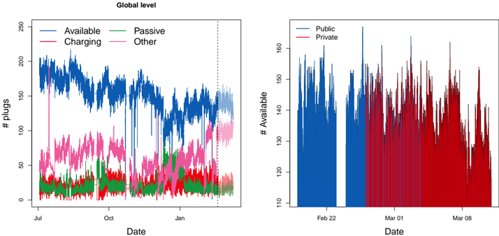
## Chart Type: Time Series Plots of Plug Availability
### Overview
The image presents two time series plots related to the availability of plugs, presumably for electric vehicles. The left plot shows the global level of plug availability categorized by status (Available, Charging, Passive, Other) over a period from approximately July to January. The right plot focuses on the "Available" plugs, differentiating between public and private availability over a shorter period in February and March.
### Components/Axes
**Left Plot:**
* **Title:** Global level
* **Y-axis:** "# plugs" with scale from 0 to 250 in increments of 50.
* **X-axis:** "Date" with labels for July, October, and January.
* **Legend:** Located in the top-left corner.
* Available (Blue)
* Charging (Red)
* Passive (Green)
* Other (Pink)
* A vertical dotted line is present near the end of the x-axis, presumably indicating a cut-off or significant event.
**Right Plot:**
* **Y-axis:** "# Available" with scale from 110 to 160 in increments of 10.
* **X-axis:** "Date" with labels for Feb 22, Mar 01, and Mar 08.
* **Legend:** Located in the top-right corner.
* Public (Blue)
* Private (Red)
### Detailed Analysis
**Left Plot:**
* **Available (Blue):** The number of available plugs starts around 180 in July, decreases to approximately 140 by October, and then fluctuates between 140 and 160 until January. After the vertical dotted line, the number of available plugs appears to increase slightly.
* **Charging (Red):** The number of plugs being charged starts around 20 in July, increases to approximately 40 by October, and then fluctuates between 20 and 40 until January.
* **Passive (Green):** The number of passive plugs starts around 20 in July, remains relatively stable around 20-30 until January, with some fluctuations.
* **Other (Pink):** The number of plugs in the "Other" category starts around 40 in July, increases to approximately 80 by October, and then fluctuates between 60 and 80 until January. After the vertical dotted line, the "Other" category appears to increase significantly.
**Right Plot:**
* **Public (Blue):** The number of available public plugs fluctuates between approximately 120 and 160 from Feb 22 to approximately Feb 28.
* **Private (Red):** The number of available private plugs fluctuates between approximately 110 and 150 from approximately Feb 28 to Mar 08.
### Key Observations
* The left plot shows a general trend of decreasing "Available" plugs and increasing "Other" plugs over time.
* The vertical dotted line in the left plot seems to mark a point where the trends shift, with "Available" plugs potentially increasing and "Other" plugs increasing more significantly.
* The right plot shows a clear distinction between available public and private plugs, with private plugs becoming more prominent after February 28.
### Interpretation
The data suggests a shift in plug usage and availability over time. The decrease in "Available" plugs and increase in "Other" plugs in the left plot could indicate increased plug utilization or a change in how plugs are categorized. The right plot highlights the difference in availability between public and private plugs, potentially reflecting different usage patterns or infrastructure development in these sectors. The vertical dotted line in the left plot might represent a policy change, infrastructure upgrade, or seasonal shift affecting plug availability. The increase in "Other" plugs after the dotted line is notable and warrants further investigation to understand what this category encompasses and why it's increasing.